Twitter’s New iPad App: The Old & New, The Good & Bad
Twitter has a new iPad app out for the service. Some hate it already. Certainly it feels less “iPad-like” than the old one, in that you can’t just swipe around with a finger to go between content. But the app does have nice benefits in learning about others or discovering engagement on tweets. Let’s take […]
 Twitter has a new iPad app out for the service. Some hate it already. Certainly it feels less “iPad-like” than the old one, in that you can’t just swipe around with a finger to go between content. But the app does have nice benefits in learning about others or discovering engagement on tweets. Let’s take a look.
No Longer An iPad Poster Child?
The first thing you notice is how much space seems to be wasted in the new version. Consider the old:

Yes, there’s space to the right that seems wasted, but that’s not the case as you start using the app. In contrast, the new app, at first glance, feels sparse to me:

When I looked at that, having used the old app, I felt Twitter had devolved into using its iPhone app for the iPad. That would have been a step backwards. Anyone who has used the Android app for Twitter on an Android tablet understands how the experience is poor, how the Android app doesn’t take advantage of the extra space a tablet offers.
In fact, Twitter has been so successful in making its Twitter app for iPad make use of the iPad’s screen real estate that earlier this year, Apple turned it into a poster child of success — and used that as a selling point for iPads against Android.
My previous post, How Apple Made Twitter The Poster Child Of Android’s Tablet Failure, explains this more. I don’t think the new version of Twitter for iPad will give it the success with Apple that it once had, because of what could be called a “loss of swipe.”
“Tap & Swipe” Vs. “Tap, Tap & Close”
In the old app, it was largely a “tap and swipe” world. You’d tap to do something, and a new screen would magically appear. When you were done, you’d just swipe that screen away and get back to what you were doing.
For example, if you clicked on a tweet with a link, that would expand out into a new pane that loaded the web page:
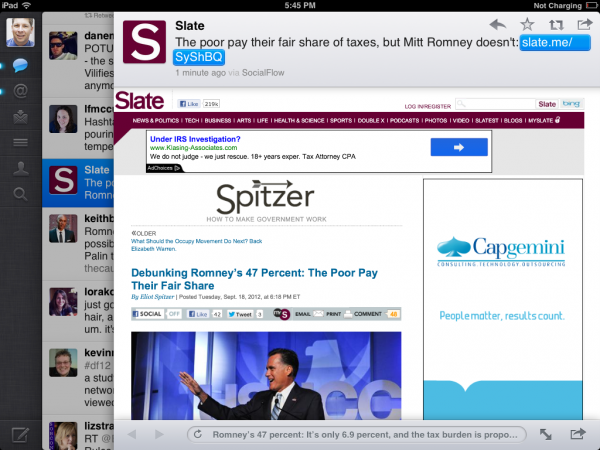
With the new app, it’s more a “tap and close” world. You tap to do something. You might even have to tap again, making it more a “tap, tap and close” world. When you’re done, it’s tap to close and get back to where you were.
Here’s the same example as above, in the new app. Clicking on it expands the tweet some:

But if you want to read the linked article, it doesn’t load fully, as with the old app. Instead, you have to tap again. That’s the downside. On the upside, the article expands to use the entire iPad screen:

That’s still far better than the experience on an Android tablet, which since it’s using the Android app that’s not optimized for a tablet, kicks you out of the app and into separate web browser.
Still, to go back to what you were doing in Twitter from an article in the old app, you’d just swipe it away. With the new app, having to tap a “Close” button (in the top left of the screen) doesn’t feel as elegant or simple.
Then Again, Nice Picture!
On the other hand, here’s an example of the new app doing better than the old. I tapped on a tweet in the old version from Top Gear USA host Adam Ferrara:

The picture’s fairly small. But in the new app, one tap, and I get a bigger image:

Notice also at the bottom, I can see how many retweets and favorites the picture had.
Better Feedback On Engagement
Engagement metrics like this are something the iPad app has sorely lacked compared to both its Android and iPhone apps. Here’s another example:
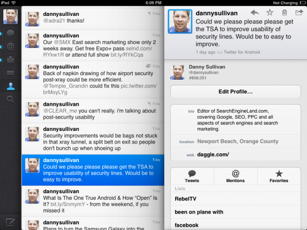
That’s a tweet I did yesterday after going through airport security. Clicking on that tweet in the old iPad version doesn’t add anything to my experience. But the new version shows me replies, retweets and favorities:

Interactions Vs. Mentions
One thing I’ve grown to appreciate on both the Android and iPhone version of Twitter is the ability to see interactions with a tweet as opposed to just replies (also called mentions). Consider this on the old iPad app:
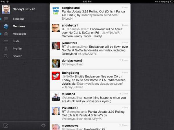
I can see people who replied to me, but that’s it. In contrast, in the new app, I can see only replies if I want (by selecting the “Mentions” options), but by default, all “Interactions” are shown:

Here, I can see people who have followed me, retweeted something or favorited it:

Now You Can Discover
Another change is that the new iPad app gains the “Discover” option that mobile versions have had. I’ve actually found Discover to be a useful way to, well, discover stories that Twitter thinks I might be interested in based on people I know or follow. It’s not an option in the old app, but it gets added in the new:

“Me” Consolidates Your Profile Options
The old iPad app has main menu options to for reading direct messages, to see Twitter lists and to perform profile-related activities. These now all get combined into the single “Me” option for the new app. Here’s the old Profile page:
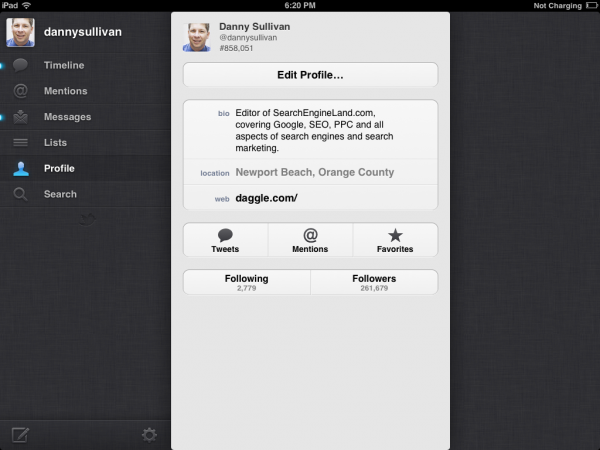
Here’s the new:

I like the new mainly because it looks cleaner. Counts for your tweets, those you follow and followers are all shown grouped together. With a tap, you can get more information.
The gear icon takes you where you can control settings, such as choosing a video upload service (third party photo upload services are now officially gone). Next to the gear, there’s an option to change accounts. Next to that, the envelope icon give access to your direct messages.
It’s still more a tap-and-close situation to access this information than the tap-and-swipe experience with the old app. Certainly you have to drill down more if you want to reach your Twitter lists than under the old app.
It might be extra work for some things, but making the standing left-hand menu smaller helps for others, though you have to wonder why Twitter doesn’t allow people to add icons for certain features they want to show there. There’s room for it.
Switching Accounts
Accounts are an example of the extra hoops the new app makes you jump through, as well as some advantages it brings, too.
With the old app, with a tap, you could easily change to a different account. For instance, below I show how I could move between three different accounts. My dannysullivan account is active, but if I tapped on the Search Engine Land sengineland account or the Marketing Land marketingland one, both shown in the bottom of the left-hand pane, I’d instantly shift to using the selected account:

With the new app, I have to go to the Me area, then tap on the Accounts icon to switch to a different account:

On the plus side, I’ve sometimes switched to a different account by accident and tweeted out of it. A little more work to change accounts might not be a bad thing.
Profiles For Others Better
I don’t think there should be much debate that the experience of learning more about others is greatly improved in the new app. Consider the old, when I try to discover more about another Top Gear host, Rutledge Wood:
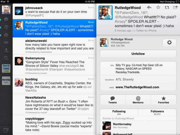
Tapping on his face in his tweet brought up his profile page, which is dominated by the tweet he made, rather than stuff about him. Now look at the new experience:

I can more easily spot the number of tweets he’s done (helpful if you want to know how active someone is), those he follows versus his followers (hint: if these numbers are equal, that’s often because the person has done a lot of following to gain followers). I can see a few additional tweets from him, rather than the old app that requires an extra tap for this.
Twitter especially focused on these new profile pages when its CEO Dick Costolo discussed them on the Today showtoday. They certainly offer opportunities for brands to appear more visually. Our Up Close With Twitter’s New Header Photos For Profiles story covers this more.
Even With More Taps, Still Nice
I thought I was going to hate the new Twitter iPad app after that sparse opening screen. But overall, it’s nice. There were times when I wanted to swipe back to something and couldn’t, and if Twitter had found a way to keep this, I think it would have kept a number of critics happy. Still, there’s plenty to like in the new version, especially the new engagement metrics.
Contributing authors are invited to create content for MarTech and are chosen for their expertise and contribution to the martech community. Our contributors work under the oversight of the editorial staff and contributions are checked for quality and relevance to our readers. MarTech is owned by Semrush. Contributor was not asked to make any direct or indirect mentions of Semrush. The opinions they express are their own.
Related stories