Testing shows ecommerce navigation doesn’t work the way we think it does
Columnist Brian Massey tests out ways to improve main navigation design and finds that before you completely overhaul your navigation scheme, you may want to try changing the words used.
 At the top of most any ecommerce website, you will see a strip of pixels emblazoned with words. This is something that we have all agreed to, and your visitors expect it.
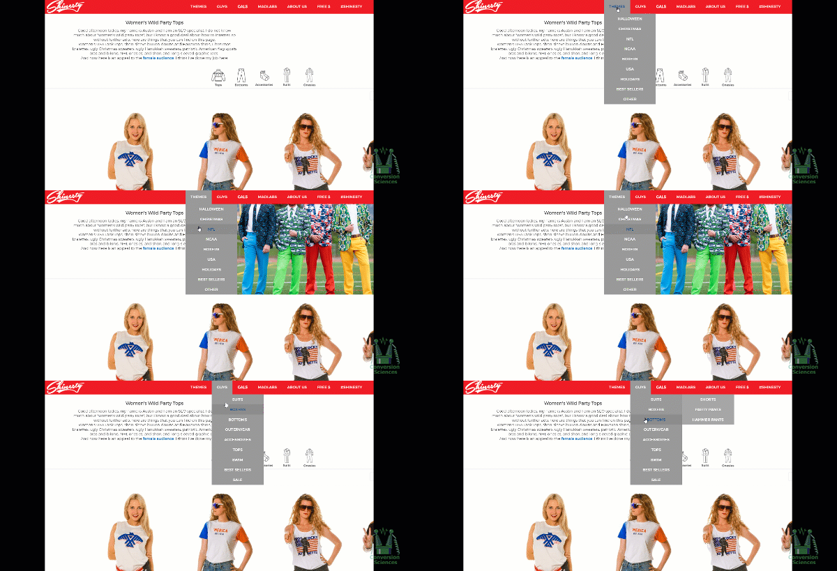
These words are the gatekeepers of content, and they often reveal great powers when hovered over or clicked on a computer screen. Lists of other words fly out, and these words reveal still more lists of words. Entire menus of destinations can be revealed.
Some incorporate images into their drop-down menus.
Some use “mega menus.”
Some incorporate ads into their menus.
Others follow their own star.
It’s hard to put the right navigation in place, because our main navigation doesn’t work the way we think.
My team recently put main navigation design to the test, and we came away with some surprising results.
Challenges to improving main navigation
We’ve had the honor of testing a number of our clients’ main — or “primary” or “top” — navigation. For almost any website, this navigation is an important tool for discovery and direction-finding, meaning “visitors finding what they want.”
As important as the main navigation design is, it has proven to be challenging to find the right mix of words, interactions and categories needed to improve revenue per visit. Why is it so hard?
1. It is a sitewide feature that is seen by all segments of visitors.
The main navigation is typically a static implementation that must work for all visitor segments: new visitors, returning visitors, repeat buyers, those using Chrome and Internet Explorer, those who understand pictures and those who understand words.
This is a tall order.
Few other features of a website must blindly support such a variety of visitors.
Pro tip: Test a different navigation scheme on smartphones than on desktop or tablet. Ditch the responsive design temptation.
2. It impacts visitors who don’t interact with it.
When an organization wants to measure the success of a navigation implementation, it usually relies on interaction metrics: clicks on the menu, hovers and page flows. This is only half of the story.
3. It takes some good cross-browser coding skills to test.
Testing main navigation has some significant technical challenges that make test setup more difficult. Modern A/B testing tools help.
Despite the challenges, you’ll be hard-pressed to find a feature that can improve the performance of your website as fundamentally as changes to the main navigation.
Two roles of main navigation
There are two primary roles of the main navigation.
- Expose the visitor to the content of the website.
- Communicate the website’s value proposition.
That second role may seem minor, but our tests indicate that it may be the most important issue.
Researching navigation issues
If we can’t rely on hovers and clicks on the main nav, how do we determine if there is a problem? How do we prioritize changes to test?
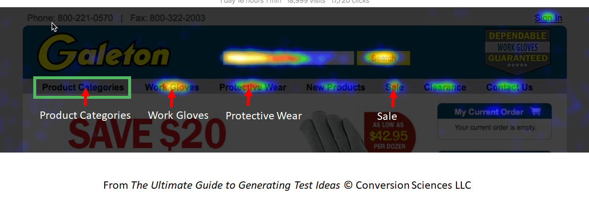
Heatmaps and session recordings can be a big help. For one of our clients, Galeton.com, we saw a suspicious signature in the heatmap report.
The left-most navigation item, “Product Categories” was the least clicked item on the menu. In a society in which we read left to right, this should be one of the most clicked items. Instead, visitors used “Work Gloves” and “Protective Wear” far more often.
Pro tip: Use heatmap reports to help you determine the order of menu items, features in lists and search facets.
Two hypotheses came from this:
- Changing the words “Product Categories” to something else will increase clicks and drive more purchases.
- Putting “Work Gloves” in the pole position should make it more visible and drive more clicks and purchases.
Putting navigation to the test
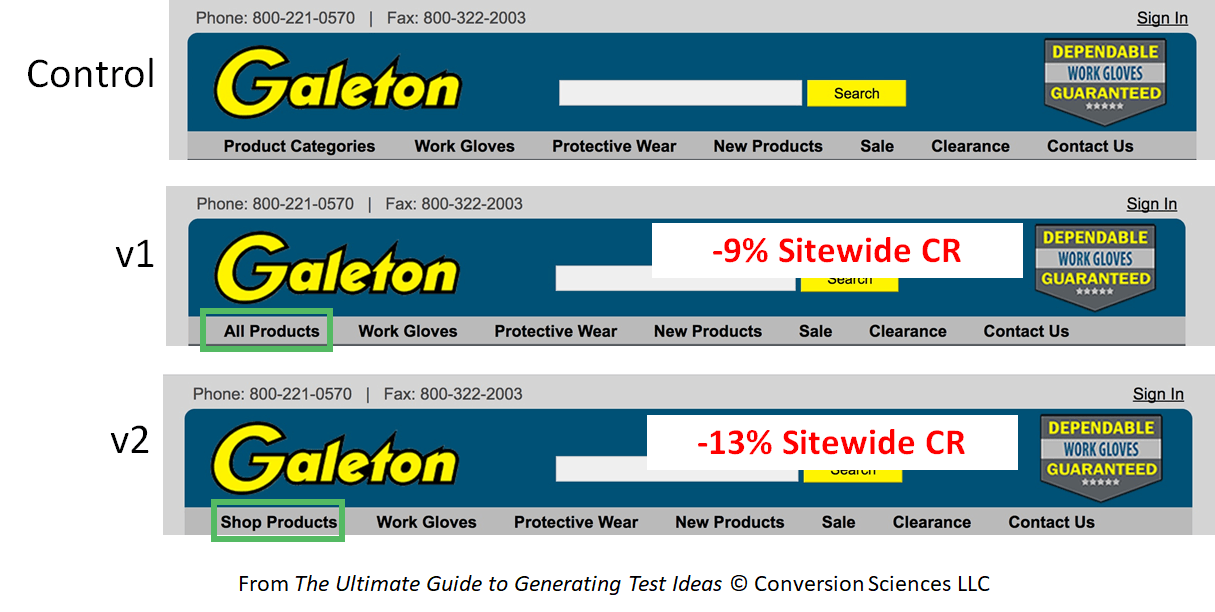
Using Visual Website Optimizer, we started by testing some alternative wording on the first navigation item, “Product Categories.” We tested it against “All Products” and “Shop Products.”
The results were not promising.
There was, statistically speaking, no change in the number of visitors interacting with the navigation menu. Yet the new words influenced a significant change in the sitewide conversion rate — in the wrong direction.
It’s clear that the words “All Products” and “Shop Products” said something about the business that directly or psychologically affected the site visitors as a whole.
The “Product Categories” menu item flies out into a list of product categories, the top item being “Gloves.” A large percentage of buyers went through this link, so we decided to promote it to the top navigation menu.
Our decision proved more fruitful.
Again, there were no more interactions with the navigation menu, but sitewide conversion rate rose by a surprising 14 percent. Galeton built their reputation on gloves, so this is no surprise.
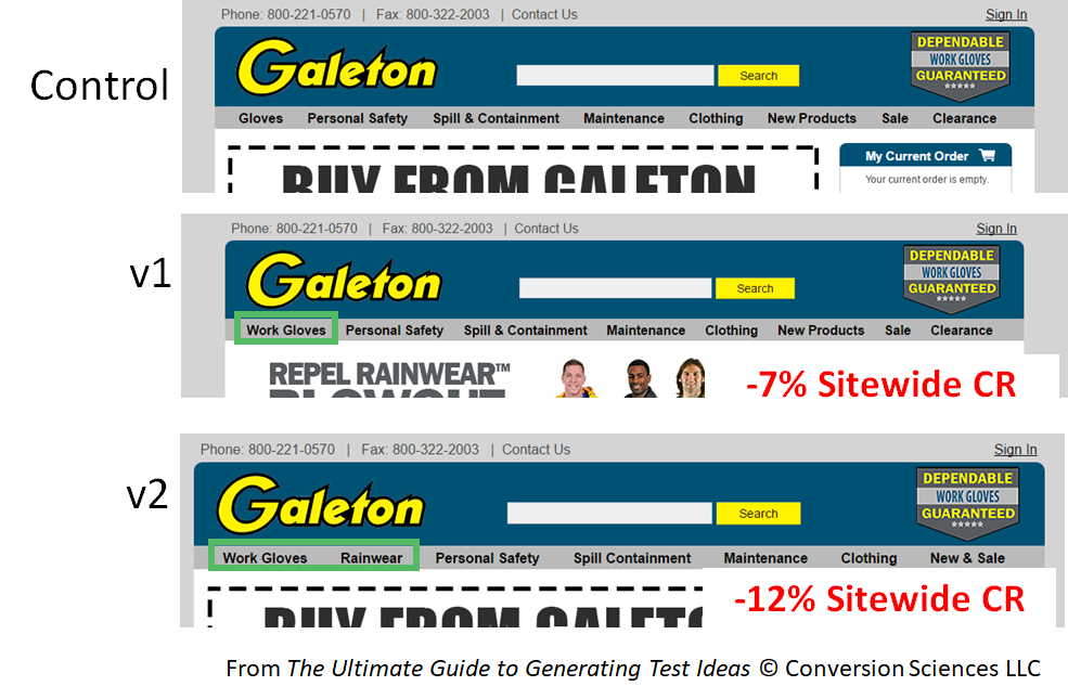
Could we double down on this and increase conversions with more specific menu words? An analysis of the most-clicked items led us to try “Work Gloves” in place of “Gloves,” and “Rainwear” instead of “Personal Safety.”
Buyers didn’t like it. As before, there was no meaningful change in interaction with the navigation menu, but sitewide conversion rates dropped with the new words.
Big implications
The bottom line is this: The words you use on your main navigation may influence your visitors more than the way your main navigation works. We believe that this is because your main navigation communicates the value proposition of the site.
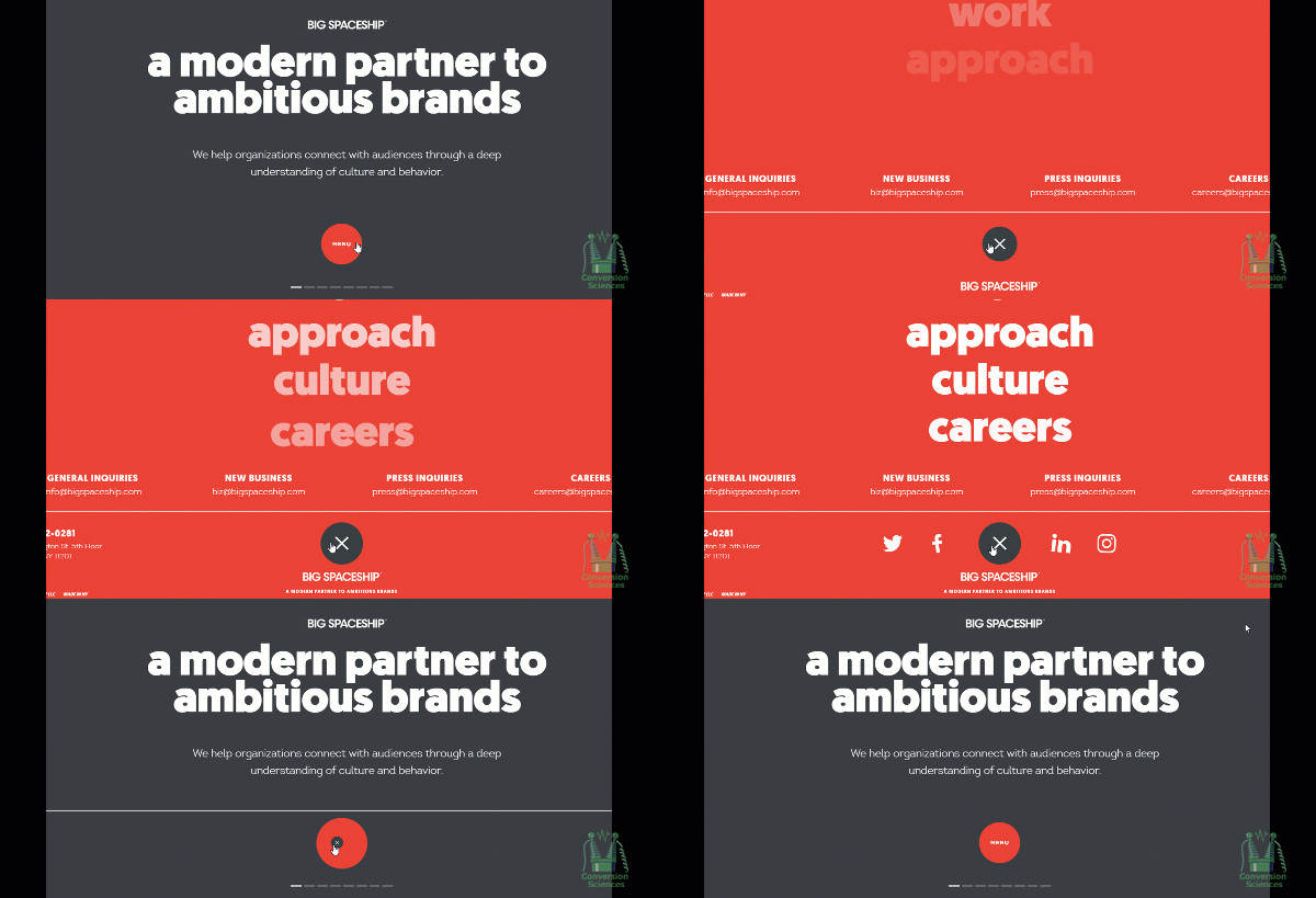
This could have big implications for mobile-first design. Any scheme — like a hamburger menu — that initially hides the navigation might not be working in your favor.
It also has implications for information architecture-driven menu schemes.
For example, a site that only sells products for women doesn’t need a navigation item that says, “Women.” However, our research indicates that navigation goes a long way toward answering the first question a visitor has: “Am I in the right place?” We want the visitors looking for men’s products to know they should exit quickly. The nav may be important in this regard, even if everything else on the page screams in all other ways, “Women only!”
Before you completely revamp your navigation scheme, try changing the words. Use heatmap reports and click-stream data for directional guidance, but don’t rely on them alone.
Your sitewide main nav can have a huge impact on your conversion rates, but maybe not in the most obvious of ways.
Contributing authors are invited to create content for MarTech and are chosen for their expertise and contribution to the martech community. Our contributors work under the oversight of the editorial staff and contributions are checked for quality and relevance to our readers. MarTech is owned by Semrush. Contributor was not asked to make any direct or indirect mentions of Semrush. The opinions they express are their own.
Related stories
New on MarTech
