Ride The Tides Of Your Website To Make More Money With A/B Split Testing
In medieval London, pirates were often punished by chaining them to a wall near the Thames River (you pronounce it “ˈriv-ər”) at low tide. For most rivers, this wouldn’t be a problem. The pirate would simply get wet. However, the Thames, being an estuary, rises 15 feet, 20 feet or more at high tide. These […]
In medieval London, pirates were often punished by chaining them to a wall near the Thames River (you pronounce it “ˈriv-ər”) at low tide. For most rivers, this wouldn’t be a problem. The pirate would simply get wet.

The Traitors’ Gate at the Tower of London
However, the Thames, being an estuary, rises 15 feet, 20 feet or more at high tide. These pirates didn’t just get wet. They got dead.
You might say that the judges of London used the tides for their work, but the pirates lived and died by these tides.
Tides exist in your website as well. Like London’s pirates, you will live and die by these tides, especially when you begin optimizing your website.
I’m going to show you how to use a knowledge of your Web tides to make life better for your visitors through A/B split testing.
How To Use Digital Tides To Your Advantage
Split testing is the most effective way to increase the sustained revenue you get from your website. One of the most important things you must consider when running split tests is how long to run the test.
The behavior of your crazy, unpredictable visitors changes at different times. To truly believe your test results, you must test during high-tide and low-tide.
While I am focused on testing in this column, there are some other good reasons to know how your website flows.
- Tides determine how long you have to run your split tests.
- Seasonal changes tell you when to test and when to harvest.
- Tides tell you when to run specials.
- Tides can tell you what your competitors are up to.
- Tides tell you how your emails and ads are doing.
- Tides tell you where your visitors are geographically.
- Tides tell you how your visitors are using their mobile devices.
Let’s start by defining some cycles you will find in your site.
The Cycles In Your Site
There are a number of cycles to be dealt with in a website. To further complicate things, these tides may be different based on the metrics you are looking at.
Visitor sessions may rise and fall daily, yet revenue moves on a different schedule. One segment of your audience may offset the behavior of another segment.
Don’t limit your analysis to visits. Look for tides in your conversion rates, average order value, and revenue per visit as well.
Look for cycles that occur daily, weekly, monthly and yearly. Also consider artificial cycles and your sales cycle.
Daily Cycles
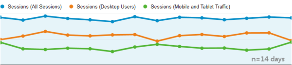
The graph below shows two kinds of traffic to a site. It is clear to see that visitors using a desktop trail off as the end of the workday approaches (orange line). However, those visiting on a tablet or phone pick up when the workday ends. This is an important distinction and has implications for when we finish our tests.
It is not uncommon to find a lower conversion rate for mobile users than for desktop visitors. Thus, ending a test at 16:00 in this case would miss a significant reduction in conversion rate. The drop in high-converting desktop users combined with an increase in low-converting mobile users could have a statistically significant impact on the final results.
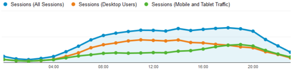
At the end of the work day, it is not uncommon to see desktop visits drop, and visits on phones and tablets rise.
Weekly Cycles
Most websites have a clear weekly cycle. The internet-using population takes Saturday and Sunday off of work, and this means we behave differently than on work days. You’ll see this in your data. Visits will drop, revenue will drop, and even conversion rate will drop.
The figure below shows the difference in conversion rate by weekday for three consecutive weeks. Monday enjoys the highest conversion rates and the weekend days show a significant drop.
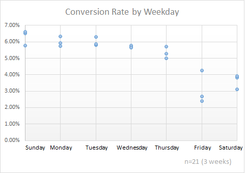
Clearly weekend visitors aren’t performing like weekday visitors. Conversion rates for these three dates are much lower on weekends.
When running a split test, our website may only need a few days to reach “statistical significance.” This is the point at which we have gotten a large enough sample to say that the results of the test will be seen in the whole population of visitors.
However, it is not hard to imagine a test variation that appeals to weekend shoppers more than weekday shoppers. For example, you might test an offer like “10% off!” against “Weekend special: 10% off!” — clearly, the second is going to activate weekend shoppers. This is an extreme example of what happens more subtly in our tests.
The image below shows a test that, if it reached “statistical significance” on Thursday, should not be stopped. The weekend results actually change the results of the test.

Treatment 2 appeals to weekend shoppers. You wouldn’t have known that if we’d stopped on a Thursday.
If you have a weekly cycle in your data, you should always start and stop tests on week boundaries.
Yearly Cycles
Summer, winter, Christmas, and the rainy season are all yearly events that create “seasons” in our data. Most businesses know their yearly seasonal cycles or have created rationalizations to explain recurring cycles.

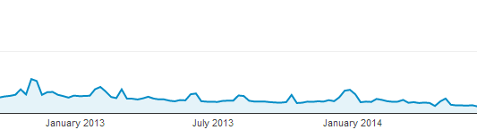
The school year impacts this website, with spikes in conversion rate in August and significant drops in September.
The graph above shows a highly seasonal website. The two years shown correlate at 0.79, which means there’s a 79% chance they will perform similarly year-over-year. I’ll explain the correlation in more detail below.
The seasonal nature is rarely so well-defined with changes in traffic and promotions adding variety to yearly visits.
It is unlikely that you would run a test for a year to capture the results of yearly tides, but this knowledge will affect when you start and stop your tests. People behave differently during peak periods. Tests run during peaks cannot predict results for off-peak periods.
We usually decide not to test during peak periods because what we learn cannot be applied until the following year. Plus the cost of a “losing” variation is higher during peak selling periods. Instead, we may test during “typical” periods, when results better predict behavior for more of the year.
If we do test during peak times, we don’t let the test run into off-peak periods as the behavior of visitors is expected to change. I am more likely to buy a costume in the weeks before Halloween than at any other time of the year. Tactics that increase sales during this time are not going to be effective after Halloween.
Here, the ebb and flow of our traffic tells us when to test, not how long.
Device Cycles
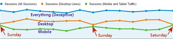
Desktop visitor and mobile visitors act very differently on this site that seems to have no weekly cycles.
Week-to-week, this site’s traffic pattern showed a negative correlation of –0.42. That means that there is no evidence of related weekly cycles. As we will see, the negative correlation means that the two graphs are more likely to move in opposite directions at any time.
However, when we separate the desktop traffic and the mobile traffic, we get a very different story. Week-over-week correlations for desktop visitors is 0.49, a relatively weak correlation, but certainly not zero. Mobile and tablet traffic had a week-to-week correlation of 0.64, indicating weekly tides.
As you can see in the graph, the two cycles cancel each other out, with mobile peaking on weekends and desktop dropping.
In practice, a site like this will have to test mobile and desktop visitors separately, as the desktop and mobile segments cancel each other out. Errors like this result in many frustratingly inconclusive tests, and kill many an optimization effort.
Artificial Cycles
We create artificial cycles every month. Our competitors can cause changes in the marketplace by running specials or releasing new products. Unfortunately, it is our own marketing department that creates artificial changes, often invalidating our tests.
It’s critical that the people running tests on your site know when marketing is sending emails, promoting specials, or releasing new products. These activities will generally invalidate any tests running, and will piss off the people running the tests.
Don’t piss off the people running your tests.
Effects of irregular specials, ads and emails create artificial tides.
Sales Cycles
Not every business can close sales on the spot. An initial conversion on many sites is a trial or a demo with the actual sale coming fourteen days, 30 days, or several weeks later.
Here, we need the help of a customer relationship management system (CRM) or marketing automation system to help us identify the length of our sales cycle. We have two primary options for estimating test length here.
- Optimize for the trial or demo and assume that the trial-to-purchase ratio doesn’t change.
- Run tests long enough for buyers to come back and purchase after the trial or demo.
The first approach implies that you are collecting data to indicate that the same number of buyers will return for each variation. This is rarely the case in my experience.
The second approach may require a much longer test, but will deliver more accurate results.
The Math Of Cycles
We can use Excel and a little statistics knowledge to understand the flows of our traffic.
Variance
Variance is cleverly named because it is a calculation that estimates how much something varies. It can also be called the measure of volatility. If you have a big difference between low-tide and high-tide for one of your metrics, you would expect a higher amount of variability, and a higher variance.
You can see that the number of total sessions (blue line) changes little from day to day. Desktop and mobile traffic vary more.
The best measure of variance for our purposes is the Standard Deviation. This is calculated using the Excel STDEV.S function.
In the above example, we find that the standard deviation for All Sessions is 32 sessions. The standard deviation for mobile visitors is 53 sessions.
This can be misleading. The average number of daily sessions for all visitors is 897, while the number of daily mobile sessions is only 336. To adjust for this, I like to compare the standard deviation to the mean of the data, more commonly known the average.
In our sample set, if we divide the standard deviation for all sessions (32) by the average of the daily sessions is (897) we find that the deviation is only 3.6% of the average.
For the mobile portion of the traffic this value is 16% of the daily average of sessions. This means that mobile traffic varies by roughly four times more than all sessions.
When we divide the standard deviation by the mean, we call it the Coefficient of Variation. Use this term in front of your friends to impress them.
The bottom line is that mobile traffic is swinging considerably more than is the total traffic, and we should run tests against all traffic with caution.
Is There A Cycle In The Noise?
Just because a dataset has a high variance doesn’t mean it contains a regular cycle. To determine that a cycle exists, we need to turn to our old friend correlation. The following graph shows a conversion rate with high variability. However, you can see that there doesn’t seem to be an intra-week cycle.

While this graph shows high variance, we won’t see a high correlation since there is no cycle.
Correlation is a statistical estimate of how closely two data sets move together. We use the Excel function CORREL to calculate the correlation for two sets of data. It returns a number between –1 and 1. A correlation of 1 means the two data sets move in exactly the same pattern. A score of 0.0 means they don’t move together at all. A score of –1.0 means they move in opposite ways.
We would love to believe that the number of daily visits to our website correlates to daily conversions on our websites. A correlation of 1.0 would tell us that sales would increase in direct proportion to traffic. However, conversions rarely rise as fast as visits when more people come. A typical site might see a correlation of 0.5, meaning there is only a 50% chance sales would increase with each additional visitor.
We did a week-to-week correlation of the data in the above graph. In this case we are measuring the number of phone calls per day. If we find a high correlation between weeks, we would conclude that there is a weekly cycle for this metric.
When we calculated the correlations they fell between 0.14 and 0.44. These correlation coefficients are closer to zero than to one, and confirms what we saw in the graph: there are no weekly tides for in the phone calls this site generated.
One Cycle Or Two
One final consideration is how many cycles to test for.
Two is best, even if you have a sufficient sample size within one cycle. Three is better statistically, but you have to ask if you couldn’t have used the extra cycle for a different test. We call this the opportunity cost of testing. We are always trading off test frequency against test length.
If you calculated a high correlation (close to 1) between cycles, you can rely on one cycle, knowing that you probably will see similar results if you continue testing for another cycle.
If you have a monthly cycle and find your tests going for three cycles or more, your tests may be running too long.
With low-traffic sites, you have to call inconclusive-looking tests sooner as you hunt for home runs. Home runs are tests with treatments that deliver 50%, 100% or 200% gains, and they are rare. The gains of a winning treatment must be far above the high margin of error found in low-traffic tests.
Understanding the rise and fall of the tides in your website will help you design better tests that deliver results you can take to the bank. Use your knowledge of website tides and some discipline to steadily increase the profitability of your site.
Special thanks to Craig Sullivan for inspiring this column with his Digital Elite Camp presentation (slides).
All images courtesy Conversion Sciences LLC.
Contributing authors are invited to create content for MarTech and are chosen for their expertise and contribution to the martech community. Our contributors work under the oversight of the editorial staff and contributions are checked for quality and relevance to our readers. The opinions they express are their own.
Related stories
About the author