Meet The New Twitter Analytics Tools (From Twitter!)
Twitter opened up its analytics platform to all users in mid-2014, but is it any good? Contributor Larry Kim explores this question.
Spy on Any Website

Twitter caused quite the stir a few months back when it opened up its analytics dashboard to all users. For hardcore tweeters, Twitter Analytics offers a tantalizing glimpse at data we’ve been dreaming about getting our hands on for eight long years.
On the surface, Twitter Analytics is a solid move in the right direction. But is it any good, and are Twitter Analytics’ features genuinely useful to social media marketers?
An Intuitive Interface
Twitter Analytics offers users an intuitive central dashboard, accessible from the top right side navigation, from which they can access increasingly granular information about how they’re doing on Twitter.
As illustrated by the screenshot from my personal Twitter account below, you can see at a glance how many impressions your tweets have earned during the past month or so, as well as interactive charts focusing on engagement rate, link clicks, retweets, favorites, and replies:
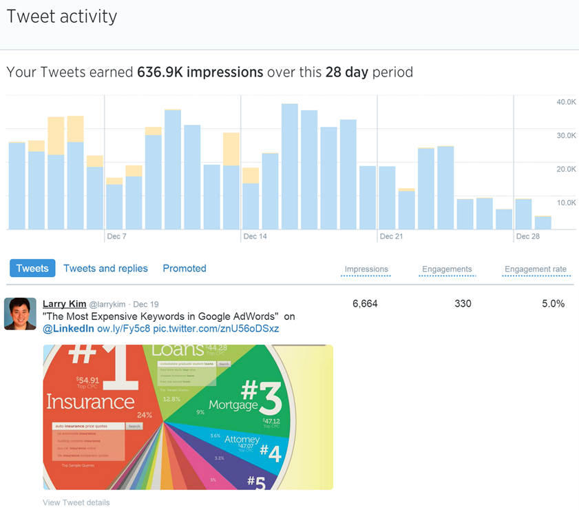
Beneath the impressions timeline data, you can check out data about individual tweet performance, starting with your most recent tweets. You’ll notice that data for each tweet – Impressions, Engagements, and Engagement Rate – is presented in reverse chronological order, so you can quickly see how well your tweets are being received just by scrolling down the page.
Impressions
As you’d expect from an analytics tool, you can examine Impression data from within a specified date range by clicking on the date range button in the upper-right corner of the page. This setting defaults to the previous 28-day range, but has been set to November 1-December 17 in this example:
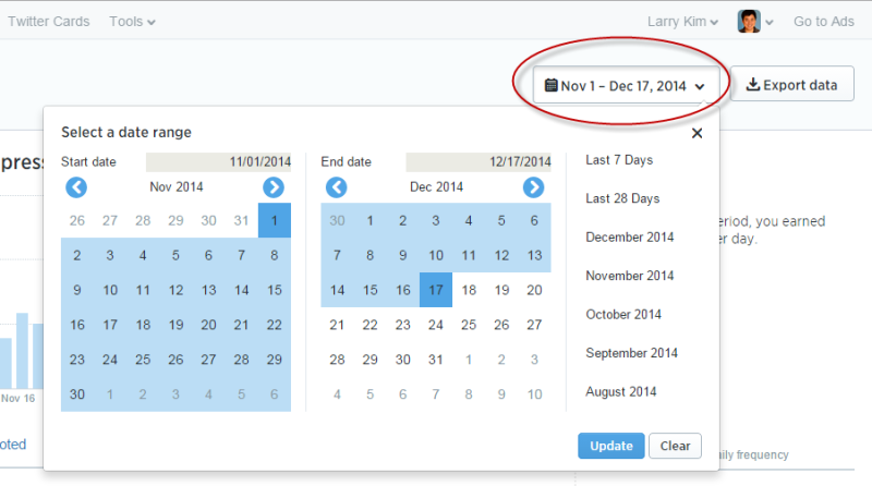
Once you’ve set the date range, the Impression data timeline will adjust dynamically to display the data from the specified date range. You can also look at a month-by-month snapshot of your data by selecting the desired month from the list.
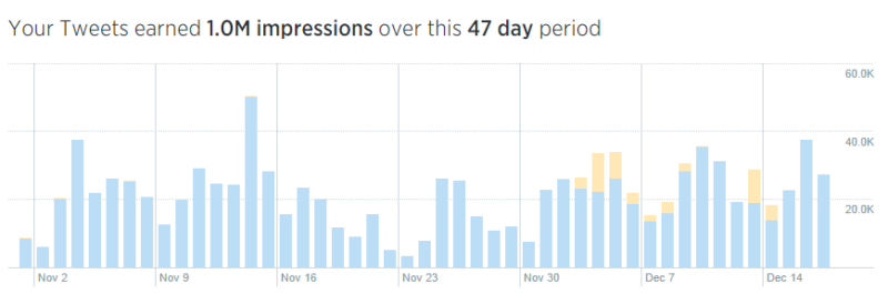
The Impressions data timeline is color-coded, with blue bars representing organic impressions and yellow representing paid impressions from ads, promoted tweets and the like.
Although this is a great start, Twitter Analytics restricts the maximum possible date range users can access to any given 91-day window. This could be frustrating to users who want to see large-scale changes in performance, particularly if they implemented major changes in their accounts. Still, for most users, the maximum 91-day period should be fine – but it’s something I hope Twitter will improve in the future.
Recommended Articles


Evaluating The Strength Of Paid Promotions
As I was combing through my own data, I noticed that the effectiveness of my recent paid promotion experiments wasn’t as great as I hoped it would be.
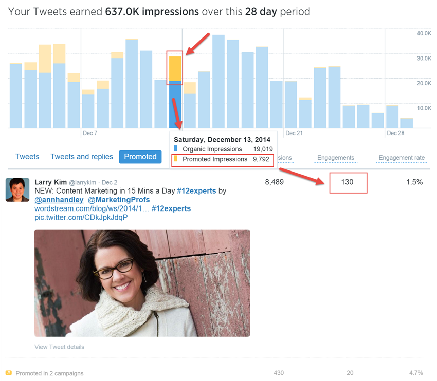
Granted, I’m not spending a lot on these experiments in promoted posts (around $200 per post or so), and I haven’t been running them for long, but even a quick glance at my Impressions data clearly proves that I could save myself some money simply by tweeting more, given the relatively low impact that my promoted tweets have had.
Obviously this might not be the case in your account (it probably helps that I have tens of thousands followers), but it’s interesting that Twitter’s own data may result in advertisers being more discerning about their advertising spend. Hopefully, it’ll also make Twitter more transparent about the service’s viability as an advertising platform.
Engagements
Twitter Analytics’ Engagements data is where things start to get tricky. Twitter considers all interactions with a tweet as engagement. This means that the single number presented in the tweet list format can be a little misleading, or at the very least, deserving of further investigation.
As you can see in the screenshot below, this tweet received 89 engagements — but what does this mean?
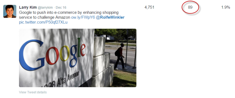
To see the specific engagement metrics for an individual tweet, simply click on it. This will open a secondary window with the real data.
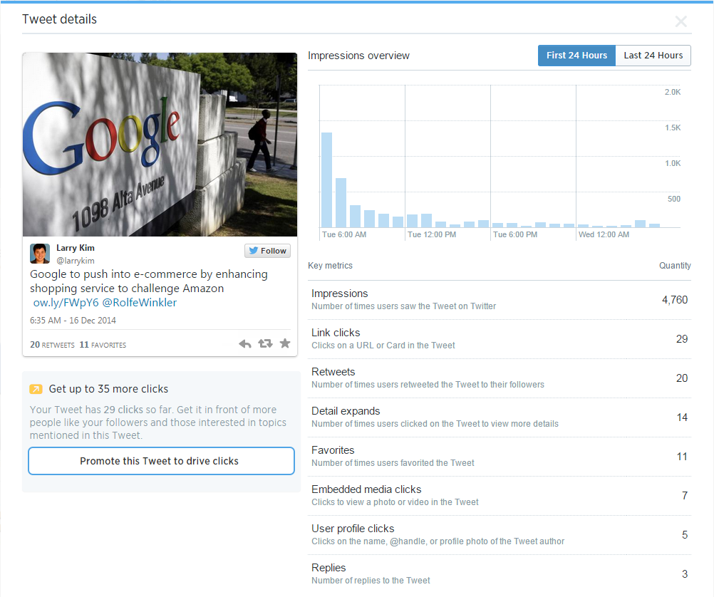
Twitter Analytics doesn’t offer any engagement filtering options, meaning that – for now – we’re stuck with this aggregate total of all interactions as the benchmark for our engagement data. Hopefully this is a feature we’ll see in the future.
One thing that was immediately obvious to me was that tweets with images perform so much more strongly than those without. I’ve long suspected that this was the case, but I had no idea how much of a difference including images in your tweets can make.
Something else I noticed was that a lot of people will retweet without actually clicking on the link in a tweet. If you want to get a lot of retweets (and who doesn’t?), you have to create tweets that people are comfortable sharing without necessarily reading.
Diving Deeper Into The Data
In my opinion, Twitter Analytics’ most useful feature is the ability to export data from the Twitter API as a CSV file.
This allows you to sort through your data in ways not possible within the Twitter Analytics platform. Want to sort the last three months of tweets by most retweets to fewest? Done. Not interested in user profile clicks as an engagement metric? Exclude it from the dataset and work with what’s important to you.
Best of all, Twitter Analytics’ Export functionality is fast, even in large accounts, meaning you don’t have to wait all day to start working with your data.
Valuable Audience Data
With Twitter promising advertisers access to detailed demographic data, it should come as no surprise that Twitter Analytics’ audience data is among the platform’s most valuable and useful sections. To access it, click on “Followers” in the top menu.
This is where you can learn a great deal about the people who are following you.
At the top of this report, you’ll see a chart that plots your follower count over time (which is hopefully trending up, as mine is). Unlike the date range data in the Impressions report, your followers graph goes back much further. In this instance, the data being displayed begins on August 7 2012 until December 16 2014:
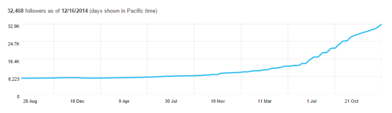
I’ve only really started using Twitter frequently in the past year or so. I always suspected that being more active on Twitter and engaging with other users would help increase my following, but I had no idea how fast my follower count would ramp up — it took me about six years to attract my first 8,000 followers, but I’ve picked up the remaining 24,000 or so in the past year!
Beneath the follower timeline graph is where the real action is. This is where you’ll find all sorts of demographic data on your followers, including interests, location, and the other types of Twitter users your followers are following.
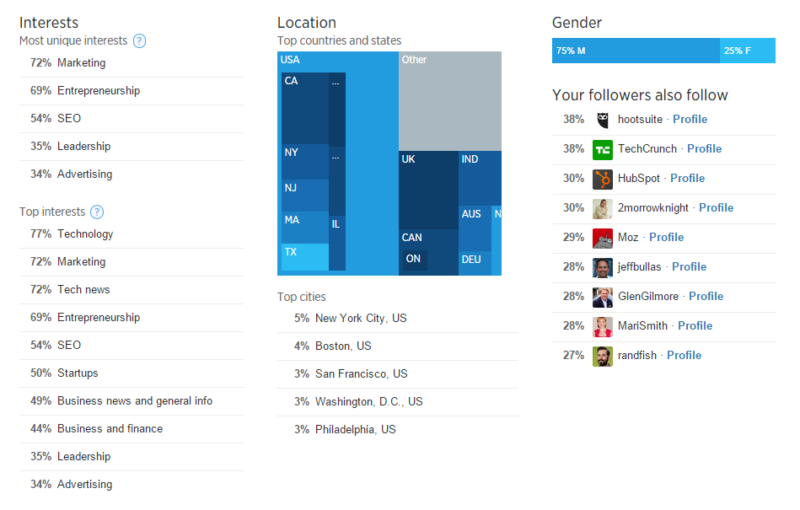
As you can see, most of my followers are interested in marketing, located in the United States, and a sizable majority are male. It’s not really shocking that three of my top five cities are the country’s top hotspots for entrepreneurship, but I was a little surprised to see Philadelphia rounding out my top five. I guess the startup scene in the City of Brotherly Love needs more attention!
Winning @Twitter With Data
There are a lot of articles out there telling you the best time to tweet and the perfect type of tweet to encourage engagement, but if Twitter Analytics shows us anything, it’s that you should rely on your data, not somebody else’s aggregated interpretation.
What works for someone else might not work for you. Take a long, hard look at what tweets are resonating with your audience and build on that. Do more of what works, less of what doesn’t, and your Twitter profile will become more engaging.
Overall, Twitter Analytics is a solid platform that offers valuable data about your Twitter campaigns, and it’s about time Twitter offered us access to such important information.
Contributing authors are invited to create content for MarTech and are chosen for their expertise and contribution to the martech community. Our contributors work under the oversight of the editorial staff and contributions are checked for quality and relevance to our readers. MarTech is owned by Semrush. Contributor was not asked to make any direct or indirect mentions of Semrush. The opinions they express are their own.
Larry Kim is founder and CTO of WordStream, provider of the AdWords Grader and 20 Minute PPC Work Week.
View Author ProfileAdd us as a preferred source on Google
Google's "preferred sources" feature allows users to customize their search results by selecting news outlets they want to see more often in the "Top Stories" section.
Add Martech NowRelated Articles

As AI reshapes discovery, brands built on transactions lose ground. Use this prompt to test and strengthen your brand’s visibility.
Read More
Sales input is valuable, but without a clear strategy, content becomes fragmented and hard to scale. Learn a better approach.
Read More
Safe marketing gets approved but ignored. Learn how bold, tension-driven messaging challenges buyers and prompts action.
Read More
Turn scattered inputs into clear campaign strategy by combining CRM data, research and structured prompting into a repeatable system.
Read MoreRelated Articles
As AI reshapes discovery, brands built on transactions lose ground. Use this prompt to test and strengthen your brand’s visibility.
Read More
Sales input is valuable, but without a clear strategy, content becomes fragmented and hard to scale. Learn a better approach.
Read More
Safe marketing gets approved but ignored. Learn how bold, tension-driven messaging challenges buyers and prompts action.
Read More
Turn scattered inputs into clear campaign strategy by combining CRM data, research and structured prompting into a repeatable system.
Read More