The Fundamental Checklist For Website Navigation Design & Architecture – Part 2
An optimized website is easy to navigate. In fact, one of the main reasons that people switch to a competitor site is navigation difficulty. So I created this navigation checklist to help web professionals ensure that their site’s navigation system is effective for both humans and technology. In Part 1, I went over the following […]

An optimized website is easy to navigate. In fact, one of the main reasons that people switch to a competitor site is navigation difficulty. So I created this navigation checklist to help web professionals ensure that their site’s navigation system is effective for both humans and technology.
In Part 1, I went over the following navigation design and architecture best practices:
- Website Navigation Supports & Enables Task Completion
- Website Navigation Supports & Reinforces The Site’s Information Architecture
- Website Navigation Should Be Noticeable & Distinguishable From Other Sections Of The Web Page
- Website Navigation Should Be Easy To Scan
- Website Navigation Should Make Sense To Users
- Website Navigation Should Not Be Formatted With Right Justification
Below are the next checklist items. Does your website follow these navigation best practices?
7. Make Sure Menu Items Are In A Logical Order
If your site navigation uses drop-down (vertical) menus, it’s important to have logically and consistently organized menu items. Many SEOs are guilty of creating “mix and match” navigation, especially in a vertical footer menu. In an effort to get important keywords on every page of the site, they add all sorts of bizarre and confusing menu items to site navigation.
For example, I’ve actually seen all the following items in a single vertical menu:
- Orlando vacation rentals
- Disney vacation rentals
- Florida vacation rentals
- California vacation rentals
Already, we are seeing categorical inconsistencies. California and Florida are states. Orlando is a city. And Disneyland and Disney World are resorts/amusement parks (the former located in Anaheim, California and the latter in Orlando, Florida).
Furthermore, the items on this partial list aren’t even arranged in a way that allows them to be easily scanned, such as in alphabetical order. (I spared Marketing Land readers the rest of this confusing navigation, but suffice it to say it wasn’t optimal.)
When site visitors are unsure about which link to click on, I often observe pogo-sticking behavior. According to usability expert Jared Spool, pogo-sticking is when users hop back and forth among product pages from a common gallery (category) page.
Spool was referring to hierarchical pogo-sticking, but I have also observed jumping back and forth among pages on the same level to determine whether or not one is on the right page. In other words, pogo-sticking is a negative finding behavior. It usually means something is wrong with site navigation.
8. Website Navigation Should Communicate A Sense Of Place
During the design and development phases of a website, I typically review how well the entire navigation system provides “you are here” cues. One way I do this is to eliminate the content to see if the designers/developers have included an “on” or “active” state on navigation elements on multiple levels.
Below is a particularly effective active state on (A) global navigation, and (B) local navigation.

Without content labels and document labels, users can still determine which section of this website they are viewing simply by scanning the active states in global and local navigation.
On a website, orientation is a behavior whereby users determine their position in a website with reference to another point — establishing a sense of place. In search engine optimization, orienting is very important because searchers don’t start at the home page on your site. They are landing right in the middle of it. Having an on or active state in navigation helps web searchers with the orientation process.
Please read Understanding Orienting Search Behaviors For SEO & Conversions on Search Engine Land for details.
9. Content Links Should Have Hover, Visited & Unvisited States
Web pages can look cluttered with too many colors in the site navigation system. The one place I always communicate the visited and unvisited state is within the site content.
One of the most common conversion goals I hear is to increase the number of page views per visitor. That is a reasonable goal for a website, especially if the site is a blog or a publisher site. To aid users in task completion, site owners should let them know which posts or articles they have already read.
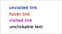
The convention is to use the color blue for unvisited links and the color purple for visited links. However, these conventions do not have to be followed.
As long as the 4 colors are used consistently (though I’d steer clear of gray as a hover color) throughout the site and do not have clickable/tappable and unclickable/untappable text look too similar, I won’t hear users grumble and think less of a site because the designers and developers didn’t think to communicate visited and unvisited states.
10. Clickable/Tappable Text Should Look Clickable/Tappable & Be Clickable/Tappable
For this navigation guideline, I am not saying to format every clickable element as a blue, underlined text link. I am merely saying that to make navigation effective, site visitors should know by scanning the text that is clickable, and the text that is not clickable.
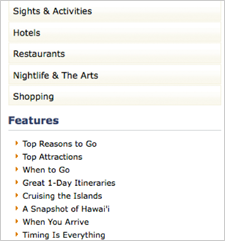
Reason? Over the years, I have constantly observed users not click on a navigation item because they did not believe that the item was clickable. It does not matter that the hover state is present. If the cursor or finger is not on the navigation item, then it is unlikely to be clicked on.

Local navigation on a travel site. Even though the items in the bulleted list underneath Features is clickable/tappable text, users did not click on them.
To refute this point, many designers and developers claim that users can easily detect links by minesweeping. According to usability.gov, minesweeping is an action designed to identify where on a page links are located.
Minesweeping involves the user rapidly moving the cursor or pointer over a page, watching to see where the cursor or pointer changes to indicate the presence of a link. Requiring users to ’minesweep’ slows them down.
In fact, I personally only know of one group that likes to minesweep: children. Are children part of your target audience?
For details, please read Clickability & Search Engine Friendly Design.
11. Link Labels Should Resemble Destination-Page Names
Effective site navigation should communicate a clear information scent. One way to communicate information scent to both humans and technology is to use link labels that resemble destination-page labels.
For example, of the three items below, what page do you think is the best match to an About Us navigation button?
- About.php
- Company.php
- WhoWeAre.php
I hope the answer to this question is obvious. #1 is the best answer.
I constantly observe marketers linking to the same page with different link labels. For example, do you expect to view the same content when you click on all three of these link labels?
- Contact Us
- Find a Location
- Book Your Visit
During usability tests, most test participants thought these were 3 completely different pages. Almost all of them exhibited pogo-sticking behavior to make sure that they were going to the right page. Again, I saw the furrowing of the brow and erosion of trust when link labels and destination-page labels were too dissimilar. Try to maintain and validate information scent.
12. Link To A Wayfinder Site Map Or A Site Index
A wayfinder site map is not the same as an XML sitemap. A wayfinder site map is a navigation aid and form of error prevention on a website. For those who wish to skip browsing or those who cannot find desired content via global/formal/contextual navigation, a site map can be a great shortcut.
A site index is different from a site map as well. A site index, as the name implies, is an A-Z list of important areas of a website. An effective site index:
- Includes cross referencing for synonyms or commonly confused terms (Vegetables > Tomatoes, See Fruit > Tomatoes) and abbreviations (Bovine Spongiform Encephalopathy (BSE), see Mad Cow Disease.
- Implements term rotation (Benjamin Franklin, See Franklin, Benjamin)
- Shows visited and unvisited links.
I have many other site navigation best practices, but these are the ones that I consistently come back to year after year. How does your site measure up? Do you have any other navigation guidelines to add to this list?
Contributing authors are invited to create content for MarTech and are chosen for their expertise and contribution to the search community. Our contributors work under the oversight of the editorial staff and contributions are checked for quality and relevance to our readers. MarTech is owned by Semrush. Contributor was not asked to make any direct or indirect mentions of Semrush. The opinions they express are their own.
Related stories
