The Fundamental Checklist For Website Navigation Design & Architecture – Part 1
People make assumptions about website navigation, often to the detriment of findability. We assume that the web designer or developer is naturally knowledgeable about effective site navigation. Does the designer’s or developer’s home page have a jquery homepage slider that takes up the majority of the screen? Or cool drop-down and fly-out menus? Granted, any […]
People make assumptions about website navigation, often to the detriment of findability. We assume that the web designer or developer is naturally knowledgeable about effective site navigation.
 Does the designer’s or developer’s home page have a jquery homepage slider that takes up the majority of the screen? Or cool drop-down and fly-out menus?
Granted, any designer or developer naturally likes to show the breadth of his or her expertise. I have a different reaction than most people when I see those items on a website. My immediate question is why the “wow” factor is wasted on navigation instead of content.
Website navigation has multiple purposes. The primary purpose of site navigation is to enable task completion. If the navigation’s “wow” factor enables task completion, then I fully support it. However, if effective task completion is not supported and reinforced, then I will recommend to my clients to reevaluate their site navigation labels, design, and format.
What follows is my fundamental checklist for website navigation design and architecture.
1. Website Navigation Supports & Enables Task Completion
Global, local, utilities, and contextual navigation should enable task completion for both humans and technology (searchers and search engines). Navigation elements should be placed where users expect to see them. And navigation labels should make sense to users.
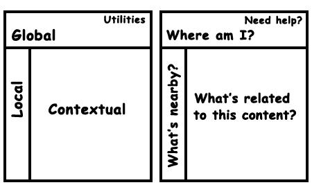
Adapted from Information Architecture for the World Wide Web by Peter Morville and Louis Rosenfeld. Used with permission. To enable task completion, navigation should be placed where users expect to see navigation on multiple devices (phone, tablet, desktop/laptop computer).
Users/searchers expect to see links to home, login or my account, shopping cart, and contact us in the utilities navigation. “Utility navigation connects tools and features that assist visitors in using the site,” said James Kalbach in his book Designing Web Navigation.
They also expect to see primary/global navigation at or very near the top of screen.
If you plan to break convention purely for the sake of creativity, proceed with caution. It can have a negative effect on conversions and the user experience (UX). I highly recommend testing new or revised navigation before a site launch.
To test whether or not navigation supports task completion, usability professionals and information architects can conduct one or a number of different usability tests: card sorting, tree tests, expectancy tests, and performance tests. If you don’t know any of these tests, here are some good resources:
- Card sorting from usability.gov
- Using Card Sorting to Test Information Architecture
- Card Sorting + Tree Testing: The Science of Great Site Navigation
- 10 Tips for Conducting Successful Tree Testing
- Card Sorting: Designing Usable Categories, book by Donna Spencer
2. Website Navigation Supports & Reinforces The Site’s Information Architecture
Before you jump into the look-and-feel of site navigation, don’t forget the information architecture (IA). And if you skipped the IA process? Shame on you or on the person who made you skip it. I personally have seen the cost of skipping the architecture phase of a website. It is far less expensive to modify a wireframe than to modify a fully coded and programmed site.
For example, here’s a common mistake: Many search engine optimizers (SEOs) give poor navigation and architecture advice. They profess moving items higher in a hierarchy to make content appear more important to search engines, thus modifying the categorization and corresponding global navigation system.
Good information architects know when and where to add shortcut links and feature areas on website templates to communicate “importance” to both humans and technology (searchers and search engines). Sometimes, a guide is a good addition to a site as well, especially since a really well written guide can be link-worthy content.
People often confuse a site’s information architecture and navigation. Information architecture refers to the categorization, organization, and labeling of content. Navigation is part of the user interface that enables effective site browsing.
When creating, designing, and coding site navigation, do not lose sight of both architecture and task completion.
3. Website Navigation Should Be Noticeable & Distinguishable From Other Sections Of The Web Page
Site visitors should be able to quickly locate site navigation. Placing navigation where people do not expect to see it, and formatting navigation so that it recedes rather than stands out, can cause abandonment.
For example, in the figure below, we conducted a performance test on 3 different home-page designs. Even though test participants found this particular home page more attractive than the others, task completion was 0%. Reasons? Site navigation appeared beneath the animated hero area of the screen, and the gray color also caused navigation to blend in too much with the rest of the design.
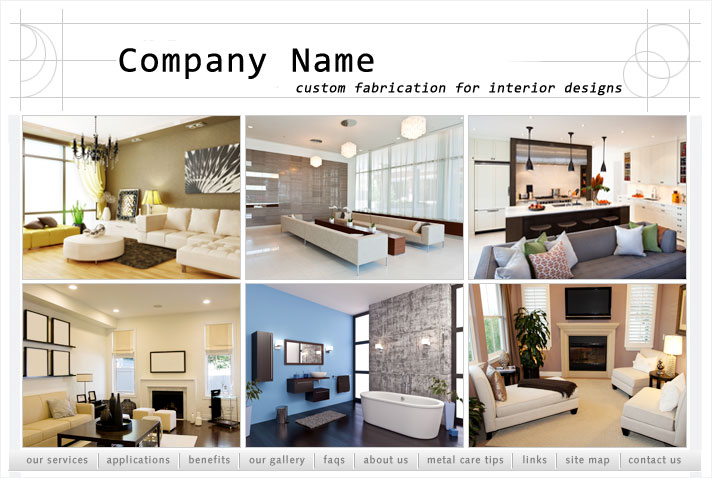
Task completion on this site design was 0% because users had a difficult time with site navigation. (Click to enlarge.)
4. Website Navigation Should Be Easy To Scan
With peripheral vision, people can choose which items on a web page to give attention to and which to screen out. In an eye tracking test, users might not pay direct attention to site navigation because it is not needed at the time. But if site navigation is indecipherable, busy, or too hard to read, many users might not fixate on it because their peripheral vision indicates that navigation was not easily decipherable.
I remember a webinar I attended about Principles to Improve Your Information Architecture. Speaker Dan Brown mentioned the Principle of Choices. If you provide too few choices in your site navigation, users feel that you might be controlling them. Users want to interact with a website on their terms. So too few navigation options can be a turnoff.
On the flip side, too many options can also overwhelm users. They might not know where to begin. They might confuse two or more labels with each other. Or they might just give up.
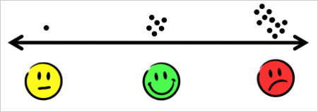
Principle of Choices: Too many choices can overwhelm users, and too few choices can make them feel controlled. Diagram adapted from Brown, D. (2012). Principles of Information Architecture. UIE Virtual Seminars presentation.
Again, testing before full launch can help you decide how many options to place in various parts of site navigation.
5. Website Navigation Should Make Sense To Users
Inevitably, a website owners who do not implement usability and findability best practices have problems with site abandonment. Have you ever heard the phrase, “Use the users’ language”? Well, using the users’ language applies to site navigation as well as content.
I’ve had to change navigation labels in the insurance industry because potential clients honestly do not know the different types of insurance. Abbreviations that might seem obvious to us might not be obvious to users. For example, I’ve had to change a label from FAQs (frequently asked questions) to Q&A (questions and answers) or Help or Customer Service.
Be careful with icons, too. Icons without supporting labels can definitely confuse users, as shown below.

In this navigation example, users could not tell which button to click to begin chat. They bounced back and forth between the first 2 navigation buttons. When I observed their behaviors first-hand, I saw furrowed brows, experienced a pause while they chose, and even heard finger tapping.
But you know, the experts are not always right. I remember a niche healthcare website with the general navigation label Resources. In my experience, users expected to see a list of annotated links or some articles, videos, or slideshows that would help them understand the offerings on the site. The site owners told us that users interpreted that label as potential financial resources. When we conducted the card-sort test, we found that the site owners were 100% right. So we left financial support information under the navigation label Resources.
Moral of that story? Test. Test. Test.
6. Website Navigation Should Not Be Formatted With Right Justification
Even though it might seem cool to you and blend perfectly with your brand and style, right-aligned text is rather difficult to read. According to usability guru Jacob Nielsen, it impedes scannability. Just don’t do it.
I have many other site navigation best practices, but these are the ones that I consistently come back to year after year. How does your site measure up? Do you have any other navigation guidelines to add to this list?
References & Recommended Reading
- Brown, D. (2010). Eight Principles of Information Architecture. Bulletin of the American Society for Information Sciences and Technology 35:6.
- Kalbach, J. (2007) Designing Web Navigation. O’Reilly Media, Inc.
- Rosenfeld, L., and Morville, P. (2002). Information architecture for the world wide web. O’Reilly Media, Inc.
Check out Part 2, in which I go over the other 6 items on my Navigation Design & Architecture Checklist.
Opinions expressed in this article are those of the guest author and not necessarily MarTech. Staff authors are listed here.
Related stories
About the author