Facebook’s New News Feed: The Before & After Look
Facebook has a new look to its news feed rolling out. How different is it? Not only is it a new visually pleasing look, but it also has substantial changes to the amount of “rich” information shown about content. Below, some before-and-after from my own news feed. Let’s start with this: That’s what I saw […]
Facebook has a new look to its news feed rolling out. How different is it? Not only is it a new visually pleasing look, but it also has substantial changes to the amount of “rich” information shown about content.
Below, some before-and-after from my own news feed. Let’s start with this:
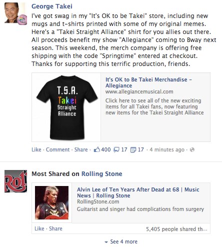
That’s what I saw at the top of my news feed in the old look, with a post from George Takei followed by a “Most Shared” box for Rolling Stone, showing me a popular story from the magazine, which I follow on Facebook. Now the new look:
The first big change is that much more space is being devoted to news feed. Both screenshots above are the actual size of what I saw on my screen.
In the article that Takei shared, the picture feels slight bigger, and the headline certainly is. No more tiny blue type on Facebook. The article’s host domain is also moved below. As for engagement metrics — Likes, Comments, Shares — those are given labels along with icons and placed into a nice reverse bar below the story, along with buttons allowing for engagement.
As for Rolling Stone, now the “Most Shared” box shows three different stories. On the downside, there’s no visual with any of these, no associated picture. But it’s still an attractive, inviting display.
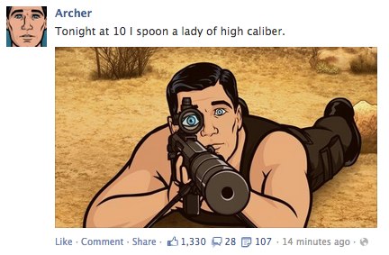
Next, the TV show Archer shared a picture that came into my old feed looking like this:
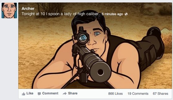
Here’s the new look:
Again, the screenshots are exactly the same size as I saw them — so the picture gets more space, in part because caption info is overlaid on top of it.
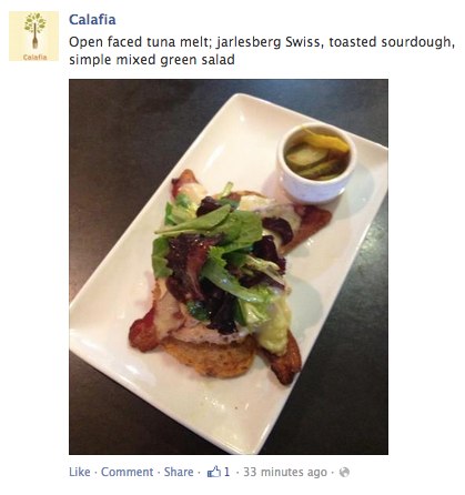
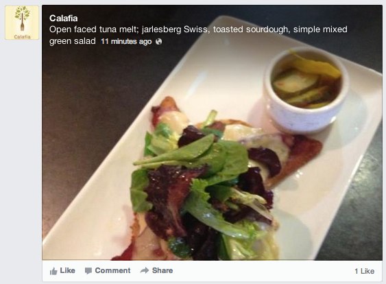
Here’s another example, with a picture from Calafia Cafe:
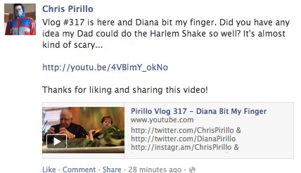
How about video? Here’s a YouTube video share, old-style:
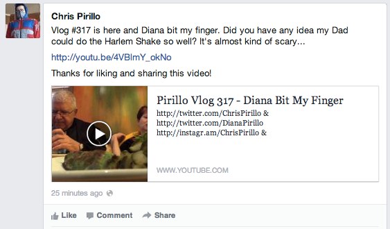
And the new:
There’s more space devoted to the unit, and it’s slightly more attractive. But the video doesn’t feel that much more inviting to watch. Still, if you do decide to, it expands and gets more room than with the old design. The old & new:
It’s a much different story when it comes to video you’ve uploaded directly to Facebook. Here’s an example from NASA, old and new:
In the old, you have a much bigger video space shown with sharing a Facebook video than a YouTube one. With the new, that space gets even bigger and more attractive. Of course, in either case, a click actually loads up an overlay page, to play the video in an even bigger space.
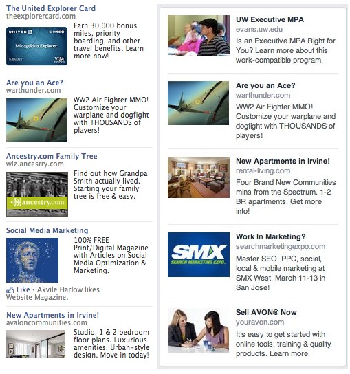
You know what else is bigger? The ads — at least horizontally. Here’s a side-by-side, old vs. new:
I may add some further examples to those above later, but for now, that’s a taste of the old versus soon-to-be-new Facebook.
Contributing authors are invited to create content for MarTech and are chosen for their expertise and contribution to the martech community. Our contributors work under the oversight of the editorial staff and contributions are checked for quality and relevance to our readers. The opinions they express are their own.
Related stories
