7 tips to generate more leads on mobile devices
When adapting your pages for mobile devices, you need to consider the mobile user's mindset. Columnist Abraham Nord shares tips for increasing mobile engagement and conversions.

As mobile device usage continues to grow, it is important to fully optimize landing pages and capture leads from this audience if we want to stay relevant in the future.
Read on for a discussion of some of the common issues I see on a daily basis regarding lead generation on mobile devices and steps we can take to improve results.
1. Use the correct mobile keypad for different field types
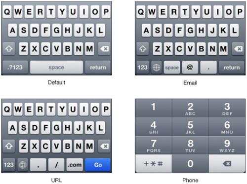
One fairly common issue for lead gen on mobile devices is that more often than not, it still involves the visitor submitting a form. This is problematic because there is not enough space on a phone to see all of the characters on a typical keyboard, which forces visitors to swap between multiple keypads to fill out the form fields.
We can improve the form experience by automatically giving visitors the correct keypad for each field. For example, show a number pad with a “phone number” field or show an email related keypad for the “email” form field.

2. Make everything on the page interactive
Visitors on mobile devices will try to click on everything. If you have images of an asset or graphics to represent features, make them tappable and reveal additional information relevant to that asset or feature.
3. Don’t hide content behind hover events/triggers
This may seem obvious, since mobile users don’t have a mouse, but I still frequently experience mobile designs that rely on people mousing (hovering) over an element in order to see additional content, information, or even the form itself.
Mobile devices do not have the ability for the visitor to “hover” — they can only “click” (tap). Any hover effect/trigger you may have on your page will not be seen by mobile visitors.
4. Reduce the number of form fields for mobile devices
Another common issue is having the same number of fields on a mobile form as a desktop form. In most cases, visitors on mobile devices are less willing to fill out a form, and thus you will experience a larger drop in conversions from having additional form fields on mobile devices.
Consider reducing the number of fields to the bare essentials on mobile devices. For example, can you remove the “Company Name” field and potentially use the domain name in their email address instead? Or can the sales rep add this information after following up with the lead? Can you reduce the “first name” and “last name” fields to just one “full name” field?
Here, you can see how the suggestions above reduce the total form space needed:

5. Use alternate calls to action that encourage calling
Another way to look at the issues associated with forms on mobile devices could be to simply not have forms. Phones are great at doing some things that computers are not, like making phone calls!
Consider using a different call to action (CTA) on mobile devices that encourages visitors to call instead of filling out a form.
6. Duplicate CTA multiple times if using a long page design
Long-form content requires a lot more scrolling on a mobile device than on desktop, due to the smaller screen size, so including multiple calls to action throughout the content can be a successful strategy when creating a long mobile page. Make sure to repeat your CTA throughout the content and even change it to be relevant to each new section of content as the visitor scrolls to the bottom of the page.
7. The order of content is more important on mobile devices
In a way, designing content for mobile can be easier than desktop because there are fewer places for the eye to move around on the page — it is pretty much confined to just looking up and down. However, this also makes the visitor’s eye less able to selectively pick out what it finds most important.
Make sure to clearly give visitors the experience that their mind is expecting. A good rule of thumb is to follow the order of “who, what, why.” For example:
- Who are you? — Company logo/slogan at top of the page
- What do you want me to do? — Download a white paper, get custom pricing.
- Why should I do this? — Bulleted list of what they will learn
If this order is changed, like giving benefit bullets before saying what they are for, then there is more likely to be a disconnect for the visitor’s mental train of thought, and they will simply leave the page.
Final thoughts
This is just the tip of the iceberg, and companies may see differing results from implementing the tips above. It is important to realize that the mobile world is changing at an unprecedented rate, and visitors’ expectations are changing just as fast.
What works one month or year may not work the next — so don’t be afraid to test new ideas, challenge “best practices” and continue to adapt and evolve alongside your mobile customers.
Contributing authors are invited to create content for MarTech and are chosen for their expertise and contribution to the martech community. Our contributors work under the oversight of the editorial staff and contributions are checked for quality and relevance to our readers. MarTech is owned by Semrush. Contributor was not asked to make any direct or indirect mentions of Semrush. The opinions they express are their own.
Related stories
New on MarTech