LinkedIn’s New “Voyager” App Gets Extreme Makeover & A More Streamlined Experience
New messaging, simple navigation and better integration headline the changes on the snappy new LinkedIn app.
NASA’s Voyager was a spacecraft that was built to go farther in space than any previous efforts and became the first craft to enter interstellar space. The fact that LinkedIn code-named their new App “Voyager” should tell you something about their goals with the new technology.
The new app has six navigation tabs at the top of the screen, including a pull-out list of other LinkedIn apps. One of the issues that previously arose with LinkedIn’s mobile strategy was the disjointed feeling that users had due to the sheer number of apps. The app navigation list shows what you have installed and can transfer you directly over in a fairly seamless format.

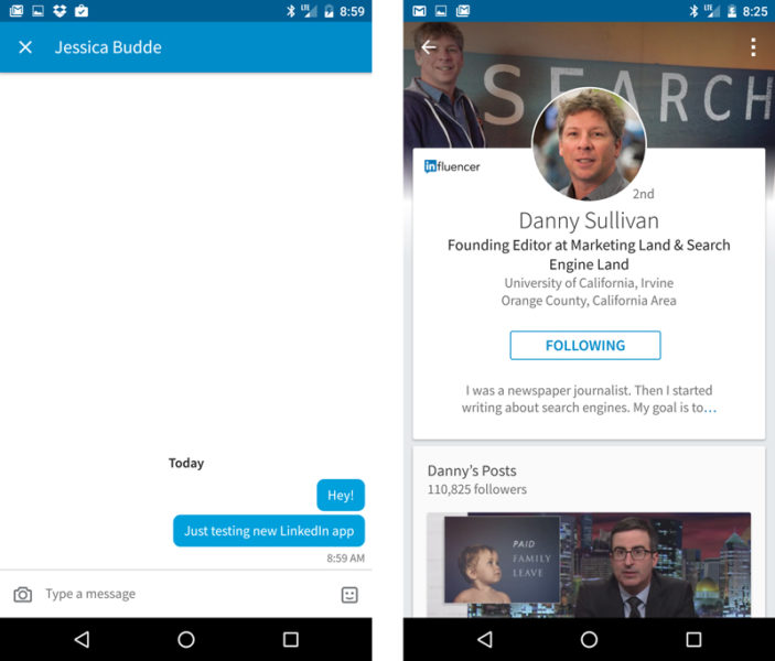
Another major upgrade is the messaging tab that displays conversations in a more casual, “text-y” private message feel than the traditional email feel of LinkedIn messages.

Beyond some of those larger changes, the overall experience seems more streamlined, sleeker and snappier. The Feed makes up the home screen and has plenty of white space that puts a premium on vivid visuals. The “Me” tab is a simple location where users can work on their own professional brand, and the search feature is quicker than before, 300 percent faster, according to LinkedIn.
The new app is now live in both the App Store and on Google Play.
For more information on the app, see the official LinkedIn blog post.
Contributing authors are invited to create content for MarTech and are chosen for their expertise and contribution to the search community. Our contributors work under the oversight of the editorial staff and contributions are checked for quality and relevance to our readers. MarTech is owned by Semrush. Contributor was not asked to make any direct or indirect mentions of Semrush. The opinions they express are their own.
Related stories
