Have retail email marketers finally reached the mobile tipping point?
With half of all email-driven orders originating on smartphones, it's important to make it easy to engage on mobile. Here's a look at how you can boost average order values on mobile devices.

Email marketers, take note and hold on to your inboxes. We’ve reached the long-awaited mobile tipping point. For the first time ever, half of all email-driven orders originate from smartphones, a study my company undertook in the first quarter revealed.
It’s crazy to think that a decade ago most consumers didn’t even own smartphones, and those who did wouldn’t have imagined regularly purchasing from them. Today, purchasing on-the-go is easier with emails in the driver seat. But Yes Lifecycle Marketing (my company)’s analysis of 9 billion emails sent in Q1 shows that mobile is now a normal — and often preferred — commerce channel.
Although this is exciting news, the work for email marketers is far from over. While smartphone and desktop orders are evenly split, desktop still drives a higher average order value (AOV), the research found. Mobile AOV remains about 40 percent lower than desktop AOV ($56 vs. $95, respectively), and this ratio has remained consistent over the last three years. This gap indicates that while consumers are comfortable purchasing on their smartphones, they still favor the desktop user experience and spend more via non-mobile devices.
But the shift toward mobile offers many benefits for marketers, not the least of which is the opportunity to engage subscribers on a fast-growing channel. To maximize mobile’s potential, marketers must now identify new ways to increase the channel’s average order value.
Boosting average order value on mobile
The key to bridging the gap between mobile and desktop email AOV is continual improvement of the mobile shopping experience, and getting email subscribers closer to the checkout button. Marketers should consider the following innovations to close the AOV gap.
1. Simplify the mobile-email-to-website experience
Consumers may spend less when they reach a site from a mobile email because it often takes multiple steps to leave the email app and navigate to the desired product on a brand’s mobile site. The longer and more convoluted the process, the greater the odds subscribers will change their minds about a purchase or get lost on the web. To reduce complexity and frustration, email marketers should take steps to lead subscribers farther down the path to purchase.
For example, a brand featuring personalized shirt recommendations could link the email’s CTA (call to action) to a specific shirt with the exact specifications in color, size and style rather than a category page on its site. Instead of leading this subscriber to a page filled with shirt options, the brand reduces the steps it takes for the shopper to make the purchase by taking them directly to the shirt featured in the email that inspired them to click through.
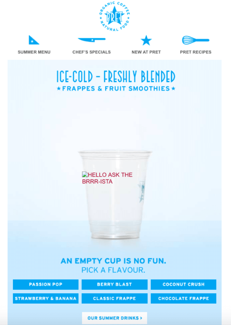
Want bonus points with your subscriber base? Provide them with several different purchase options within the email, further reducing the number of steps it takes for subscribers to get to the item they want. Ready-to-eat restaurant Pret sent a great example of this with its emails promoting fruit smoothies. At the bottom of the email, the brand offered six different flavor options with shifting hero images and links to landing pages where the subscriber could order a specific flavor. This tactic saves the subscriber the time and clicks required to go to the brand’s site, find the item and then navigate through flavors.

2. Stop replacing responsive design with scalable design
Similarly, many consumers find mobile screens difficult to read and navigate, deterring them from completing purchases via mobile emails. Marketers should use responsive design to create optimal mobile experiences that automatically adapt to subscribers’ screen sizes. However, many marketers confuse responsive design with scalable design and simply shrink images to fit on the mobile screen (aka scalable design).
If you’re a seasoned marketer, you know that responsive design should be a no-brainer. But our data shows that only 27.3 percent of marketers always send responsive emails, and 14 percent never do. Brands that have yet to embrace responsive design are leaving money on the table.
For those who do utilize responsive design, keep in mind that some best practices have changed. Now that subscribers are more accustomed to reading email on their mobile devices, they scroll more. Don’t be afraid to offer a longer email with sticky content or a higher volume of recommended products.
3. Tailor content to device affinity
Another way to boost mobile order value is by catering to device affinity. If you know a subscriber’s device preference (iPhone or Android), take advantage of the device’s unique functionality. For example, you could include CTAs that allow iPhone users to pay with Apple Pay, while letting Android users utilize Google Pay.
You can also use the device data to identify different personas for Apple and Android users and incorporate offers or sticky content accordingly. For example, maybe Apple users tend to shop more online, while Android users go in-store. In this case, you could send more online-only offers (e.g., a percent off or free shipping) to Apple users and in-store locations to Android users.
Another fun idea? We know emojis render differently on Apple and Android devices, so play around with emojis that might look better on one device or the other. To entice opens (and ultimately purchases), you can use different emojis in the subject line, preheader and content depending on the device.
4. Provide more product information
Finally, consumers may put off purchasing big-ticket items from mobile because they feel they are missing product or shipping information they would receive if researching the item on a larger screen. To instill confidence in mobile shoppers, provide access to more product information through images, short bullets or videos within the email.
For example, marketers can feature multiple product images from various angles (or a 360-degree product view GIF), incorporate videos or include customer ratings and reviews. Most importantly, don’t forget key product differentiators and specs such as size, dimension, material and more.
As a marketer, you need to test any new idea because some new email strategies won’t succeed right out of the gate. In the device affinity example, you should test extensively to determine the types of content, images or offers that are more likely to resonate with subscribers on different devices.
Today’s consumers make just as many purchases on their smartphones as they do from desktops. That means mobile shopping is no longer a novelty, and you can’t rely on desktop to do all the heavy lifting. Innovate and optimize mobile for your brand to make it as easy as possible for subscribers to engage and convert on their preferred device.
Contributing authors are invited to create content for MarTech and are chosen for their expertise and contribution to the search community. Our contributors work under the oversight of the editorial staff and contributions are checked for quality and relevance to our readers. MarTech is owned by Semrush. Contributor was not asked to make any direct or indirect mentions of Semrush. The opinions they express are their own.
Related stories