Google+ Gets A New Look With Interactive Navigation & “Timeline-esque” Profiles
Big changes are waiting for you the next time you log into your Google+ page. Today Google’s social network launched a total refresh of the look, making images and videos larger and navigation customizable. The design fits very well with the new streamlined Google look and helps to draw more attention to the content that users are […]
Big changes are waiting for you the next time you log into your Google+ page. Today Google’s social network launched a total refresh of the look, making images and videos larger and navigation customizable. The design fits very well with the new streamlined Google look and helps to draw more attention to the content that users are sharing:
[youtube]https://www.youtube.com/watch?v=A3Atj57r15U[/youtube]
Overall, this is a very large change that should make the Google+ experience better for users. Some of the highlights include:
Bigger Photos & Video
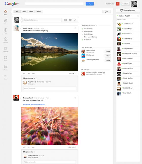
While Google+ has already been doing a good job at showcasing media, the new change will draw even more attention to content shared on the network. One photo will now take up nearly all the above-the-fold area with the new change:

In addition to the change, a new “insta-gallery” will appear when you hover over a photo, making it easier to see an entire photoset.
Explore
The “What’s Hot” section of Google has now been re-named “explore.” Within the new Explore section users will be able to pull up current trends on Google+ as well as viewing popular content.
Timeline-esque Profile Pages
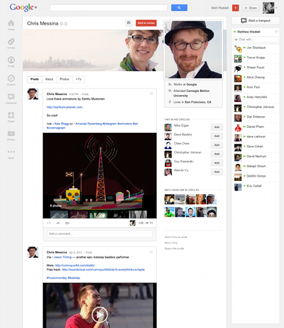
One of the largest changes that you may notice is what Google glazes over in the official announcement. All new profile pages are coming that mimic Facebook’s Timeline layout. Users can upload a large horizontal image that shows up alongside their profile picture:
This of course should help Google+ become a more personalized experience and compete with Facebook.
Navigation Ribbon
One of the most unique layout changes has to be the improved, customizable navigation ribbon. The new naviation shows up on the left hand side and allows users to move apps up and down based on their personal preference:
[youtube]https://www.youtube.com/watch?v=Zxbs5uqEjc0[/youtube]
This is a nice improvement, and something that Facebook is currently lacking.
Hangouts Page
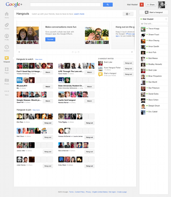
With the new layout, Hangouts are becoming a bit easier to manage. Instead of working directly into the stream, a set page will be implemented:

This page will include updated Hangout invitations, quick access to public hangouts and popular hangouts that are displayed via a large billboard.
These Google+ changes are being rolled out “over the next few days” so keep an eye out for the new-look Google+ soon! For more information see the official Google blog post.
Contributing authors are invited to create content for MarTech and are chosen for their expertise and contribution to the search community. Our contributors work under the oversight of the editorial staff and contributions are checked for quality and relevance to our readers. MarTech is owned by Semrush. Contributor was not asked to make any direct or indirect mentions of Semrush. The opinions they express are their own.
Related stories