

Generating leads from content: Placing calls to action
What are the best ways to present your calls to action on a content landing page? Columnist Brian Massey outlines key strategies for getting your offer in front of your readers.
Spy on Any Website
 Last month, I showed you how to turn a content page into a lead-generating landing page. After reading it, you should know what the following terms mean:
- Sidecar
- Showing the Guns
- Page Flair
- Peacocking
- Zuckerbait
- Heroing
- Lead Magnets
Today we’re going to talk about where you should place powerful calls to action on a page. We’ll introduce you to the “Top Hat,” “Dripping Pan,” “Compass,” “Inliner,” “Coffee Break,” “Wheelie Popper” and more.
The job of a content landing page
To review, your content landing page has the same two jobs as a typical landing page:
- Keep the promise made in the ad, email, social post or link.
- Get the visitor to take action.
For a content page, the promise is typically “read this article” or “find out more about this topic.” A content landing page keeps the promise by providing the content. That’s the easy part.
Getting visitors to take action is the next step, and it’s quite a bit more difficult. There are two main strategies:
Strategy 1: Get the visitor to take action on the page.
Strategy 2: Get the visitor to visit a landing page.
The advantage of strategy 1 is that it doesn’t require the visitor to leave the page, where conversion rates are usually higher. The advantage of strategy 2 is that dedicated landing pages with a specific offer have higher conversion rates than content landing pages.
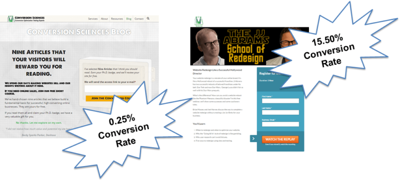
We’ve found that conversion rates for dedicated landing pages (right) average 15.5 percent, with many converting over 40 percent.
Last month, we talked about how to optimize strategy 1: getting visitors to subscribe to your content. Today, we’ll talk about how to get visitors to these high-converting landing pages with relevant content offers.
Make the offer relevant to the call to action (CTA)
Which of these offers is more likely to make you convert on the page? (Disclosure: Both of these are examples from Conversion Sciences, which I founded.)

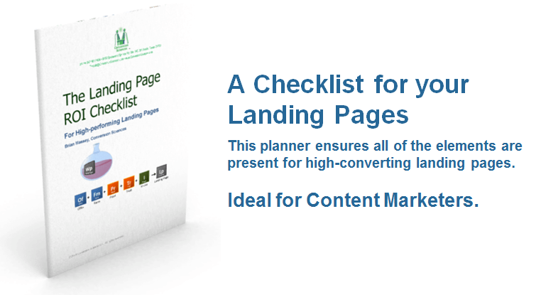
If you just happen to be in the retail electronics industry, the Retail Electronics Report may appeal to you. In general, this will interest fewer readers than the Landing Page Checklist because the latter is more relevant to the content on this page.
Someone reading an article on landing pages is more likely to be interested in more content on landing pages. The landing page converts at 25.5 percent with 1,000 visitors. The Electronics Industry Report converts at 44 percent but has only seen 32 visitors (n=32).
Relevance + Dedicated Landing Page = Best Results
Where we place these relevant content calls to action is the big question, and you have many options.
Recommended Articles
The Top Hat: Call to action above the content
Many blogs use a “Top Hat” so that readers see the offer even before the content title. For some, this may feel like a broken promise. Any Top Hat that pushes the title below the fold may be working against the first job of the landing page: “Keep the promise.”
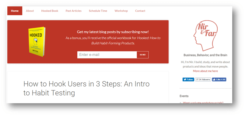
With this Top Hat, a book offer sits above the content title.
The Top Hat on the Conversion Sciences blog home page converts at 0.5 percent (n=588,327), about average for offers on the site.
Dripping Pan: Call to action at the bottom
If someone reads to the bottom of your article, they are probably pretty interested in the topic. This is why it is powerful to place relevant calls to action at the bottom of the article. We call this a Dripping Pan.

HubSpot used this Dripping Pan to great effect for a long time.
The Compass: Calls to action in navigation
When visitors look for the next thing in their quest to answer questions, they will turn to the top of the page. Here, calls to action in the navigation may carry extra weight. This is called a “Compass” — because it’s navigation. Get it? A call to action in footer navigation can serve as a Dripping Pan.
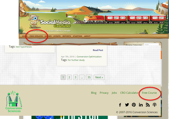
Consider calls to action in top and bottom navigation.
Inliners: Drop calls to action in the content
Links in the content attract the engaged reader. These work best if your style sheet offers obvious links. Here, we use the traditional blue underlined text to clearly communicate that there is a link to be clicked for more information.

Placing links in the call to action engages readers.
Faux Headings: Calls to action that look like headings
Scanners move from heading to heading and scan the first sentence of paragraphs. Placing an offer on the page that looks like a heading — a “Faux Heading” — will catch scanners who might miss an Inliner. We call this a Feading for short (pronounced “fedding”).
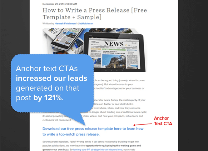
Hubspot says it saw a 121 percent increase in leads over their Dripping Pan with a Faux Heading.
Coffee Break: Inline calls to action
Placing an ad inline with your content is also effective for scanners.

This Coffee Break delivered visitors to a mobile-optimized landing page with a 36 percent conversion rate.
Overlays, popovers and pop-ups
Everyone says they hate popovers. Yet, they consistently increase conversion rates.
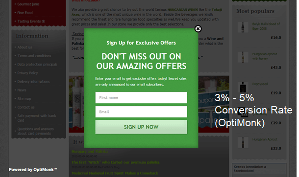
Welcome Mat: Get ‘em when they arrive
The Welcome Mat is an entrance popover that fills the screen. This can be dismissed or can be implemented as a huge hero image.
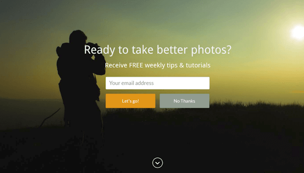
Welcome Mats fill the screen and deliver a call to action.
I’ve even tried using a Welcome Mat in one of my presentations with good effect.
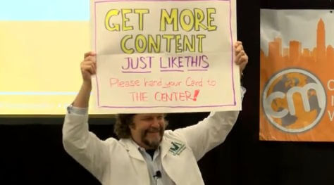
This live welcome mat generated a surprising number of business cards from the audience.
Wheelie Popper: Scroll-triggered and time-triggered pop-ups
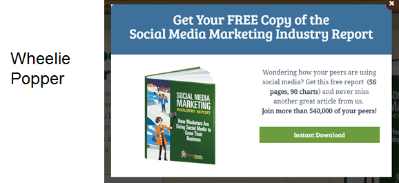
We can tell when a visitor is into an article. They scroll more than halfway down the page or stay for 30 or 60 seconds. Often these visitors are great candidates for a relevant offer. We call these Wheelie Poppers because your mouse wheel triggers them.

Jilted Lovers: Exit-intent popovers
Technology has allowed us to tell when someone is about to hit the back button. We can then desperately beg them to take action, like a Jilted Lover. Optimonk says that exit-intent popovers can save 10 to 15 percent of visitors on their way out. So, swallow your pride and test one on your content pages.
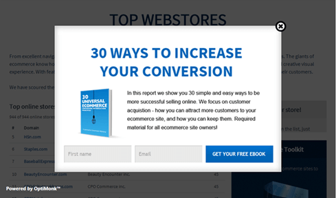
10 to 15 percent of lost visitors can be “saved” by using exit-intent popovers.
Sticky Sidecar, Headband, Sticky Shoes: Keep the offer in front of them
Some of the more ambitious treatments include “sticky” elements that stay on the screen when the visitor scrolls. Orbit Media Studios uses a sidecar that sticks as the visitor scrolls.

Copyblogger uses two techniques: The Headband, a sticky header, and what we call “Sticky Shoes,” or a footer that sticks.

Copyblogger uses a Headband and Sticky Shoes together.
Mix it up
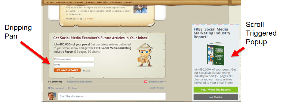
While your mileage will vary with these techniques, you may find it most effective to use a combination of these. Social Media Examiner pulls few punches, combining a Top Hat, Compass, Dripping Pan and Wheelie Popper and Jilted Lover on their content pages.

Get the content and offer right first
We’ve seen the possibilities with Top Hats, Wheelie Poppers, Sticky Shoes and more. You should test them on your site rather than using them arbitrarily. And remember: None of this works without great content and relevant offers.
When it all comes together — content, offers and placement — your content pages will truly be lead-generating content landing pages.
Contributing authors are invited to create content for MarTech and are chosen for their expertise and contribution to the martech community. Our contributors work under the oversight of the editorial staff and contributions are checked for quality and relevance to our readers. MarTech is owned by Semrush. Contributor was not asked to make any direct or indirect mentions of Semrush. The opinions they express are their own.

Brian Massey is the Conversion Scientist at Conversion Sciences and author of Your Customer Creation Equation: Unexpected Website Forumulas of The Conversion Scientist. Conversion Sciences specializes in A/B Testing of websites. Follow Brian on Twitter @bmassey
View Author Profile
Add us as a preferred source on Google
Google's "preferred sources" feature allows users to customize their search results by selecting news outlets they want to see more often in the "Top Stories" section.
Add Martech NowRelated Articles

Customer journey orchestration
6 minutes readThe moments that drive growth can also drive churn. Learn how to spot them and respond when the stakes are highest.
Read More
Most brands recognize customers but don't understand their context. Learn what's keeping personalization from meeting rising customer expectations.
Read More
Every AI investment should make it easier for customers to accomplish what they came to do. Here's how to evaluate whether it does.
Read More
AI is generating more of the web, and it's carrying the same accessibility gaps with it. Marketing has the leverage to close them
Read MoreRelated Articles
Customer journey orchestration
6 minutes readThe moments that drive growth can also drive churn. Learn how to spot them and respond when the stakes are highest.
Read More
Most brands recognize customers but don't understand their context. Learn what's keeping personalization from meeting rising customer expectations.
Read More
Every AI investment should make it easier for customers to accomplish what they came to do. Here's how to evaluate whether it does.
Read More
AI is generating more of the web, and it's carrying the same accessibility gaps with it. Marketing has the leverage to close them
Read More