Evaluating Website Performance: I’m All About That Slope, ‘Bout That Slope
When you're looking at a graph in Google Analytics, is it really obvious what you're seeing? Not always. Columnist Brian Massey explains how you can understand the changes in your metrics and know what's working for your online business.

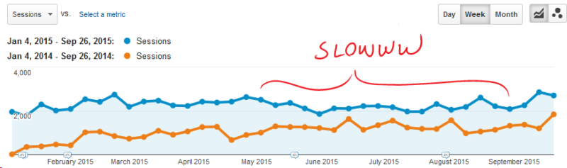
What can you tell me about the website from this graph of all traffic?

Things seem to be slowing down since June. How can we be sure?
You would conclude that the site’s traffic has grown over last year, but that growth has slowed. You would also conclude that this site had a slowdown beginning in June. This slowdown wasn’t seen last year.
Given that nothing has changed in the way the site generates traffic, how would you diagnose this slowdown in traffic?
Is this really a slowdown? How bad is it?
It’s hard to tell from a graph like this. However, Excel offers us a tool that will help us understand the magnitude of changes in our metrics, and it’s pretty easy.
You’re About To Do Regression Analysis. Tell Your Friends
Regression analysis is a fancy word for “tell me the straightest line through some data points.” For a time-series graph like we get from Google Analytics, we can call a “linear regression line” a “trendline.” I prefer “linear regression line” because it makes me sound smarter than I really am.
We can do this sort of thing easily enough in Excel.
First, let’s look at the data on a weekly basis. This gives us more data points to work with, and this can mean a more accurate regression analysis.
The weekly data highlights the summer slowdown in the data.
We can easily export this data to Excel using the Export > Excel (XLSX) feature in Google Analytics.

Google Analytics makes it easy to export to Excel and other formats.
I’ve started with the Audience > Overview report, looking at sessions by week. The data that gets exported is in the second tab, labeled Dataset1.

Google uses Week Index to identify weeks in data tables.
The “Week Index” column is the week index for this data, not the week-of-the-year index. It always starts with zero.
This is for January 4, a Sunday, through September 26, a Saturday. This ensures we are dealing with full weeks at the beginning and end of the data.
The question is, “Is our traffic trending up for the first nine months of the year?”
Picture an imaginary line passing through our data that is as close to all of the points as possible.
We can see this easily with Excel. Create a graph of the data, right-click and select “Add Trendline” from the drop-down menu.

Right-click on your data to add a Trendline.
It calculates a “linear regression” line for us. It’s the dotted line in this graph.

The trendline is a closest fit to the data.
This line has an equation that we can pick apart. It follows the formula y=mx+b.
For reasons unknown to me, m is the slope and b is called the “y-intercept.”
Slope is helpful because it tells us if the data is generally going up or if it is generally going down. Or if it’s flat. Looking at the graph, the trend line seems flattish to up-ish. Let’s calculate the slope and find out for sure.
By right-clicking on the trendline, we can choose to Format Trendline. Click the box next to “Display Equation on chart.”

Excel will show you the equation of the trendline.
Voila! An equation appears. This is in the form of y=mx+b, or y = slope * x + y-intercept. This trendline has a slope (2.4042) and a y-intercept (2229.1).

The equation tells us that the trendline for this data has a slope of 2.4 and a y-intercept of 2229.
Fun With Slope And Y-Intercept
For time-series data, the slope tells us how fast the data is growing or shrinking. The y-intercept can give us an idea of the magnitude of the change, or the rate of change.
The slope is normalized. A slope of 2.404 means that our blog traffic is increasing by 2.4 sessions each week.
If we had started at zero, this might sound good. However, the y-intercept tells us the value of this line when X is zero, and we use this to calculate an initial rate.
Our growth rate here is the slope divided by the y-intercept, 2.4 / 2229 = 0.11%. We’re not burning up the internet with that kind of growth.
We can simply calculate the slope without doing a graph. We calculate the slope of the trendline for this data with a simple Excel formula, conveniently named “SLOPE.”

Our “know_y’s” are found in the column labeled Sessions. “Y” values change depending on “X”. For this, our “known_x’s” are the “Week Index” values.
Our result is an error.

Google Analytics exports Excel data that needs some adjusting.
The Week Index values are strings, not numbers. We have to convert them. Why not use dates? That makes the graphs look pretty, right?
Getting The Labels Right
It’s important to get our “X” values right. We can simply convert the Week Index into numbers:

Excel’s Value function will give us a number we can use.
We might also convert them into dates. While this makes our graph look nice, it is not smart, as we will see.

We can easily calculate the week’s start date by adding seven days successively.
Our slope changes depending on which we use for known_x’s.

Choose your y values carefully as your results can change.
You may recall that the slope of a line is the rise over the run. One of our calculations is using steps of one week for the “run.” The other is using steps of seven days.
The run of our day-oriented data is seven times longer than our week-oriented data. And in fact, 2.404201733 is exactly seven times more than 0.343457396.
To show you what this looks like on a graph, here are two graphs of email traffic for the same period. The dotted trend lines are the same, but the graph with pretty dates has a much lower slope — seven times lower than the graph with week index numbers.
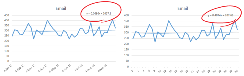
These lines are the same, but the equation changes based on the values we choose for the y axis.
Not only is the slope different, but the y-intercept is no longer helpful. The x value is zero beginning of time, or some computer estimate of that.
The bottom line is, be true to your data. Only use dates if you have daily data.
What Does Slope Tell Us?
The right answer for slope here is 2.404201733. Let’s call it 2.4. This means that each week, we are growing our traffic by 2.4 more visits. That doesn’t sound very impressive. Is this really what is happening?
The answer is, “Yes, statistically.” But not all data fits well into a line.
We can use another value to see how close our line is to the actual data. Go back to your Trendline Format and check the box labeled “Display R-squared value on chart.”

How to display the R-squared value to see how good our line fits.
If you want to sound smart to your “Magic: The Gathering” group, you can call this the “coefficient of determination.” The closer this R2 value is to one (1), the tighter our fit.

The checkbox to turn on the R-squared value in Excel.
Our R2 value is 0.0118. That’s nowhere close to one. So we can deduce that our data is a poor fit and that our slope isn’t really telling us anything helpful.
If we just looked at a portion of our graph, we might get better data. Let’s see what the slope is since the low-point, or trough, of our slowdown.

We might want to see what our trendline is like from the most recent low point.
By calculating the slope of our line from week 21 to the end, we get a better idea of what’s been going on recently. [pullquote]We try to be careful not to selectively choose our data points to give us the answer we want.[/pullquote]

The slope of the line since the lowest point gives more relevant data.
Now we have a slope of 34 and a y-intercept of 1924. Since this trough, we’ve added 34 sessions a week to our traffic, a rate of 34 / 1924 = 1.8%.
Furthermore, our R-squared value is 0.42, much closer to one than 0.0118. This data is less wiggly than the entire year-to-date data was, and more likely to predict the future.
There are 17 data points in this sample. Is this enough to make us confident that we’re really looking at a trend?
Trends are used to predict the future. The rule of thumb is, the more points the better.
Making Decisions With Slope And Y-Intercept
Excel offers functions for the slope (SLOPE), y-intercept (INTERCEPT) and R-squared value (RSQ). So you can calculate these easily in spreadsheets.

Evaluating traffic sources using slope, y-intercept and R-squared values.
While the slope of the trendline for our Social traffic is less positive than that of our Organic Search, we see that the initial rate is almost double for Social. The data on our Direct, Email and Referral traffic is all over the place, as is demonstrated by the low R-squared values.
This approach can be applied to individual pages. Here’s the landing page data on a blog post we classify as an “iceberg.” It’s been a bulge in our analytics, but traffic is now dwindling. It’s melting.

Our regression line tells us how fast is the traffic dwindling on this “melting” blog post.
The initial drop rate is 4.8 / 249 = 1.9% per week. In week 31, when traffic was only 100, the rate of drop was closer to 4.8%. This is a dying post, from a traffic perspective.
Apply these tools to conversion rate, average order value and goal completions to understand the performance and volatility of your Web business.
Using slope, y-intercept and R-squared value, we can quickly evaluate the performance of our inline properties over time. We will quickly isolate problems and repeat successes.
Contributing authors are invited to create content for MarTech and are chosen for their expertise and contribution to the search community. Our contributors work under the oversight of the editorial staff and contributions are checked for quality and relevance to our readers. MarTech is owned by Semrush. Contributor was not asked to make any direct or indirect mentions of Semrush. The opinions they express are their own.
Related stories
New on MarTech
About the author