Dashboard Series: Creating Sexy Scrolling Charts In Excel
Last month, I promised a series on creating dashboards in Excel. To kick off the series, I started with a tutorial on how to create combination charts in Excel. Every marketer should have this critical skill mastered. You can expect this series to focus on cool visualizations in Excel. Next up, I’m going to show […]
Spy on Any Website
Last month, I promised a series on creating dashboards in Excel. To kick off the series, I started with a tutorial on how to create combination charts in Excel. Every marketer should have this critical skill mastered.
You can expect this series to focus on cool visualizations in Excel.
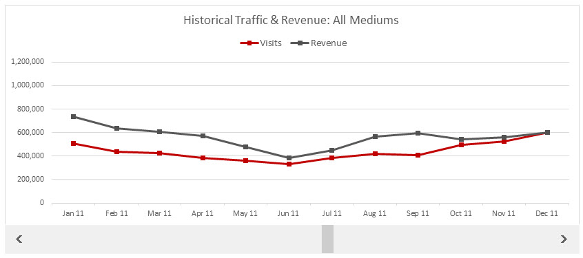
Next up, I’m going to show you how to create a super-cool scrolling chart. These are especially helpful to show traffic trends over a long period of time, like years. They really add panache to your dashboard and save on space. It’s also a great way to show your boss or client(s) the progress they’ve made over a longer period of time.
And, let’s be honest. You will also look like an Excel aficionado — and no one has to know you learned it from me!
Download Excel Doc
If you want to follow along, you can download the Excel spreadsheet I work from. It includes the data from the Google Analytics API, the Chart tab I use in the video tutorial, and the final, sexied-up chart.
As I mention in the video, if you’re using an export from the Google Analytics (GA) interface, it works just as well. I just use the API to create dashboards for clients, which you should do, too. You set it up once and then just have to update it. I show you how using a free Excel plugin (PC-swim only).
Collect Data From Google Analytics
You will first need data to chart out. I will typically use a scrolling chart for overall traffic over time and organic traffic over time — but if I have a dashboard client who’s doing paid search, I’ll use a scrolling chart to show a panoply of PPC metrics as well.
I’m going to use GA data for my example. You will need to know how to create a custom report with a Month of Year dimension. If you haven’t created one of those before, I have a quick video tutorial on how to do that. Or you can use this custom report for overall traffic or this one for organic. You need to be logged in to Google Analytics in the browser you open those links in; otherwise, you’ll get a 404 error. If you’re not reading this post in the same browser you’re logged in to GA with, just copy the link and paste it into that browser.
Caveat: The date format for the Month of Year dimension is improperly formatted as yyyymm (e.g., 201307). Excel has no freaking idea what to do with that, so you’ll have to fix the formatting (as I demonstrate in this post) before you can chart it out. I know… data drama. Pfft.
Recommended Articles
Charting Prep
Because I work almost exclusively with the GA API, my export will look a little different from exports pulled via the UI. But it doesn’t matter. As long as you have column headings, you can rock this chart. Here’s what my raw data looked like:

If I’m charting historical data, I generally like to show 12 months at a time. Makes sense, right? To do this, we’ll need to create a subset of our data set. The perfect function to do that is the INDEX function.
The format for the INDEX function is as follows:
INDEX( array, row_number, [column_number] )
(The brackets indicate an argument that’s optional.)
Think of the INDEX function as playing the game Battleship or Bingo — the array is the board, and the row and column numbers help identify which value from a data set you want. To create the table, I won’t need the optional column number because I use separate INDEX functions for each column. It’s kind of like playing Bingo with only the B column. You don’t need to yell B each time if that’s the only column you’re calling numbers from. (Okay, fine. The analogy breaks down a bit, but you get the idea.)
Enable Developer Tab
To add a scroll bar, you’ll need to enable the Developer tab in Excel. Here’s how to do it in 2013 and 2010 and 2011 (for Mac).
Video Tutorial
From here, go ahead and view the video below to see how to create the scrolling chart. I discovered as I was creating the chart that Excel 2013 still has some bugs in it, which made it an exercise in frustration. So I redid the video using 2010.
[youtube width=”600″ height=”485″]https://www.youtube.com/watch?v=gTC4KTw3SwA[/youtube]
Axis Formatting Alert
If you scroll through your chart and see the maximum value (or the number at the tippy top of the vertical axis) changes from one view to another, for the sake of clarity, you’ll want to update the axis so that it sets the highest value for the entire chart as the max.
For example, in the chart I used, the maximum value was 800,000 to start with and then bumped up to 1,200,000 because in Aug 2012, revenue came close to $1,000,000.You can see the difference in the screenshots below:
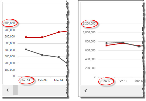
If you don’t standardize the axis, the increases in traffic, revenue, or whatever you’re charting won’t be as apparent because the scale will keep changing. You don’t want to be accused of being a data tease. (I think.)
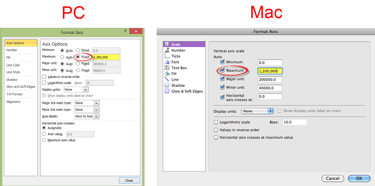
Anyway, to change this, just select the axis and press Ctrl-1 (Mac: Command-1) to pull up formatting options. And format as you see in the screenshots below, replacing 1,200,000 with your highest value:
Click for larger image
Formatting Tips
I don’t go through all the steps to format the chart in this video to keep it to a reasonable length. However, here are some posts that I’ve written and videos I’ve created to help you:
10 Simple Tips To Make Your Excel Charts Sexier
Give Your Data An Extreme Makeover
Change Dashes To Zeros In Excel
I also include a list of the formatting changes I made in the Excel workbook available for download. (I know — I spoil you guys!)
Contributing authors are invited to create content for MarTech and are chosen for their expertise and contribution to the martech community. Our contributors work under the oversight of the editorial staff and contributions are checked for quality and relevance to our readers. MarTech is owned by Semrush. Contributor was not asked to make any direct or indirect mentions of Semrush. The opinions they express are their own.
Annie Cushing is an SEO and analytics consultant. Her areas of expertise are analytics, technical SEO, and everything to do with data — collection, analysis, and beautification. She’s on a mission to rid the world of ugly data, one spreadsheet at a time. If you just can’t get enough data visualization tips, you can check out her blog, Annielytics.com.
View Author ProfileAdd us as a preferred source on Google
Google's "preferred sources" feature allows users to customize their search results by selecting news outlets they want to see more often in the "Top Stories" section.
Add Martech NowRelated Articles


The default martech sales motion asks you to tear out your stack and bet 18 months on a rebuild. Buyers increasingly prefer a different path.
Read More
Marketing artificial intelligence (AI)
6 minutes readA single afternoon of tool-calling can eat a $20 monthly subscription. The fix isn't using fewer tools, it's changing where your data lives.
Read More
As AI automates workflows, scoring, and orchestration, MOps shifts from system management to business impact.
Read MoreRelated Articles
The default martech sales motion asks you to tear out your stack and bet 18 months on a rebuild. Buyers increasingly prefer a different path.
Read More
Marketing artificial intelligence (AI)
6 minutes readA single afternoon of tool-calling can eat a $20 monthly subscription. The fix isn't using fewer tools, it's changing where your data lives.
Read More
As AI automates workflows, scoring, and orchestration, MOps shifts from system management to business impact.
Read More