How to increase B2B form submissions through conversion testing
Contributor Abraham Nord looks at four tests that illustrate how improving the online experience can lead to dramatic increases in conversion rate and lead results.
Nearly all business-to-business (B2B) marketers are focused on increasing leads, improving lead quality and improving return on investment (ROI).
Conversion testing plays a key role in all three of these objectives. Let’s look at four tests that illustrate how improving the online experience can lead to dramatic increases in conversion rates and lead results.
We will also analyze why the tests worked so you have a better understanding of how to apply the same principles to your own unique circumstances.
Test #1: Form position and orientation
Test variations:
Hypothesis: By centering the registration form and moving it higher on the page, visitors’ eyes will more easily flow from the call-to-action (CTA) statement to the form. The benefit bullet points and asset imagery will now serve as secondary, supporting content.
Results: Variation 1 won with a 34.47 percent higher conversion rate at 92.04 percent confidence.
Conclusion: Many visitors were ready to get the downloadable asset without needing additional information. The registration process was more seamless and apparent with Variation 1, thus increasing form submissions.
Test #2: ‘Instant download’ badge
Test variations:
Hypothesis: Visitors do not like waiting for an asset to be emailed to them, especially since they often have to check their junk folder to find/receive the asset. By adding a badge indicating the asset is an “instant download,” we will eliminate this pain point, thus increasing form submissions.
Results: Variation 1 won with a 31.93 percent higher conversion rate at 91.61 percent confidence.
Conclusion: Visitors did, in fact, appreciate the straightforward and transparent approach of giving them the asset immediately. There was also no significant difference between variations in terms of the quality of emails provided.
Test #3: Tabbed content
Test variations (desktop):
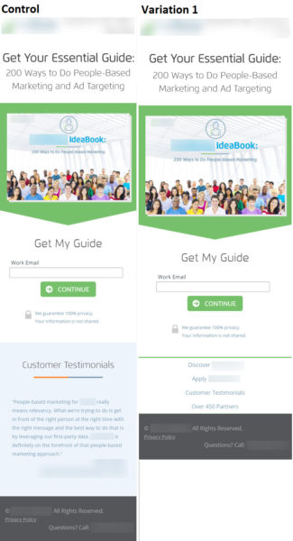
Test Variations (Mobile):
Hypothesis: By including additional information about the company and organizing that content in tabs, visitors will more easily see how the downloadable asset is relevant and beneficial to them, and thus, more visitors will complete the form and convert.
Results: Mobile: Variation 1 won with a 160.28 percent higher conversion rate at 98.75 percent confidence. Desktop: Control won with a 31.13 percent higher conversion rate at 86.28 percent confidence.
Conclusion: For desktop visitors, the tabbed information was less meaningful than immediately seeing testimonials and partners (as social proof) at a glance. However, mobile visitors appreciated the additional content presented in an easy-to-digest tabbed format on the smaller screen.
Test #4: Overall look and feel
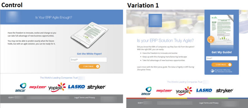
Test variations:
Hypothesis: By testing a different page layout/look, we can make the largest gains in conversion rates in the shortest amount of time. The increased visual prominence of the asset and form area will draw visitors’ eyes to the area where we want the most engagement.
Results: Variation 1 won with a 44.73 percent higher conversion rate at 88.41 percent confidence.
Conclusion: The more prominent form section and front-on view of the asset were the largest factors in Variation 1 winning. Visitors could more easily see the asset they would be receiving and more immediately understand how to get the guide. After finding a winning overall layout/look, we can test additional iterations of this page.
Improve your lead resulting via testing
These four landing page tests represent a small sampling of possible conversion rate optimization (CRO) tests available to B2B marketers. The examples showcase the importance of page layout, registration form placement and format and the information/images associated with downloadable assets.
And as Test #3 reinforced, make sure you are looking at different device types and experiences separately so you can customize and optimize the conversion rate for all of your visitors, regardless of how they come to your site.
Contributing authors are invited to create content for MarTech and are chosen for their expertise and contribution to the martech community. Our contributors work under the oversight of the editorial staff and contributions are checked for quality and relevance to our readers. The opinions they express are their own.
Related stories
New on MarTech


