Why Responsive Email? Making A Case Internally
Even though industry statistics indicate that more than 50% of email opens occur on a mobile device, a brand’s desire to provide an optimal customer experience isn’t always strong enough to convince it to move to a responsive email design. According to BlueHornet, 70% of consumers immediately delete emails that don’t render well on a […]
Spy on Any Website
Even though industry statistics indicate that more than 50% of email opens occur on a mobile device, a brand’s desire to provide an optimal customer experience isn’t always strong enough to convince it to move to a responsive email design.
According to BlueHornet, 70% of consumers immediately delete emails that don’t render well on a mobile device. If that statistic isn’t compelling enough to shift your company’s internal mindset, then consider this: it’s faster to build an email from a responsive email template than to build an email from a traditional HTML template.
Efficiency is key. Management listens when there is a faster way to get an email out the door. Efficiency is the primary reason why many retail emails are often image-only, without any optimization for HTML text, even though images are blocked by default by most email clients.
The initial move to responsive email designs may take an investment in design and coding resources, but once the new template is complete, it is faster to design and build an email.
What Makes It Faster?
Why is it faster to build a responsive email than an email from a traditional template?
- Building a responsive email only requires editing a few lines of code, rather than building tables or new design layouts each time.
- Responsive emails utilize more HTML text which makes it easier to accommodate revisions after the email is built.
- Responsive emails are based off of one predefined template for all screen sizes, so you can avoid creating a unique version for each device.
- Responsive emails with saved content area layouts utilize existing HTML, which is how it allows for only editing a few lines of script. This streamlines your QA process because it eliminates certain HTML-specific code that would typically be reviewed if using a traditional template.
- Responsive emails have a more structured template and are more pre-defined than the traditional template, which saves time in both design and building.
Design
The last advantage above is where we often meet resistance from a graphic design team. However, we’ve worked with our creative team to design a variety of template content areas that still allow for significant creative freedom. Take a look at the following responsive template that includes several variations in content area layouts.

Following is an email created from the template above, showing the display of both the desktop and mobile phone versions. (Nebraska Furniture Mart is a client of DEG, my employer).

Desktop version (left) and mobile version (right) of the same responsive email template.
You will notice that the layout of the content in the email doesn’t exactly reflect the template concept above. That’s because the template is meant to accommodate the overall look and feel, while the saved content areas (A, B, C, D, etc.) allow for a flexible email design. By re-ordering, adding and/or removing different content areas, a unique email layout is created for each campaign.
The specific email shown above uses the combination of C, D, C, A, A, C, A, A, C, C from the template. Note that C can be of varying height and scales to accommodate the responsive display.
By creating variations of the content area layouts, the creative design aspect is not lost. Any combination of these content areas results in a new design look and does not give the appearance of being a template. Depending on your brand, I recommend several content area layouts (which can be saved) to at least accommodate a different number of products in an email. For example, in one email you may want to feature a single product (content area layout C above); but in another, you may want to showcase four (content area layout B above).
Recommended Articles
Code
Once you’ve worked with your design team to create the responsive concepts, you are ready for coding. This is where you may find your next hurdle. Because responsive email design is relatively new and you are running on a budget of lean resources (isn’t everyone?), you may not have someone who can code the responsive email template and styles for the saved content areas. Email is already unique in its coding requirements, but responsive makes it even more so.
If your design or engineering team is unable to help with this task, you may need to reach out to a third party (like a contractor or agency) to code the initial template and content areas and train you on how best to utilize it.
Once the template is created, let’s look at how to update the code. The benefit of modifying code for saved content areas is that it doesn’t require any HTML knowledge. So the steps for creating the email could be as simple as 1) select the content areas based on the designed layout; 2) prepare and upload the images; and, 3) modify a few lines of code.
With traditional templates, building an email can require deep HTML knowledge for the formatting to display correctly across various ISPs; but with a responsive template, modifying a few lines of code really means updating content.
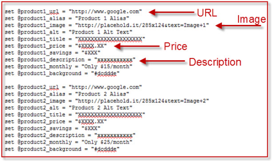
As you can see in the following code (for one of the stored content areas for the above template), the individual updating the content only needs to update the product information such as name, image reference, alt tag, price, description, etc. The style and formatting of these items is saved as part of the template setup, making the ability to modify this much easier and without the requirement of HTML knowledge.
Why Should You Move To Responsive Emails? Because…
The ability to design and build emails quickly is always critical, but is more important than ever as we head into the holiday season.
So, next time you encounter the question, “Why should we move to responsive emails?” you can respond with:
- “Because we will be able to get our emails built faster.”
- “Because subscribers will opt-out if we don’t.”
- “Because the majority of our subscribers open on a mobile device.”
- “Because open rates increase when emails are responsive.”
Now to update your website to be responsive after they click through!
Contributing authors are invited to create content for MarTech and are chosen for their expertise and contribution to the martech community. Our contributors work under the oversight of the editorial staff and contributions are checked for quality and relevance to our readers. MarTech is owned by Semrush. Contributor was not asked to make any direct or indirect mentions of Semrush. The opinions they express are their own.
Cara Olson is Director of Digital Direct/eCRM at DEG, a full-service digital consultancy based in Kansas City. Leveraging her 14 years of experience and thought leadership in digital direct marketing, she and her team lead email and SMS strategy, integrations, and campaign execution for flagship brands like Crocs, Helzberg Diamonds, MathWorks, Cabela's, Life is Good, and TITLE Boxing. In her spare time she runs half marathons, cheers on her beloved Royals, and drinks copious amounts of coffee while trying to exhaust her eight year-old daughter, five year-old boy, and one year-old golden retriever.
View Author Profile
Add us as a preferred source on Google
Google's "preferred sources" feature allows users to customize their search results by selecting news outlets they want to see more often in the "Top Stories" section.
Add Martech NowRelated Articles

New research found marketers invest in targeting, AI, and creative while neglecting the post-click experiences they say drive paid media ROI.
Read More
Free tools have lowered the cost of marketing mix modeling, but data quality and human expertise remain the biggest barriers to success.
Read More
IAB Tech Lab's proposed SupplyChain v1.1 update could give advertisers a clearer view of every company that touches a programmatic bid request.
Read More
Build a repeatable system for creative experimentation using pre-vetted freelancers, modular briefs, and automated workflows.
Read MoreRelated Articles
New research found marketers invest in targeting, AI, and creative while neglecting the post-click experiences they say drive paid media ROI.
Read More
Free tools have lowered the cost of marketing mix modeling, but data quality and human expertise remain the biggest barriers to success.
Read More
IAB Tech Lab's proposed SupplyChain v1.1 update could give advertisers a clearer view of every company that touches a programmatic bid request.
Read More
Build a repeatable system for creative experimentation using pre-vetted freelancers, modular briefs, and automated workflows.
Read More