Tips For Mobile Design: Travel Brands That Are Going Places
The U.S. Department of Transportation estimates that the Thanksgiving holiday will see long-distance travel increase by 54% and another 23% for Christmas and New Year’s Eve from previous years. The stress of holiday travel can be compounded by a modern disorder, nomophobia, or the fear of being disconnected from mobile technology. With most of us toting […]

The U.S. Department of Transportation estimates that the Thanksgiving holiday will see long-distance travel increase by 54% and another 23% for Christmas and New Year’s Eve from previous years.
The stress of holiday travel can be compounded by a modern disorder, nomophobia, or the fear of being disconnected from mobile technology.
With most of us toting our smartphones on these trips, it’s up to the brands whose services we use daily to provide a seamless experience despite our temporary displacement. There’s comfort that comes from being in touch, especially with our most-used mobile brands.
In addition to quelling our severe FOMO (fear of missing out) moments, successful brands reduce what Nielsen Norman Group calls our cognitive load:
[blockquote]When the amount of information coming in exceeds our ability to handle it, our performance suffers. We may take longer to understand information, miss important details, or even get overwhelmed and abandon the task.[/blockquote]
Once Aunt Edna misplaces her boarding pass and Uncle Rick has “gone to look at something,” it’s crucial for any other piece of competing information not to get lost in the fray.
Outlined below are select tips that companies can use to improve the continuity of their mobile experience particularly when their user is traveling.
Tip 1: Help Travelers Find Their Way
Welcome to Seattle! The pilot and crew have gotten you this far, but once you step off the plane, you’re on your own.
Wayfinding is more than just getting from point A to point B — it’s about establishing spatial awareness and proper orientation. Companies like Delta Airlines and Uber guide users through unfamiliar territory, starting with exiting the airport in one piece.
Fly Delta App
Navigating the airport involves the following processes: get off plane, find baggage claim sign, find baggage claim, find proper baggage carousel, fight for spot at carousel, wait for bags, rinse, repeat.
The Delta Airlines Fly Delta app aims to minimize this scenario’s overwhelming cognitive load through detailed airport maps, baggage tracker, and layover/gate information via push notifications. Not to mention, this can all be done as you taxi in.

Delta helps travelers find their way with features like airport maps (left) and bag trackers (right).
Uber
Now that you’ve got your bags, it’s time to get home. Uber offers on-demand rides with the push of a button.
At some airports, including Seattle, UberX (lower cost ride-share cars) are not allowed to pick passengers up due to competitor contracts. In response, Uber provides a brief in-app interstitial message that explains this, while offering an alternative to UberX.
Furthermore, passengers can use the app’s Fare Estimate feature to determine trip costs prior to the drive, a service most taxis won’t offer.
By allowing users to input their end destination prior to the drive, the ride-sharing company simplifies the navigation process especially by auto-populating popular destinations.
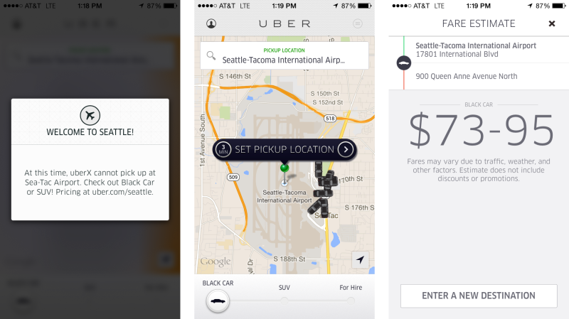
Uber offers many features to make ground transportation easier. These include service recommendations (left), live maps (center), and fare estimates (right).
What We Can Learn
So, what’s the lesson here? After a long flight, getting out of the airport is probably the least enjoyable part of traveling.
Apps like Delta and Uber make navigating easy with detailed maps, push notifications, and auto-populated input fields.
If reducing cognitive load is the goal, companies should allow users to accomplish all their wayfinding needs when they’re aren’t competing for said users’ attention: taxing from the runway.
Tip 2: Enhance The Journey With Useful Content
So, you’ve arrived, oriented yourself, and gotten on your way. Phew! Now what?
Brands like AirBnB and TripAdvisor step in to answer this question. Using contextual information like location, time, and even data connection, these apps deliver useful content at just the right time.
AirBnB
With AirBnB, booking a place to stay is just the beginning of the experience. AirBnB helps travelers manage communications through a variety of mobile channels, including SMS, email, push, and the app’s own inbox.
Guests receive automated SMS reminders based on the time or status of a reservation. They can also use the app to communicate directly with hosts about directions, questions, and even recommendations on things to do.
AirBnb is aware that travelers often don’t have access to fast internet speeds. Its app offers a “low-bandwidth mode” that provides users an option for low-resolution images to improve performance and save data. It allows an image-heavy brand like AirBnB to customize its experience to each user depending on their needs.

AirBnB provides timely updates about reservations (left). It also allows users to choose a low bandwidth mode (center) to switch from between high and low-resolution images (right).
TripAdvisor
Like AirBnB, TripAdvisor also extends beyond search, review, and purchase features. It provides a catalog of useful information to travelers — everything from restaurant reviews to tips on selecting a seat.
Having a lot of information is great, but what really stands out is the way TripAdvisor uses location and context to serve up the most relevant content. Features like “Near Me Now” let people discover nearby activities based on GPS location and user reviews.
Contextual hints also help guide decision-making. If you want to grab a pint at the Fremont Brewery, the app can tell you if it’s open now, and estimate the time, cost, and distance to take an Uber there.
TripAdvisor offers a feature called Downloaded Cities, which allows users to save city maps, attractions, and reviews to use without a data connection.
So, when a tourist is on Seattle’s Underground Tour, s/he can still use the app for dinner recommendations. The app maintains its value, anticipating a scenario when users have little access to content but need it most.

TripAdvisor provides relevant content based on location (left), time (center), and data connection (right).
What We Can Learn
AirBnB and TripAdvisor have recognized that the customer experience doesn’t start and end with a transaction. They position themselves as partners in the entire travel experience. By taking this view, they’re able to realize opportunities to be useful to customers. Their mobile apps become travel tools, helping users get more out of each step of their trip.
Tip 3: Easy Transactions Make Happy Customers
Whether it’s a breakfast sandwich, a tank of gas, or a last-minute gift, it’s likely that travelers will need to stop and buy something along the way. Transactions, though common, can be complex processes. Customers have to evaluate options, make choices, and do math, often with little time or attention for details.
Mobile payment services can afford easier transactions by simplifying tasks and personalizing the experience. By removing the difficult or awkward parts from a transaction, brands can help customers get what they want quickly and afford them more control over the experience.
Starbucks
Starbucks recently redesigned and streamlined its mobile app. The new experience focuses first on mobile payment and second on managing rewards, removing most other features. The simple design is what makes the app so appealing. It’s fast, easy, and reliable, making it comfortable to use.
A single click of a “pay” button brings up a screen with all the information needed for purchase — the barcode, current balance, and any available offers. The cashier scans the barcode and with a quick beep, the transaction is complete. Reward points are captured, and the app prompts easy tipping via push notification.
The value here is that Starbucks has replaced several mundane tasks — searching for a wallet, exchanging money, stamping a coffee card, calculating a tip — with one elegant interaction. The company has hidden less enjoyable parts of visiting the store, allowing customers to focus more on the desired experience of familiarity, comfort, and leisure.
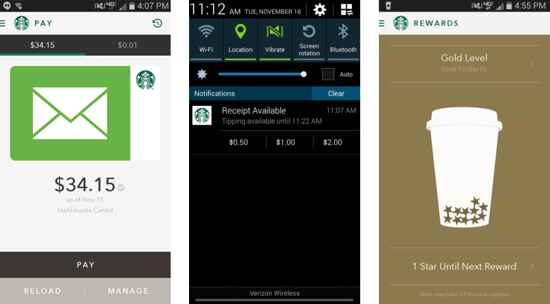
Starbucks creates a great transactional experience with mobile payment (left), tipping push notifications (center), and loyalty rewards (right).
Square
Like Starbucks, Square uses mobile capabilities to simplify and personalize transactions. The basic service Square provides isn’t unique — it processes a credit card payment. T
he difference is in the way the experience works. Square’s mobile nature allows cards to be accepted in more places. And the design of its service enables quicker transactions and great tools for post-purchase engagement.
Many Square transactions consist of four steps: swipe a card, sign, tip, and receipt. Knowing that customers will need to engage directly with the app, the interface is designed to enable quick action and avoid errors.
The tipping screen presents three large options with preset amounts. For the person standing at the front of a long line, this makes adding up the tip as simple as clicking a button.
Square takes advantage of mobile to enhance the experience after purchase. The POS system sends electronic receipts via email or SMS, providing customers with an immediate and storable record.
Businesses can opt to use these receipts to get feedback or track loyalty information for return customers. The receipt itself becomes a useful tool, replacing ever-losable punch cards for free coffee or sandwiches.
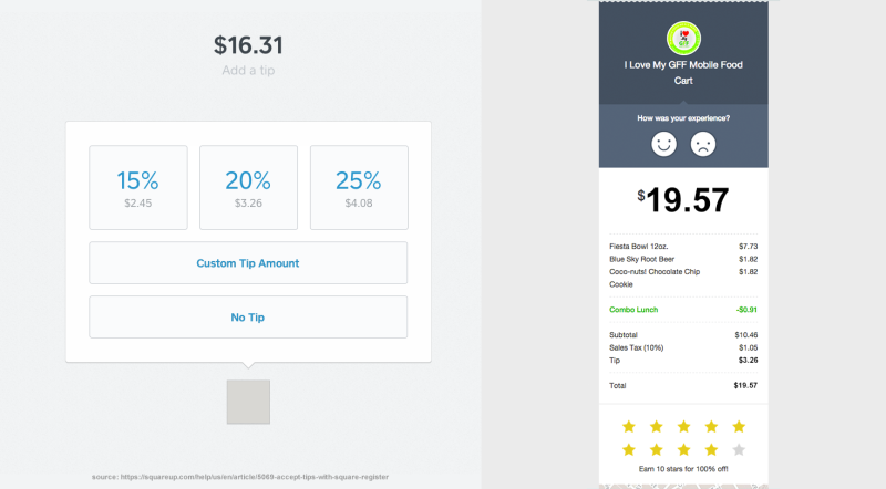
Square makes the transactional process easier with simple tipping interface (left) and useful email receipts (right). Image source: https://squareup.com/help/us/en/article/5069-accept-tips-with-square-register
What We Can Learn
Starbucks and Square show us that mobile apps are great at taking on tedious or repetitive tasks. So when it comes to transactions, let the app do the work.
Remove additional steps that are awkward, tedious, and confusing. Reward customers who have chosen to stand in line and buy your product by improving the experience at the register and giving them reasons to return.
Conclusion
Getting around has never been easier. Delta and Uber help you navigate unfamiliar territory, while TripAdvisor and AirBnB provide mobile, offline resources for housing, food, and more.
With more than 60% of us owning a smartphone, the world is truly at our fingertips. Square and Starbucks have successfully integrated mobile payments that make carrying a wallet no longer a necessity.
Ultimately, brands are challenged with providing a similar experience wherever users are, eliminating any barriers to efficiency, and staying ahead of the trends. This is smart design and what makes a superior mobile experience.
Special thanks to Anthony Bursi of Oracle, who researched and co-wrote this article.
Contributing authors are invited to create content for MarTech and are chosen for their expertise and contribution to the search community. Our contributors work under the oversight of the editorial staff and contributions are checked for quality and relevance to our readers. MarTech is owned by Semrush. Contributor was not asked to make any direct or indirect mentions of Semrush. The opinions they express are their own.
Related stories
About the author