Rethinking The Lowly Thank You Page
Let’s face it, the Landing Page gets all the attention these days. Every marketing blog (including my own) has an opinion on the best landing page and what to do to convert every visitor with its brilliant magnificence. Don’t get me wrong, the landing page deserves the huge amount of attention it gets. But if all you’re […]
Let’s face it, the Landing Page gets all the attention these days. Every marketing blog (including my own) has an opinion on the best landing page and what to do to convert every visitor with its brilliant magnificence. Don’t get me wrong, the landing page deserves the huge amount of attention it gets. But if all you’re doing is giving visitors a confirmation message when they click Submit, you’re missing a big opportunity to engage with your visitors.
Can You Convert A Visitor Twice?
When you visit most commercial websites, you’ll find whitepapers, demos, eBooks, webinars and events — typically behind a form. As a visitor, when I fill out these forms, I give them my contact information in return for whatever asset I’m interested in. Of course, I know I can expect an email or phone call within a day or so, but I give out my information anyway because I want whatever is behind the form.
Once I submit the form, they either send me straight to the asset, email a link to the asset or send me to a thank you page with a link to the content I want. If they are smart, they’ll send me to a thank you page and send an email.
It’s surprising how something so simple isn’t standard. But is even that enough? Since I filled out the form, I’m now an engaged visitor. Can more be done right now to move me closer to being a customer — or better yet, a fan?
If the only thing you do for a visitor after they submit a form is provide what they asked for, you’re missing the opportunity to engage more deeply with that visitor and move them closer to becoming a customer.
Elements Of A Great Thank You Page
Just like a Landing Page, a Thank You page has its standard components. Always deliver what you promised in the first place. If you don’t do that immediately, your visitor has the opportunity to look elsewhere for the information they came looking for.
- Primary Response. This is the general thank you message and either links to the asset or provides what they can expect next in the case of a demo or contact form. Make sure this confirmation is very obvious. You don’t want visitors to have to hunt around for this information on the page.
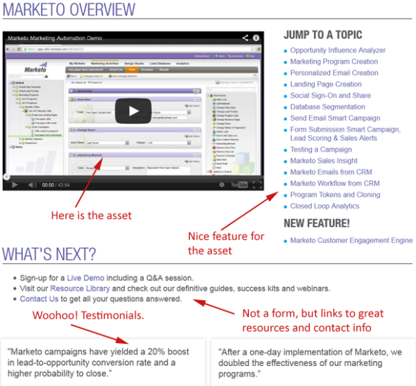
- Contact Information. Just in case they love what they see, give the visitor contact information so they may take the next step and be proactive if they want to. Include the appropriate email and telephone number. When possible, do more than just an info@ or support@ email. Try and make it personal if you have the ability, so that they know they are connecting with someone and not an email bot.
- Testimonials and Badges. This is a great place to show off a customer testimonial or two as well as any awards you’ve won. This helps establish a greater amount of trust with the converting visitor, and you get to shine as well.
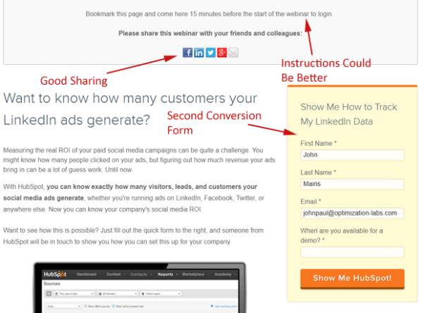
- Sharing the Love. People enjoy sharing stuff they think is useful with their friends. Let them post a Tweet, Like or post it on their G+ and LinkedIn pages. This way, one happy, converting visitor can multiply the effects of your campaign to more people outside the campaign. Because conversion volumes are usually not high, I wouldn’t typically use the type of social sharing buttons that display the number of shares, but rather, a standard sharing button. If it looks like not many people have shared it, they will be less likely to share it themselves.
- Bonus, Unexpected, Awesome Material. If you have related material, like case studies, blogs or whitepapers, show them off here. If you happen to know what industry the converting visitor is in, show off your case studies in their industry. This kind of personalization shows you have a great handle on their issues and can be trusted to understand their needs. Whatever the content is, when you can, provide content that they weren’t expecting, yet is something they are really excited to find.
- The Next Step in the Funnel. If you have mapped out your conversion assets to their place in the marketing funnel, go ahead and present the next step in the funnel. For instance, if they watched a webinar, ask them if they want a demo. Be sure not to ask the same information since you already have it, but ask for some new information that will be helpful in understanding their needs.
Some Examples Of Good Thank You Pages
There aren’t many outstanding Thank You pages out there. It’s hard enough having enough content to make a few landing pages, much less a really strong Thank You page full of great content. But it really pays off when you have the captured attention of an interested visitor.
HubSpot Thank You Page
I’ve always liked Hubspot’s Thank You pages. You’ll often find they ask converters to take the next step. Below is an example from a webinar I signed up for. You’ll see they provide ok instructions, but they ask you to share it, and they have a short form for the next stage in the funnel if you found the material useful.

Marketo Thank You Page
Another company that does a great job with their Thank You pages is Marketo. They have a lot of content to work with to create custom tailored Thank You pages that move the prospect through the marketing funnel.

The Goal Of The Thank You Page
Your goal with Thank You pages is, of course, to provide what the visitor asked for — but you’re also trying to move them further into the marketing funnel till they enter the sales funnel. At the point in time when a visitor converts, they are likely at a peak point of interest in your company. Take advantage of this moment to give them more than they expected and create fans, not just prospects.
Contributing authors are invited to create content for MarTech and are chosen for their expertise and contribution to the martech community. Our contributors work under the oversight of the editorial staff and contributions are checked for quality and relevance to our readers. MarTech is owned by Semrush. Contributor was not asked to make any direct or indirect mentions of Semrush. The opinions they express are their own.
Related stories
New on MarTech