Just Having A Mobile-Friendly Site Isn’t Enough To Ensure It Shows In Search
If you think having a mobile-friendly site is all you need for mobile SEO, think again. Columnist Bryson Meunier explains how businesses can go beyond just being mobile-friendly.

So you’ve checked the box and now have a mobile-friendly site. “Mobilegeddon” convinced you that mobile searchers are worth paying attention to, so you made your site responsive or at least gave mobile searchers content they don’t have to pinch and zoom to view.
Mission accomplished. On to the next thing. Right?
Maybe not so fast. Here’s an example that might make you think twice.
The other day, my wife asked me to pick up something for dinner, and being a carb-based lifeform from the Midwest in close proximity to a Noodles & Company, I went to my phone to pull up the menu.
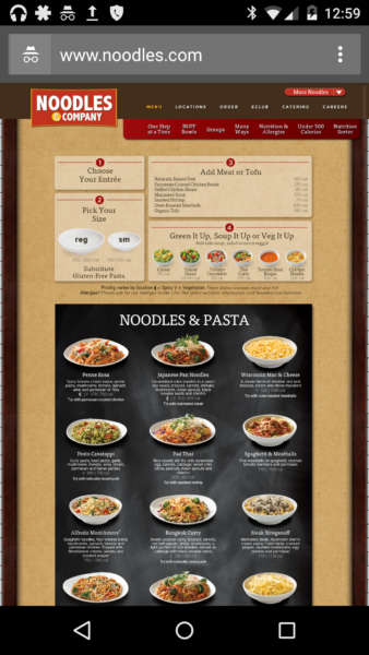
Using the query [noodles and company menu], as more than 39k searchers per month do on their smartphones, according to Google Keyword Planner, I scrolled past the ad in the first place and the featured answer in the second as I wanted pictures, and clicked through to the menu…

…which was not mobile-friendly.

So Noodles & Company doesn’t have a mobile-friendly site, right? Not the end of the world.
But the thing is … they do have a mobile-friendly site. It’s just not being shown.
Why is this? Two basic reasons:
- Google’s mobile-friendly algorithm didn’t apply to navigational queries. If it had, Google might have shown me Noodles & Company’s mobile-friendly site, had they been aware of it.
- Noodles & Company didn’t do everything they could to make sure consumers like me see the mobile-friendly site instead of tiny text and faraway images.
How To Go Beyond Being Mobile-Friendly
Had I been in marketing for Noodles & Company, and not just a guy looking to get some Whole Grain Tuscan Fresca on the way home, this is what I would have done.
I’m telling it here in the hopes that Noodles & Company and businesses like them make their sites more accessible in search to people using smartphones — and that businesses of all sizes understand that sometimes being mobile-friendly is not enough for mobile SEO.
- Identify all mobile-friendly versions, and pick a canonical one. Doesn’t apply if you have a responsive site (although they can have their own unique problems), but it certainly applies to Noodles & Company, which has a mobile version of its menu, as well as 530 local copies of its menu on orders.noodles.com/menu that are also mobile-friendly.
Search behavior tells us most people aren’t looking for Noodles menus in specific locations, so unless the menus are clearly different, it’s probably wise just to put canonical tags on those local copies or to link all the local sites to the main mobile-friendly menu and permanently redirect all the local copies.
The problem is, it looks like Noodles & Company is using a vendor to make its locations mobile-friendly, and it has separate mobile-friendly landing pages for its locations.
This is a mistake. Mobile search is largely local search, and local content should be mobile-friendly to get as much visibility as possible.
But since this is already done, it makes sense in this case to add bidirectional annotations to local store sites so that Google understands what to display in smartphone search, instead of canonicalizing the local menus to the menu page.
- Add bidirectional annotations so that Google understands which site they should show to mobile searchers. Bidirectional annotations are pretty simple, and they’ve been around long enough for us to know that they work well. Yet Noodles, like many businesses, is not using them.
They could solve their problem if they did. They would just need to add a canonical tag to the mobile menu page pointing back to the desktop page and an alternate tag pointing back to the mobile menu page on the desktop menu page. Like this:
On the desktop page (http://www.noodles.com/food/), add:
<link rel=”alternate” media=”only screen and (max-width: 640px)”
href=”http://www.noodles.com/mobile/food/” >
and on the mobile page (http://www.noodles.com/mobile/food/), the required annotation should be:
<link rel=”canonical” href=”http://www.noodles.com/food/” >
That’s it. Problem solved.
- Add redirects to desktop site when mobile searchers land on them. Finally, it’s not required by Google, and it’s not technically SEO, but if you’re going to have a mobile site it makes sense to show it to mobile searchers, rather than frustrating them with unnecessary pinching and zooming.
I know redirects are tough to get right, and many of the common mistakes that Google sees have to do with improper redirects, but if you have equivalent content, it doesn’t help any user to see the wrong version of your site.
Look, none of this is rocket science. And most of it is in Google’s great mobile SEO guidelines and has been for years. The problem is, it might not be obvious to business owners who think having a mobile site is all that’s necessary for mobile SEO.
If you’re in that category, whether your business is noodles or not, do yourself and your users a favor and check out Google’s guidelines for mobile SEO that goes beyond just being mobile-friendly.
Contributing authors are invited to create content for MarTech and are chosen for their expertise and contribution to the search community. Our contributors work under the oversight of the editorial staff and contributions are checked for quality and relevance to our readers. MarTech is owned by Semrush. Contributor was not asked to make any direct or indirect mentions of Semrush. The opinions they express are their own.
Related stories