How To Update An Entire Dashboard In Excel With One Radio Button [VIDEO]
I’ve been writing a series on how to create dashboards in Excel that started with this post on Search Engine Land and carried over to Marketing Land. Now, I’m going to show you a trick that will give you the ability to control an entire dashboard with one menu — in this example, a radio […]
I’ve been writing a series on how to create dashboards in Excel that started with this post on Search Engine Land and carried over to Marketing Land. Now, I’m going to show you a trick that will give you the ability to control an entire dashboard with one menu — in this example, a radio button menu.
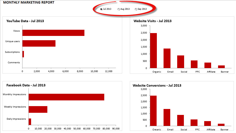
In the sample file I’m including, I’ve put months in the menu at the top of the dashboard, but you could put anything in there to segment your charts and tables:
- countries
- marketing channels
- departments in a company
- sales staff
- traffic source
- affiliates
- etc.
Just as I mentioned in my last post, when you’re creating an interactive dashboard, I highly recommend that you put your raw and calculated data into separate worksheets from your dashboard. I name my worksheets Dashboard, Raw Data, and Calculated Data (this is pretty standard among analysts), but you can use whatever best helps you to keep track of everything.
The Chart We’ll Be Creating
Here is a screenshot of the chart you’ll learn how to create in the video below:
Excel File To Download
If you want to download the Excel file I use in the demo, you can download it here.
Developer Tab
In order to use these fancy drop-down menus, radio buttons, etc., you’ll need to enable the Developer tab in Excel. If you’re on a PC, this post describes how. And if you’re on a Mac, you can check out this post.
Functions You Need
Here are the functions I used in this tutorial:
INDEX: This function is a more flexible version of VLOOKUP. You can learn more about how to use it here.
IF: This function allows you to apply Boolean logic to your data. You can learn how to use this powerful function in marketing here.
TEXT: I show you how to create a dynamic chart title that updates when you select a new month.** But when you concatenate a formatted value like a date, the number formatting you have applied doesn’t carry through. Instead, you get the raw value, which is not very useful at all. The TEXT function allows you to shoehorn your number formatting back in to your date. You can learn more about the parameters here.
**I probably wouldn’t have the month duplicated in every chart like I did in this example, but I added them for a couple reasons:
- To demo how to create a dynamic chart title (because they’re super sexy).
- To make the fact that we’re segmenting by month pop out a bit more. Radio buttons can’t be formatted (boooo!), and they’re not terribly obvious at the top of the dashboard. I wouldn’t normally use radio buttons for this purpose; I would use a combo box, which gives you a nice drop-down menu. But I used them for this tutorial because I already used the combo box in my last tutorial.
Date Formatting
If the TEXT function doesn’t make sense, you might want to check out this tutorial I wrote on date formatting.
Save Yourself Time With Chart Templates
There’s no need to recreate each of your charts every time. Excel gives you the ability to save any chart you create as a template that you can reuse later. These templates are saved to your hard drive though, so if you want them accessible in each of your computers, you’ll need to copy and paste your template files to the proper directories:
PC: C:/Users/[Your User Name]/AppData/Roaming/Microsoft/Templates/Charts
Mac: Users/[Your User Name]/Library/Application Support/Microsoft/Office/Chart Templates
When you’re finished with your changes, you can save it as your own template. On a PC, you would just choose Chart Tools > Design > Save As Template. (Note: In Excel 2013, Save as Template is no longer available on the ribbon. To save a chart as a template, right-click the chart, and then click Save as Template. Excel should have had this as an option in the contextual menu all along.)
On a Mac, the easiest way is to right-click on the chart and choose Save as Template. But if you prefer using the Ribbon, go to Charts > Change Chart Type > Other > Save as Template.
Video Tutorial
You can check out the steps I took to create this dashboard in the video below. If you like it, be sure to subscribe to my YouTube channel (and like the video if you’re so inclined).
Contributing authors are invited to create content for MarTech and are chosen for their expertise and contribution to the search community. Our contributors work under the oversight of the editorial staff and contributions are checked for quality and relevance to our readers. MarTech is owned by Semrush. Contributor was not asked to make any direct or indirect mentions of Semrush. The opinions they express are their own.
Related stories
New on MarTech
