The growing appeal of responsive-aware email design
Many brands are utilizing responsive design for their email marketing, but the production costs and skills needed to create fully responsive emails can sometimes be prohibitive. In these cases, columnist Chad White recommends responsive-aware design.

Several years into the Age of Mobile, brands are finally catching up to consumers, who have embraced mobile much faster than brands have.
Spurred by Google’s mobile-friendly update, which gave a boost to “mobile-friendly” sites in mobile search results, 93 percent of B2C brands now have websites that render and function well on desktops and smartphones. And driven by the fact that the majority of emails are now opened on mobile devices, 77 percent of B2C brands now send mobile-friendly emails, up from 56 percent a year ago.
Responsive email design has become the dominant approach for creating emails that look great and function appropriately across devices big and small. Fifty percent of B2C brands use this approach, compared to 27 percent using mobile-aware design.
Just so we’re clear on our definitions:
- Responsive email design involves using media queries to control the formatting, layout and display of email content depending on the subscriber’s screen size.
- Mobile-aware email design (also known as scalable email design) is aimed at creating a single email that works well on a wide range of screen sizes but treats smartphones as primary. To do this, designers employ techniques such as using a single-column layout, utilizing large text and images and incorporating large, well-spaced links and buttons.
However, not all brands are all in on responsive. Some brands use a mix of responsive and mobile-aware design called responsive-aware design.
The percentage of B2C brands using this approach more than doubled over the past year to 20 percent from 9 percent.
What is responsive-aware design?
Responsive-aware design leverages the strengths of both responsive and mobile-aware design, using each approach where they do the most good.
Responsive-aware emails use responsive design in the header, navigation bar and footer. Those areas tend to have the smallest text and the highest link densities on desktops. This method allows marketers to increase font sizes and spread out links so they can be easily and accurately tapped with a finger, drastically improving the subscriber experience.
Responsive design involves more work and coding, because you’re essentially creating two or more versions of the content to optimize it across screen sizes. So the other big benefit of focusing your responsive coding in the header, navigation bar and footer is that those elements tend not to change very often. That means you can incorporate that code into your template and reuse it over and over with minimal need to touch those between sends.
Mobile-aware design is then used for the primary and secondary message blocks — the portions that change for pretty much every email sent. Using responsive design for this content significantly increases production time, so sticking with mobile-aware is very efficient.
What does responsive-aware look like?
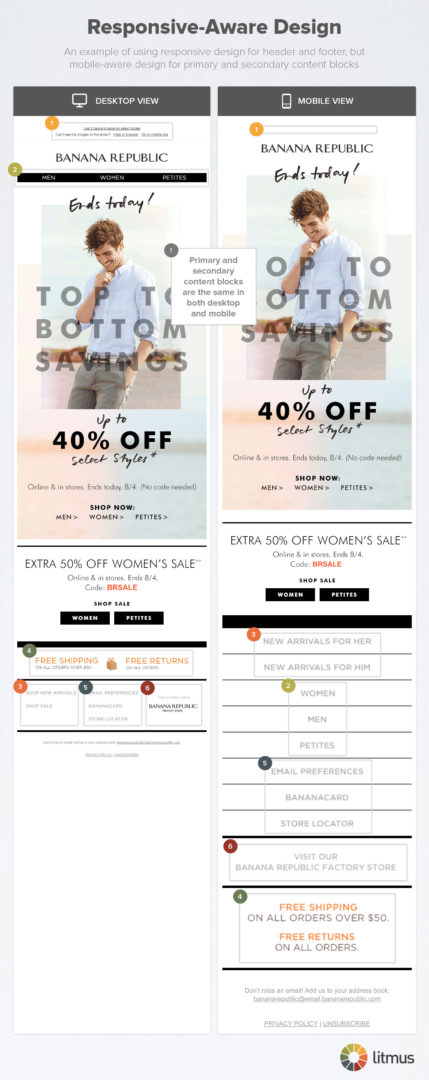
This Banana Republic email is a fairly typical execution of response-aware design. Notice in the mobile rendering that:
- the preheader text disappears;
- the top navigation bar links drop down into the bottom navigation section and become vertically stacked; and
- the links in the bottom navigation become vertically stacked.
Meanwhile, the primary message block (“Top to Bottom Savings”) and secondary message block (“Extra 50% Off Women’s Sale”) are unchanged in the two renderings.

When primary and secondary content blocks aren’t too big, the click-through rates of the bottom navs on mobile devices are comparable to top navs on desktops. As more brands use responsive design to move top navs to the bottom, consumers will be conditioned to look there for these links, which should gradually improve click rates.
Who is responsive-aware design best for?
Responsive-aware design is great if:
- your brand uses mobile-aware design and wants to ease into responsive email design;
- your brand doesn’t have the resources to create fully responsive emails; or
- your brand doesn’t have a big enough email list or high enough frequency that the benefits of fully responsive emails compensate for the additional design and development costs.
If you’re in that third bucket, you should consider periodically A/B testing a fully responsive email versus your responsive-aware email to make sure that cost-benefit analysis still isn’t in your favor. At some point, it likely will be.
All signs continue to point to responsive design as being the default design approach of the future. However, because of the extra production cost and skills needed, fully responsive emails aren’t appropriate for every brand. For many brands, responsive-aware will be responsive enough to meet their needs and the needs of their subscribers.
Contributing authors are invited to create content for MarTech and are chosen for their expertise and contribution to the search community. Our contributors work under the oversight of the editorial staff and contributions are checked for quality and relevance to our readers. MarTech is owned by Semrush. Contributor was not asked to make any direct or indirect mentions of Semrush. The opinions they express are their own.
Related stories