The 5 Levels Of Mobile-Friendly Email Design: Time To Graduate
Some brands have mobile-friendly websites but fail to give their email subscribers the same experience. Columnist Chad White explains why it's time to close that gap and suggests ways to do it.
2015 is the Year of Mobile. Just like 2014 was … and 2013 … and 2012 … It’s become a bit of a joke, really. But what’s not funny is that consumers have been well ahead of marketers when it comes to mobile behavior.
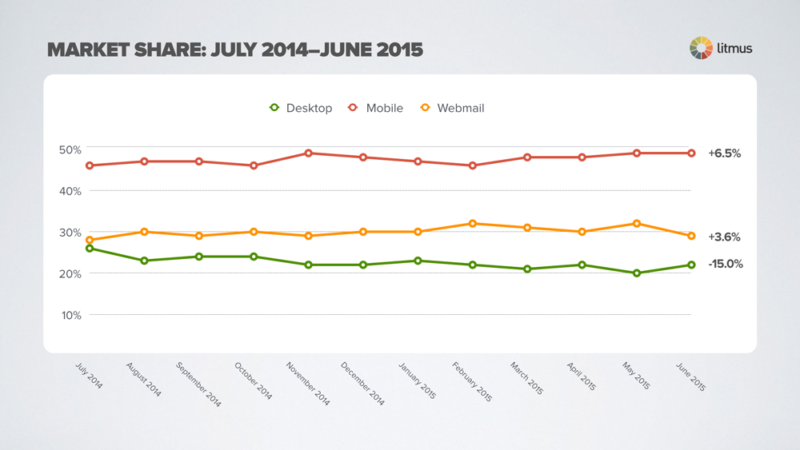
Mobile reading of email is a prime example. Email reading is the No. 1 activity on smartphones, according to Salesforce. And roughly 50% of emails are currently read on mobile devices, according to the latest environment marketing share data from Litmus (disclosure: my employer). It has been hovering near that level for much of the past year.
Meanwhile, marketers have been racing to catch up. Over the past year, the percentage of B2C brands using mobile-friendly email designs for their promotional emails has grown by 36%, according to joint research between Litmus and Salesforce. However, even with that substantial progress, only 56% of B2C brands have adopted email designs that are mobile-friendly.
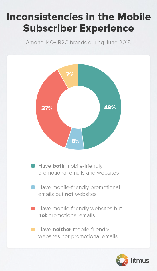
I say “only” because brands have been much faster to adopt mobile-friendly designs for their websites. According to our research, 85% of B2C brands have mobile-friendly websites, which is up from 74% the year before.
The result is email experiences and Web experiences that aren’t aligned — and, in many cases, are jarring. For instance, 8% of B2C brands send mobile-friendly emails, but their websites are not mobile-optimized, while another 37% have mobile-friendly websites but not emails. I’d like to focus on that second, much larger group.
Research has shown that many consumers will immediately delete or unsubscribe from emails that don’t look good and function appropriately on their smartphones. Having a mobile-friendly site is great, but few of your email subscribers — who are among your best customers — are going to bother to click through based on a bad experience with your brand in the inbox.
Reasons Behind The Gap
These brands have acknowledged that mobile is a valuable channel to them by taking the effort to make their websites mobile-friendly. But why haven’t they also provided that same experience to their email subscribers? A few reasons are likely:
- Limited expertise. They may not have the skills or training necessary to create mobile-friendly templates.
- Limited resources. Depending on the number of people on their team and the number of campaigns they send each week, they may not have the people available to create mobile-friendly campaigns.
- Confusion over best approach. What’s the best approach? Mobile-aware? Responsive? Something else?
If you’re experiencing any of the above, there’s good news on all those fronts.
1. Many ESPs (email service providers) now offer their clients free responsive templates. Litmus also offers free responsive templates that we’ve thoroughly tested.
Media queries, which allow responsive designs to adapt to different screen sizes, don’t work in all email clients — most notably all Google environments, including Gmail, Gmail app for Android and iOS, and Inbox by Gmail. However, it makes a huge difference in other email clients, including the Apple iPhone native email app, which tops the list of most popular email clients.
2. Becoming mobile-friendly can increase your email marketing team’s workload, but there are ways to mitigate that. For instance, you can redesign your templates to take a more modular approach to content. This constraint can simplify design and can be great for content stacking in mobile email renderings. You can also adjust your email design approach incrementally, which we’ll talk more about in a minute.
3. Don’t get decision paralysis over the best approach. It’s not responsive or nothing. There are many shades of being mobile-friendly, and incremental improvement is always better than nothing.
5 Levels Of Mobile-Friendly Email Design
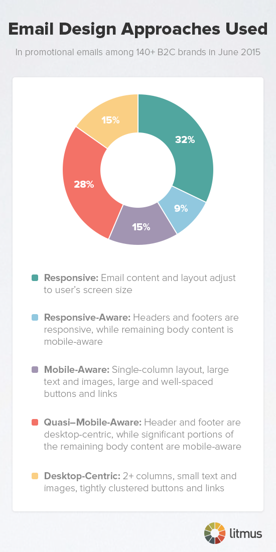
There are five levels of mobile-friendly email design. They vary in sophistication and workload, and they largely break down based on the design approach used for the header and footer versus the primary and secondary content blocks.
5. Responsive email design. Using media queries and other means, responsive design changes the content and layout of an email based on the user’s screen size.
Most of the growth in the adoption of mobile-friendly email design over the past two years is due to the adoption of responsive design. Plus, in the past few months, this has become the dominant email design approach used by B2C marketers and is on its way to becoming the standard design approach. Google has indicated that it has become a priority for its email clients to support responsive design in the future. When that happens, responsive will get a huge boost.
4. Responsive-aware design. This approach uses responsive design for the headers and footers, while using mobile-aware design for the primary content block and any secondary content blocks.
This is a savvy approach; headers and footers arguably suffer the most with mobile, since they tend to have tightly packed links and small text. Using responsive design to turn an eight-link navigation bar into a three-link one, for instance, or converting a horizontal nav at the top of the email into a vertical nav at the bottom of the email makes the subscriber experience much better. And navigation bar links generally convert at a high rate, so ensuring that they’re easily tappable with a finger is smart business.
3. Mobile-aware design. Single-column layouts, large text and images and big, well-spaced buttons and links are the hallmarks of mobile-aware design, which is sometimes referred to as mobile-first. The popularity of this design approach has been quite stable over the years, hovering around 15%.
The wonderful thing about this approach is that technically, it’s very simple. No fancy coding here. In essence, you’re just scaling everything up and simplifying it so it’s easy to read and interact with when it gets scaled down to smartphones. Fewer elements also mean email production and quality assurance are easier.
The hard thing about this approach is that it requires a lot of difficult decisions about what content to cut from your previous desktop-oriented email design. However, making these difficult decisions will give your emails more focus, which is critical for success in mobile inboxes.
The above three email design approaches are mobile-friendly, while the next two are not.
2. Quasi-mobile-aware design. This approach caters to desktop users by using small text and closely packed links in the header and footer, but it acknowledges mobile users by making the primary content block mobile-aware. Depending on the implementation, secondary content blocks may lean toward desktop or mobile users.
This is actually the second-most popular approach to email design. This group has been growing slowly as marketers abandon pure desktop-centric design. However, this approach still creates a fairly poor subscriber experience for mobile email readers. In many cases, the next step for these marketers is to jump up to a responsive or responsive-aware design.
1. Desktop-centric design. Multiple columns, small text and images, and tightly clustered buttons and links are the staples of desktop-centric design, which favors big screens and the pinpoint accuracy of a mouse.
In the next 18 months, we may see this design approach to email effectively disappear as the low bar for what’s acceptable rises.
Choose The Design Approach That’s Best For You
All of this begs the question: What design approach should I be using?
First, look at your audience. Where are they opening your emails? Generally speaking, if fewer than 10% of your email opens are from mobile email clients, then quasi-mobile-friendly email design may be fine. If 20% or more are being opened on mobile, graduating to mobile-aware is wise. And if more than 30% of your opens are coming from mobile, then graduating to responsive-aware or responsive is advisable.
Keep in mind that roughly 50% of email opens are happening on mobile devices at this point, so if your audience is well below that, then you can likely expect it to continue to rise in the months ahead.
And second, think about the subscriber experience you’re trying to create. Think about the brand experience you’re trying to create. For instance, I’m shocked by how many luxury retailers have yet to make their emails mobile-friendly. And if you’ve already done the hard work of creating a mobile-friendly website, taking the next step and creating a consistent experience across Web and email makes a lot of sense from a brand perspective.
What’s certain is that with the majority of B2C brands using mobile-friendly email design, consumer expectations are rising. Increasingly, they’ll be expecting an email and Web experience that works on smartphones and tablets. That also means that if you’re not being mobile-friendly, the risks to your brand image and to subscriber engagement are rising, too.
Contributing authors are invited to create content for MarTech and are chosen for their expertise and contribution to the martech community. Our contributors work under the oversight of the editorial staff and contributions are checked for quality and relevance to our readers. The opinions they express are their own.
Related stories
New on MarTech


