Review: Real Life With The Galaxy Nexus Android 4.0 Smartphone
The third generation of Google’s “pure” Nexus-series phone goes on sale tomorrow, the Galaxy Nexus. Sporting the latest version of Android, is this the phone you’ve been waiting for? As always, maybe. There are nice things, there are bad things. Here’s my past month living with the phone. First Impressions I’ve had a Galaxy Nexus […]
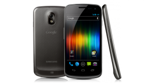 The third generation of Google’s “pure” Nexus-series phone goes on sale tomorrow, the Galaxy Nexus. Sporting the latest version of Android, is this the phone you’ve been waiting for? As always, maybe. There are nice things, there are bad things. Here’s my past month living with the phone.
First Impressions
I’ve had a Galaxy Nexus review unit since the middle of November, and I covered some initial thoughts about the phone in my earlier review, First Impressions: Galaxy Nexus Android 4.0 Smartphone.
In particular:
- Finally, a “pure” Android phone comes to Verizon’s awesome 4G network
- It’s big, but it feels good
- The camera gets better controls
- Despite having NFC, there’s no Google Wallet support
- Android 4.0 takes getting used to after Android 2.2
- Button confusion! How do I go back? Where’s the search button?
I’ll revisit some of these issues, but not all of them. My focus in this review is on how I’ve found the phone to perform with real life tasks that I do each day.
Size & Feel
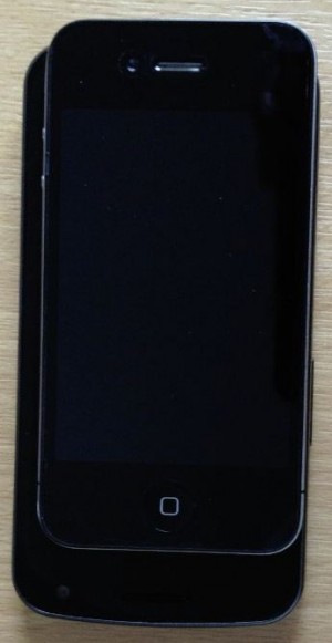
This is a big phone, continuing the trend of super-sized phones I hate so much. To the right, you can see the iPhone 4S sitting on top of the Galaxy Nexus.
My earlier review talks more about the size. A month in, it’s pretty much the same thing. Despite being so large, the Galaxy Nexus doesn’t feel that big. It slips easily into a pocket, assuming you’re fine without a case. It’s nice to hold.
It’s also feels light. But the Verizon version, rather than the T-Mobile one I’ve been carrying, might not.
The Galaxy Nexus version for T-Mobile’s and AT&T’s networks is 4.8 ounces or 135 grams.The iPhone 4s comes in at 4.9 ounces or 140 grams. The main phone I use, the Droid Charge, is 5.0 ounces or 142 grams.
The Verizon version of the Galaxy Nexus is 5.3 ounces or 150 grams. How noticeable that extra weight will feel, I can’t tell, obviously.
Text Entry & Keyboard: Mostly Nice
I’m pretty demanding of my phone’s on-screen keyboard. I want it to accurately let me type one handed, with my thumb, while I’m walking off an airplane or otherwise on the move.
My real torture test is how well I can type when I’m rollerblading. I usually go out for a skate at the end of the day, and the return journey is often against a heavy wind. It’s a handy distraction to kill off some emails while I’m fighting that. Or to tweet some sunsets.
OK, I know that’s not a typical use case. But if a phone can handle that for text entry, it can handle most anything
The iPhone does this beautifully. In part, it does this well because as it’s not a super-sized phone, you can easily hit all the keys with a thumb-reach.
Thumb typing is a further reach on the Galaxy Nexus, but it’s not as bad as I expected. The keyboard is nice, clean, easy to use and doesn’t require me to toggle though a strange set of three different keyboards if I want to use a symbol, as the Droid Charge does.
Here’s the iPhone 4s keyboard compared to the Galaxy Nexus:
Better, the auto-prediction is very good. I can type away without looking, and the correct word, even if I misspelled, is often entered. It’s far better than with the Droid Charge; maybe a little less accurate than the iPhone. But that might also be down to me being more comfortable with the iPhone (even though the Droid Charge is the phone I use the most).
Where it all goes wrong is with the space bar. It sits right above the system’s home key:

I find when I’m really on the move skating, I’m always hitting that home key by mistake rather than the space bar and so exit out of what I’m typing. This never happens with the iPhone or the Droid Charge, because they use “hard” menu buttons that you have to physically depress. You can’t accidentally push them.
Like I said, typing while skating is an unusual case. When I’m just walking off a plane, I’m far less likely to hit that home button. But it still feels a bit annoying that it’s so close to the space bar.
Email Client Disappointing, Confusing
While I use Gmail (through a Google Apps account), I’m a fan of the native email app on my phone, rather than using the Gmail app.
I think this is because native apps usually group emails in conversations, yet you can view each individual email separately and delete/archive them, if you want.
In addition, not everyone uses Gmail, so I think a close look at the native email apps (which sadly get neglected by Android handset makers) is worthwhile.
The iPhone is my touchstone here. Doing email using the native iPhone app is a delight (doing it using the quick preview feature of the iPad is even better).
On the iPhone (i use iOS 5, but iOS 4 was similar), you can easily open to view all messages in a conversation, archive some individually, archive the whole conversation, reply to a single person, reply to all and so on. You can also turn off the “Organize By Thread” feature, if you want.
The menus that the iPhone offers are intuitive. Refresh or write from your inbox:
They stay in the same place when you’re reading an actual email, joined by new options that appear between them to move email to a folder, to delete/archive and to reply:

In contrast, the Galaxy Nexus is more limiting and confused. There is no conversation view, kind of absurd on a phone from the company that popularized through Gmail the concept of threaded email.
I know. I hear the Android fanboys screaming: use the Gmail app! I shouldn’t have to, and as I said, not everyone does. If the iPhone’s native client can do threading, so should the native client on the Galaxy Nexus.
As for menus, there is no consistency as with the iPhone. From my Galaxy Nexus inbox:
Compose is on the left, followed by search, switch to another folder, refresh and the menu to open more settings. Let’s call that thing the triple-colon, because it looks like a colon with an extra dot. We’ll be seeing a lot of it.
Go into an email, and the buttons are all over the place:
Reply is at the top; Reply All & Forward are available through the triple-colon at the top right. At the bottom is the trash/archive button, move to new folder, move to older/newer email and another triple-colon menu button, this time to open settings. Even further down are the overall system buttons.
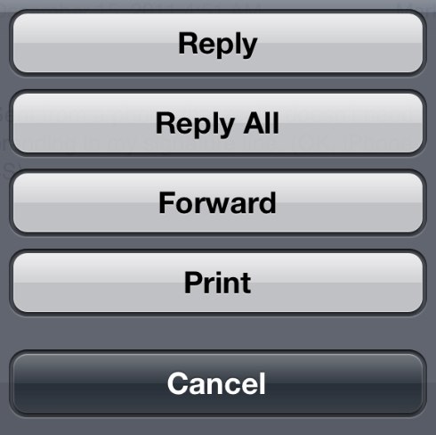
Now, the iPhone has buttons at the top and bottom of its email window, too. But two key differences. First, a single reply button is smart enough to offer all the reply options you need (though you’ll need to take a second tap to actually reply, something not required with a basic reply with the Galaxy Nexus):
Second, the buttons aren’t in the email itself. If you scroll down in your email on the Galaxy Nexus, the reply buttons disappear. You read to the end of the email, think “Hmm, I want to reply,” and then you have to scroll back up to do so.
If you do reply, more menus are offered, as you can see on the left:
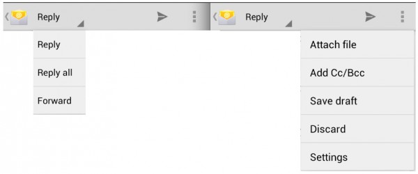
If a single button had asked about me doing reply, reply all or forward at first — as the iPhone does — I might not need this reply menu.
Meanwhile on the right, in the screenshot above, there’s an option to save a draft of what you were writing.
With the iPhone, if you hit cancel after entering something, it asks if you want to save a draft. With the Galaxy Nexus, you have to know to use a menu. Fortunately, if you don’t use the menu and exit, the Galaxy Nexus will save a draft anyway. So, then, why ask about saving?
Meanwhile every time I send email, I get confused. The iPhone has a Send button. It even clearly says Send:
In contrast, the Galaxy Nexus has this weird little arrow at the top that I’ve yet to learn means to send:
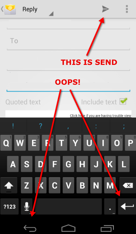
Instead, I keep heading for that arrow down below that’s really my return key or occasionally my back button from the system menu.
By the way, when you delete a message, it will auto-advance to a newer message. That’s a pain if you’re like me and read from older to newer messages. But under General > Settings > Auto-advance, this is easily changed. Phew!
There are more issues, enough so that if I were permanently going to use this phone, I’d probably seek out a different email client. That’s disappointing.
Screen Resolution Great, But Browsing Has Some Issues
The Galaxy Nexus screen is beautiful. When the iPhone’s Retina display came out, I definitely noticed a difference. This is the first Android phone that’s felt like it caught up in crispness.
Of course, you’ll see much more simply because the screen is bigger and has more resolution, 4.65″ and 1280×720 to the iPhone 4S screen of 3.5″ and 960×640.
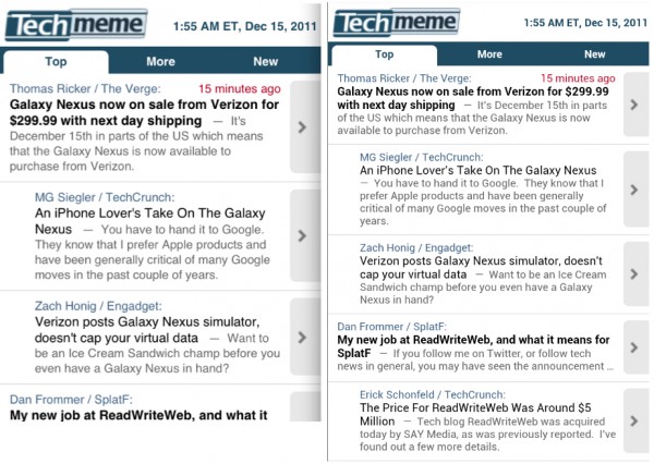
Here’s an example of the extra real estate, what my iPhone and Galaxy Nexus both showed for the same page. The iPhone screen is on the left; the Galaxy Nexus is on the right (and that’s true for the other examples below):
But to me, it’s not just that you can see more. The crispness also means you can read all you can see, in those screenshots above. There’s no need to zoom in.
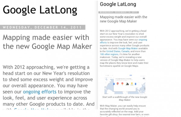
Crisp resolution might not make that much of a difference as you actually browse, however. Here, a story on the Google LatLong blog gets auto-zoomed by the iPhone while the Galaxy Nexus stays wide (I’ve added a border so you can fully understand how much white space was left with the Galaxy Nexus rendering):
In this case, the iPhone is nicer in that the text fills the screen, making it a bit easier to read. But tap twice on the text with the Galaxy Nexus, and it zooms to fill the screen as well. An extra step, but you can read a lot more in one go.
Here’s another case from the Consumerist, where both browsers rendered pulled back to the degree that you’d probably want to zoom to read in both cases:
Double-tap to zoom work in either case, but with the Galaxy Nexus, you have to adjust after doing it. Here’s how both zoomed:
Now, all the side-by-sides above were done by using screenshots from both phones and putting them together in my editing program. That means the sizing’s not perfect. The iPhone screens look larger than if I’d taken a picture of both phones next to each other.
I might try that in the future, but that doesn’t take away from the real issue. Both have great screens. The Galaxy Nexus will show you more. But I consistently found odd rendering with the Nexus like you see above, where the double-tap zooming didn’t quite fill the page right. It was a minor irritant, but one I hope will get fixed.
A far bigger issue was flipping through open pages. The iPhone shows the number of open windows you have at the bottom of your browsing screen, and selecting that makes it easy to flip through what’s open:
With the Galaxy Nexus, I continually confused the Recent Apps button at the bottom of the screen with the actual button I needed, the Open Windows button at the top:

Over time, I suppose I’ll learn. But it’s confusing to have an option that lets you flip through apps (I’ll come back to this) when you’re also trying to find something to flip through pages. What I really want is for my open pages to be separate apps I could get to.
Finally, one thing I really love is the “Request Desktop Site” option on the Galaxy Nexus, which the iPhone lacks. I’ve used this plenty of times.
Taking Pictures & Video
In general, the picture quality of the Galaxy Nexus is fine. I could do side-by-sides and try to figure out if my iPhone 4S camera with 8 megapixels is better than the 5 megapixel camera of the Galaxy Nexus.
But as I always say in these reviews, c’mon — it’s a phone. Pretty much any phone is going to shoot decent enough pictures for the types of reasons people use it: a spur of the moment shot, when just getting a shot, rather than the best quality shot, is the priority.
Instead, I find that the photo controls are often more important to me, when using my phone. If I’m shooting into light, can I overexpose? If it’s dark, is there an easy night-setting I can use?
I love shooting panorama shots and do it all the time with my Droid Charge. The downside is that the Charge requires me to shoot eight frames. With the Galaxy Nexus, I can record as wide or not as I like. Nice. That’s not something you can do natively with the iPhone.
As I previously wrote, the Nexus also has a range of scene controls that are handy, along with exposure controls. There aren’t as many as with the Droid Charge. This continues to be an area where handset makers can add value to Android. But they’re far more than the iPhone, which offers none natively.
Another surprise was when shooting video, you can zoom in and out. This is the first smartphone I can recall offering this feature. Perhaps others may have this, and I’ve missed it. But I know it’s not offered on the iPhone 4.
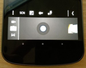
The main thing that drives me crazy are the disappearing system buttons with the Galaxy Nexus. In camera mode, it decides to turn these into dots:
As a result, I seem to always clicking them accidentally and exiting camera mode.
Photo Sharing Natively To More Than Twitter
I share a lot from my phone, but how the apps work is really down to the individual social media companies, not to the Galaxy Nexus or Android 4. But some of how photo sharing is handled seems to be a hardware-specific feature.
With Twitter or Facebook, if you want to share a photo, the iPhone app asks if you want to take a fresh picture or choose from your library. If you use a library pic, you’re taken to your camera roll, where the latest picture you’ve taken easy to find.
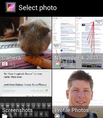 With the Galaxy Nexus, you choose whether to take a photo or go to your library using different buttons, which is a slight time-saver. But if you go to your library, you then have to pick from a variety of libraries. I have things like “Camera” or “November 4, 2011” or “Screenshots,” as you can see on the right.
I’m not exactly sure how my pictures got grouped this way. Some of it may be due to my Google account mixing camera photos with those from Google+ and Picasa. But on my Droid Charge, while there are also some various albums, these are far less than with my Galaxy Nexus.
However it happens, last picture in, that’s what I want to share generally makes more sense. That’s also how things work with the Google+ app on the Galaxy Nexus, for whatever reason. In that case, pictures are listed chronologically, with the most recent at the top.
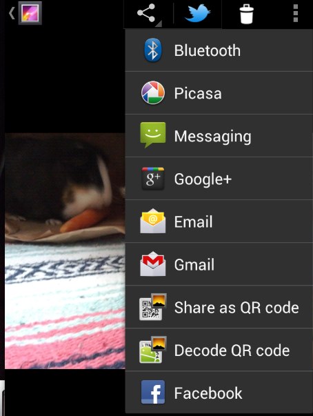
Another way of sharing is from the picture itself. Here, the Galaxy Nexus does better than the iPhone. The iPhone lets you send a picture to Twitter. The Nexus (like my Droid Charge does) lets you also send to Google+ and Facebook:
Task Manager Is Tiresome
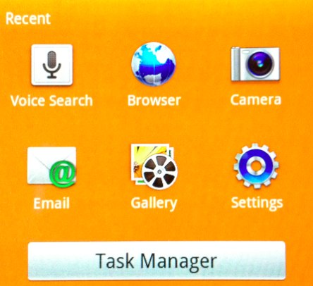
With Android 2, a hard press on the home button opened a task manager/swapper. Android 4 introduces the Recent Apps button.
So far, this has failed to grow on me. I should like it. It is easy to flip through what you’ve had running recently. But for some reason, I find it almost overwhelming.
I think this is because with Android 2, you can easily see the apps you’ve been running in one go:
Similarly, with a hard press on the iPhone’s main button, you get an at-a-glance view:

But with Recent Apps, I’m having to scroll through more than I want to in order to return to a particular task:
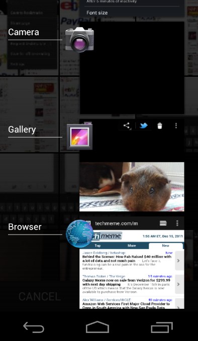
Far more screen real estate is used to show me fewer options. As a result, I’m finding it easier to ignore the Recent Apps button and go back to the home screen.
It is pretty cool that you can “swipe” away any item in recent apps to remove it. That’s a way of keeping your Recent Apps list tidy and focusing on what you want the most, but it won’t be static display, and it still doesn’t show as many apps at-a-glance as with Android 2.
Menu, Menu, Where’s The Menu?
Another thing that drives me crazy is that the Galaxy Nexus has dropped the system-wide menu/settings button that used to exist. Now, I never know where to go to find settings for a program.
With the Galaxy Nexus, apps put the menu/settings button all over the place. The browser has it up top in the “chrome” outside of the actual content:

Email has it up top but within the content of the email:
![]()
Email also puts it at the bottom above the system buttons:
![]()
Facebook and Foursquare put it at the bottom but outside the app, making it appear next to the system buttons:

The photo gallery has it at the top, outside the application:
![]()
The iPhone, like the Galaxy Nexus, lacks a system-wide menu/settings button. So why doesn’t it suffer the same problem? I think it’s because the iPhone never had a button at all. I get the impression this caused app designers to think more intuitively about where and how to surface a button leading to controls.
Searching For The Search Button
Another change with Galaxy Nexus and Android 4 is that the system-wide search button is gone. I miss it terribly.
I’ve used that button so often on my Droid Charge to speak searches or voice commands like “Navigate to…” followed by a place name to quickly launch the GPS. It worked. It worked well.
To do the same thing on the Galaxy Nexus, I have to reach up high with my thumb and make sure I’ve hit the microphone icon in the search box. That might sound like a little thing, but it becomes annoying over time, especially when the other way worked so well.
Meanwhile, with an app like Foursquare or Twitter, on my “old” Droid Charge, the Search button still works to give me a simple direct way to search within those apps. With the Galaxy Nexus, I have to find where the Foursquare soft search button is. With Twitter, I have to actually click a tab to be able to reach search.
Ironically, with the iPhone 4S having Siri, though a long-click on the home button, I feel like it’s actually easier to voice search on the iPhone than on the platform that popularized voice search, Android.
Battery Life & Background Processes
Until recently, I assumed that the Galaxy Nexus just had cruddy battery life. In reality, it’s on par with my other phones. The missing link was that I hadn’t disabled background data, as I have on my other phones.
With Android 2, this is generally a fairly easy option to find. Here it is on my Droid Charge:
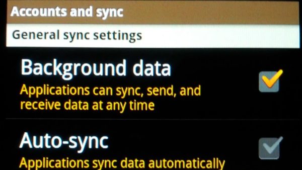
With Android 4, it’s pretty buried. Because I turned off everything in my Accounts & Sync screen, I’d assumed that was stopping background requests. I certainly didn’t find any other options to control this.
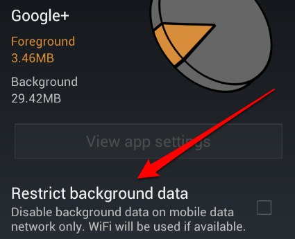
However, after I kept getting notifications from all types of apps on my phone, I started looking deeper. Under the menu option for Data Usage, there’s a Restrict Background Data tick box:

For that to work, you first have to set a mobile data limit, which is annoying. Not hard, just an annoying extra step. After that, you can globally restrict background data. Alternatively, from the Data Usage screen, you can pick individual apps to restrict:
Where’s Find My Android?
About two months ago, I lost my Droid Charge in a cab. Fortunately, it was turned in to the cab company, and I got it back the next day.
While it was lost, I learned to really appreciate the Find My iPhone feature that’s baked into the iPhone for free. Using it, I could have tracked my phone, locked it or even remotely wiped it.
For Android, you have to find a third party app to do all this. That means you also have to find some third party that you’re going to trust. Alternatively, your carrier might offer this — though finding Verizon offered it for $7 per month, and only at purchase time, made me pretty grumpy.
I settled on Lookout Premium, a $30 per year solution that already helped me find my phone once, making it scream where it was in my hotel room even though I’d had it set to silent.
But this is something you’d think Google would have baked into Android by now, at least into its own brand of phone.
Phone Calls
Call quality is pretty crap on the Galaxy Nexus. But it’s pretty crap on my iPhone 4. It’s pretty crap on my Droid Charge. I use Google Voice in most instances, so maybe that’s the problem.
Then again, when I don’t use Google Voice, call quality is still crap. I’ve learned to live with the fact that with any smartphone, I have to repeat everything over and over again. Ah, technology, leading us from best to good enough.
I don’t like it, but I don’t talk much on the phone. It’s more a portable computer to me. But I do resent being charged for “voice” by networks that all seem to be unable to actually let me communicate by voice well.
Now get off my lawn.
Google Voice Continues To Rock
One thing I continue to love about Android is the tight integration with Google Voice. I have one phone number that currently calls my two regular cell phones as well as any review phones I have.
That’s not a normal case for most people, but I love that my phone number is mine. That if I want to walk away from a carrier, I can point the number immediately somewhere else without having to wait for a port. That’s something anyone can do with Google Voice.
If you’re a Google Voice user, Android continues to have the edge here over the iPhone. Yes, you can use Google Voice on the iPhone. I do. It’s just a pain.
GPS Navigation Rocks Even More
Having GPS isn’t new to the Galaxy Nexus, but this is another feature that continues to make me reach for my Android phone over my iPhone. I’ve got a decent GPS, wherever I go.
I use this feature all the time, far more than I ever thought I would. There are plenty of times I’ve gone with the iPhone, found myself needing to drive somewhere and wishing I had my Android phone instead.
There are options for the iPhone you can get, I know, some free, some paid. But GPS being baked into Android is one of those advantages that the platform has.
Real 4G
A last thing before concluding. Another key advantage this phone has over the iPhone is that it runs on Verizon’s 4G network. By 4G, I mean real 4G — super fast, not the mock-4G most of the other carriers talk about.
My iPhone 4 is on AT&T, so it’s supposed to be as fast as you can get short of the limited LTE support that’s just rolling out on AT&T.
My Droid Charge, a Verizon 4G LTE phone, leaves the iPhone 4 in the dust. I can upload eight photos to Google+ within a few seconds, while the iPhone takes a minute or longer. It’s fast. And I also find it available in cities I travel to all over the US.
If you really care about speed, right now a Verizon Android phone is the way to go. Whether that means the Galaxy Nexus phone, well, let’s get to that conclusion.
Should You Get It?
Who should get this phone?
- Anyone who really loves Android
- Anyone thinking about going to Android who doesn’t yet have a phone
- Anyone due for an Android hardware upgrade and who likes having the latest product
- Anyone sick of waiting for an Android software upgrade
- Anyone who uses Google products a lot
Who shouldn’t get this phone?
- Anyone who loves their iPhone
- Anyone who feels their current phone bandwidth is fast enough
- Anyone happy enough with their current Android phone
- Anyone who uses Apple products a lot
Those are my best guesses, and they won’t include everyone or all cases. But to expand a bit more….
This is a beautiful phone. It’s fast, both in switching apps and — if it matches my other Verizon 4G phone — in pulling down data.
My Droid Charge, recently (and finally after nearly a year), got upgraded to Android 2.3. Despite that, it still feels as buggy as hell. For all the speed gain I get with data, I’m losing that as I have to load my email program, watch it crash, then load it again just to read my mail.
For me, or any Android user suffering crashes, going to Android 4.0 is like a massive bug fix. I’ll be making the jump, because I’m tired of wondering when and if Android 4.0 will ever come to my Droid Charge.
But it’s also a business expense for me, so I don’t have to weigh it heavily. If I did, I could easily tick along without this upgrade. While it’s beautiful and fast, in some ways, I feel like the Galaxy Nexus is also taking away some features I like in Android 2.0.
This definitely isn’t the iPhone. I don’t even feel like the Android 4.0 software makes things more elegant or simple in the way that so many find the iPhone to be. In some ways, I find Android 4.0 more complex than Android 2.0. But I’m hoping it’s an important stepping stone to somehow getting to that simplicity.
That’s my take. Others will have different views, and a range of reviews are showing up here on Techmeme that you should check out. I’d especially suggest seeing MG Siegler’s comparison to the iPhone 4 and Jason Kincaid’s review from an Android-lover’s perspective.
The phone launches officially today with Verizon for $300 (OK, $299, on a two year contract). You’ll find it info here at Verizon. It will also come to AT&T and T-Mobile (in versions that won’t work with Verizon), but no release date has been set for those networks.Watch Google’s own page for more on that.
Eventually, Android 4.0 will come to other phones, but it’s anyone’s guess as to when that will happen. From what I’ve read, don’t expect to see for at least three to six months, as handset makers go through the certification process.
Related Stories
- Schmidt: Forcing Carriers To Provide “Clean” Android Would Violate Principle Of Open Source
- The Best Android Fragmentation Example: No Google Search App On Android 2.1
- My Life With Google Voice Number Porting, Six Months In
- Life With The Droid X & Do We Need Super Sized Phones?
- A Tale Of Three Android Phones: Droid 2, Samsung Fascinate & Google Nexus S
- Verizon 4G Android Faceoff: HTC ThunderBolt Vs. Samsung Droid Charge
- Google Wallet Surprisingly Easy To Use
- How Siri Patches Up The iPhone’s Voice Search Weakness Vs. Android
- Head To Head: Siri Vs. Google Voice Actions
- First Impressions: Galaxy Nexus Android 4.0 Smartphone
- The Kindle Fire Is A Kindle-Killer, Not An iPad Killer — That’s Why It Works
Contributing authors are invited to create content for MarTech and are chosen for their expertise and contribution to the martech community. Our contributors work under the oversight of the editorial staff and contributions are checked for quality and relevance to our readers. MarTech is owned by Semrush. Contributor was not asked to make any direct or indirect mentions of Semrush. The opinions they express are their own.
Related stories
New on MarTech
