Enhance Your Creativity Through Analytics
Think data analysis and creativity are mutually exclusive? Contributor Brian Massey explains how the two can and should work together.

“Addiction Torments Addicts and their Love Ones.” This is a headline that conversion optimization specialist Mike Perla tested for the website of an addiction treatment center. The control headline was, “A Place of New Beginnings.”
Both headlines required creativity. The first is a complete story in seven words. There’s an antagonist (the Addiction), a protagonist (the addicts and loved ones), and a central conflict of torment.
The control draws on primal memories of a time when mistakes can be put behind us. (Example courtesy of Which Test Won.)
Two headlines, each based on sound creative communication principles. Shouldn’t it be sufficient to pick one and move on?
As we will find out, one of these was a “better” creative than the other when considered along with the business purpose of the website.
An Abundance Of Good Creative Ideas
Much of the literature that I read on data analysis paints a false picture of the process. The picture is that of an eggheaded data scientist scanning spreadsheets and graphs for clues to questions not yet asked.
It seems that there is some kind of mutant marketer devoid of the right hemisphere of its brain – the hemisphere associated with symbolic thought and creativity – laboring away in front of a wall of screens searching for a needle in a digital haystack.

Left brain, Right brain
This is not the way things happen, even in an eggheaded company like ours.
When we do our analysis, we begin by coming up with creative ideas about why a particular part of a website is or is not working for the business. We have the same conversations heard in companies and agencies the world over.
- What if we changed the headline or image?
- What if we changed the call to action on the button?
- What if we reduced the number of fields in the form?
- What if we made the free shipping message more evident?
- What if we redesigned this page completely?
Like any well-trained designer or writer, we stretch ourselves creatively. We look for “corner cases,” or extreme changes. We try to incorporate non-intuitive thinking, pulling ideas out of left field and putting them on the pitcher’s mound.
In the end, we end up with a long list of good creative ideas for making a website more interesting, more engaging, better at communicating and better at making money.
Without some way of sizing these ideas up, we must simply pick the ones we like best and run with them.
A Dearth Of Data
Like the image of our eggheaded data scientist sitting in a room covered with monitors, there is a similarly false image of marketing creatives. It is the Mad Men image of bright people sitting around coming up with great ideas until BOOM the right one emerges.
To be fair, these ideas are often based on research, traditionally self-reported research such as focus groups. Unfortunately, when we are asked to explain why we buy something, we tell lies. This is human nature and a discussion for another day.
Today, the creative process is backstopped by a search for evidence. For any creative idea there is now a fossil record that can be accessed in the form of web analytics.
There are two primary kinds of analytics you can use to validate your creative ideas:
1. Behavioral analytics like those delivered by Google Analytics and Adobe SiteCatalyst. These tools track the page-to-page behavior of visitors en masse.

Behavioral data tells us how visitors navigate across our website from entry to exit.
2. User interaction analytics like those delivered by Crazy Egg and ClickTale. These tools use heatmaps and session replays to uncover the way visitors interact with specific pages.

User interaction analytics tell us where visitors click on a page and how far they scroll.
With these tools, we can look for evidence that our creative ideas will make a difference.
From Creative To Proof
An online business owner recently lamented, “We have the best prices and free shipping. Why aren’t people buying from us? Do I need to put up a neon sign telling them to just buy?!” In exasperation, this is exactly what he decided to do. In scientist terms, his hypothesis is, “If I make my call-to-action button more noticeable, more visitors will buy.”
How would we find evidence that the call-to-action button is the issue?
For most ecommerce sites, the “Add to Cart” or “Add to Bag” button is found on the product detail page, or just Product Page.
We can look at our behavioral database to speculate on two questions: Are visitors serious about buying? If so, are they confounded by our call-to-action?
It just so happens that our analytics packages are equipped to tell us these two things.

Google Analytics lets us look at just product pages for clues to support our creative.
In the above table, we see from the first column that the product pages represent 20.35% of all page views on the site. The other 80% will be on the home page, on category pages and on landing pages.
The third column of numbers gives us an average of the time visitors spend on product pages. It’s higher the average time spent on all pages of the site, so visitors aren’t whizzing past these pages, but they aren’t lingering, either.
The seventh column, % Exit, tells us that 17.88% of visits end on these pages. This number is below the site average, but why is this the terminus for 18% of visitors? Are our prices too high? Is our description poor or our pictures wanting? Is our call-to-action button not being seen?
The sixth column shows a bounce rate considerably higher than the site average. This means that 61.77% of visitors are leaving after seeing this page. We can deduce from this that visitors coming to this page directly aren’t being grabbed.
There is some evidence that these pages are not performing at their peak. The high bounce rate and average exit % tell us we can be doing better.
Do we see something in the way visitors are interacting with the site that we should pay attention to?

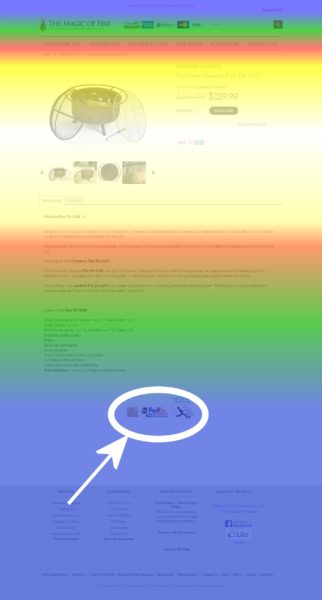
A scrollmap tells us how our visitors are scrolling.
A scroll map is one report presented by click-tracking software. The “hotter” the shaded color, the more eyes are seeing it. Where it is cool green and blue, we can be sure few are getting the chance to see that information.
Our example scroll map is typical of many of them. It’s hot near the top, but quickly gets cool “below the fold.”

The Add to Cart button is seen by a large percentage of visitors.
So, where is our call-to-action button? It’s right in the middle of a band of high attention. Hmmm. Our hypothesis that making the Add to Cart button bigger and brighter isn’t holding up too well. One thing is for sure: if we change the Add to Cart button, many people will see it.
There is something else that we see from this scroll map, though. There, in a sea of blue near the bottom of the page is a very important piece of information: “Free Shipping.”

Free shipping won’t work for you if nobody knows about it.
This tells us that there may be a better creative hypothesis available: “If we mention free shipping somewhere in the hot part of the page, more people will see it and are more likely to buy from us.”
Which should we test first? There is more “evidence” in the scroll map report that the free shipping offer is being missed by visitors than the “Add to Cart” button. I would test the free shipping hypothesis first.
Other Sources Of Proof
There are many other places we could look to bolster our hypothesis.
- Search live chat transcripts for the word “shipping” or “free shipping.”
- Survey our competition to see if they are offering free shipping.
- Ask our customer service folks if they get questions about free shipping often.
Every “creative” idea can be verified or disproved by a dedicated search for proof.
When The Data Don’t Exist
I don’t know if Mike Perla had analytics evidence to support his headline hypothesis. But we know he decided to collect the data to support it.
He did a split test.
You can look at testing as a way to collect data about your hypothesis. The data from a split test is very convincing.
What did Perla find in his test?
The story headline (“Addiction torments addicts and their loved ones”) increased conversions by a whopping 184% over “A Place Of New Beginnings”.
To summarize, we can use analytics, click-tracking and other analytics data to help us choose what to test. Then we use split testing to provide the kind of data that is hard to argue with.
This is how the creative design process is supported and guided by data. Both are necessary. Designers and writers can be supported in their creative decisions by data created by the people they are designing and writing for.
What creative ideas do you need data for? Let me know in the comments and I’ll tell you where to look for support.
Contributing authors are invited to create content for MarTech and are chosen for their expertise and contribution to the martech community. Our contributors work under the oversight of the editorial staff and contributions are checked for quality and relevance to our readers. MarTech is owned by Semrush. Contributor was not asked to make any direct or indirect mentions of Semrush. The opinions they express are their own.
Related stories
New on MarTech