The Power Of The Call to Action & How Its Strength Boosts Conversions
The call to action is a key ingredient to any effective marketing program. Columnist Jeremy Smith explains how CTAs work and what every one of them must have to be successful.
 If you have a website, you have a call to action, or CTA — multiple CTAs, probably. There’s no such thing as a successful marketing campaign unless there is a successful CTA.
Conversions, revenue, business and profit — they all depend on the mighty call to action. The CTA is so powerful, so important and so foundational to the success of any online marketing initiative that I just have to tell you how to develop CTAs that will benefit your business.
I know this from working as a consultant to dozens of businesses and coaching hundreds of marketers. This information is too important to sit on.

So below, I’m going to describe what a CTA is and the many forms it can take, and how to make sure your CTAs contain the basic elements that must exist to make them work well for you.
No, seriously…
Who’s Calling Who To What Action?
The call to action, better known as the “CTA,” is an appeal to users, inviting their response. In digital marketing, the CTA is usually a button with copy.
Conversion is simply getting someone to respond to some kind of a call to action. A successful CTA results in a conversion. Most of the time, it involves a click or tap on a button.
There are literally thousands of different types of calls to action. You can use a call to action whenever you want the user to do something or respond in some way.
A CTA can be used to spur users to take any step: download a PDF, fill out a form, buy a product, or even just click through to another page.
Michael Aagaard of Unbounce calls the CTA the “tipping point between bounce and conversion.”
Here are some of the most common types of CTAs:
- Buy buttons/“Add to cart”
- Information-gathering forms
- Subscription signups
- “Read More”
- “Try it Now”
- Social media share buttons/widgets
- Help — now a friendlier “Online Chat” in many cases
Here’s how and where you’re likely to encounter CTAs:
- Persistent headers — like Hello Bar
- Pop-ups and slide-ins
- Side panels
- Purchase pages
- End of page, article, post
- In ads
The fact is, CTAs can go just about anywhere. And they should. Posting CTAs all over your website is a great way to attract more conversions.
What’s In Your CTA?
A CTA is meant to entice a website visitor to take a specific action that benefits you. You must pour every creative, compelling and persuasive effort into making your CTA as good as it can possibly be.
There are three main features to a CTA:
- Where it is (Placement).
- What it looks like (Design).
- What it says (Copy or Text).
Tim Ash, CEO of SiteTuners, writes this about the CTA:
[blockquote] For your CTAs to work, two things need to happen. First, visitors need to be able to spot them without any effort. Second, visitors must instantly know what they do.[/blockquote]
His advice dovetails with my outline. In order to easily spot the CTA, it has to be 1) placed correctly and 2) designed accurately. And in order to know what to do, 3) the text on the CTA must be very clear and compelling.
Let’s take a deeper dive.
Placement
There are three basics to CTA placement:
Have multiple CTAs. There is a mistaken notion that there should only be a single CTA on a page. The more CTAs on a page, the more chances the user has to convert at any point on the page. Use CTAs liberally, and your conversions will go up.
But CTAs on a page must not compete with each other. Don’t confuse the user with too many options. Choice paralysis can too easily set in, causing the user to make no choice at all.
Put CTAs on every page. Every page gives users a new opportunity to do something — to convert in some way. So why not add a CTA? Not just “Why not?” — do it. Give users the opportunity to convert.
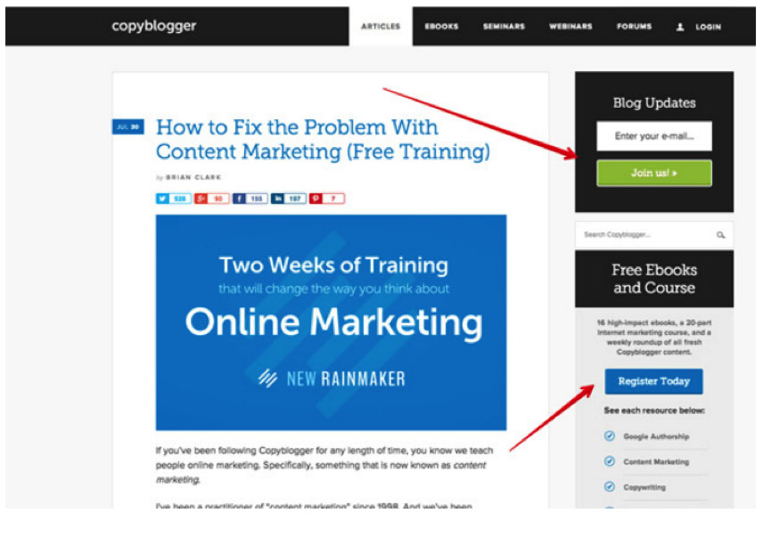
Make CTAs prominent. Place your CTAs strategically, so that they receive maximum attention and visual focus. Multiple eye-tracking studies have shown that website users scan pages in an F shape.
Starting in the upper-left corner, a user typically makes two glances across the page horizontally, then looks (and/or scrolls) vertically down the left. This suggests you should place CTAs in headers, side-panels and at the end of the page, article, post and so on.
But as always, you should test to find out what works for visitors to your site.
Here’s a great example of side-panel placement. One glance across the page — Join us! Second glance across the page — Register Today. Bang. Boom.
Design
As the marketing and conversion expert, you must use your best judgment and research to guide creation of the CTA. Your designer will do the hands-on work and will likely have good ideas, but you need to make sure the final product does what it’s meant to do and doesn’t just sit there and look good.
Make sure your CTAs are designed to be:
Recognizable. As ConversionXL says, people spend most of their time on other websites and are accustomed to common wording, like “prices” or “log in.” Don’t let your message get lost in a fog of creativity. People must recognize your CTA as something they are meant to click on.
Well-Defined. A CTA should be part of the page but set off from the main body of text. Use a stark outline or shadow and/or contrasting colors to provide a clear definition to your CTA.
You can also use negative space to define your CTA. Negative space is an empty area around the CTA (or any design element). Sitepoint defines “negative space” as “the breathing room around the subject,” which helps define it and adds to its appeal.
Here’s a great use of negative space:
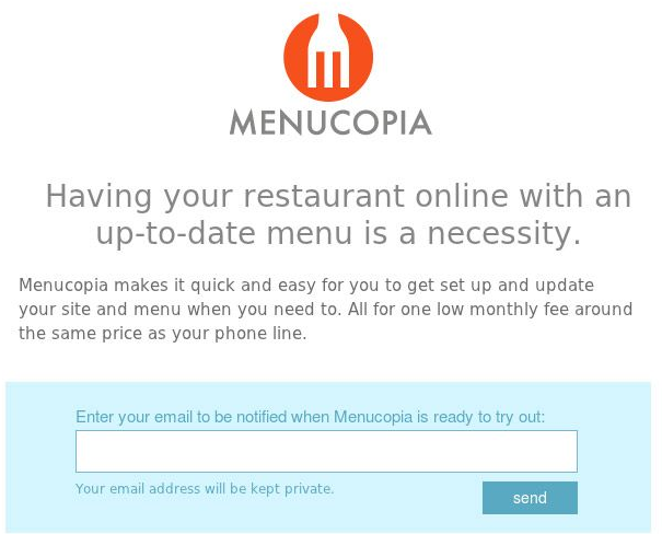
(I’d use a word other than “send” and make the contrasting color a bit more pronounced, but still, it’s a nice example of how negative space makes a CTA stand out.)
Striking. Your CTA must stand out; it should call out to the user. To do this, for starters, it should introduce a strong, contrasting color to the page.
Below, the orange pops out of the white background. It contrasts not only with the white of the background, but also with the website’s blue color scheme.

You might think it’s common sense to use a colorful button as part of your CTA. But not everyone does it. For example …

This CTA is so grayed out that I feel like I’m not supposed to be looking at it, let alone clicking the boring “subscribe” button.
Color has an important but disputed role in CTAs. You’ll hear the wonder stories of people who switched the button color on their CTA and saw conversions explode by 15,000,000 percent. It happens — sometimes.
But button color alone is not the key to successful CTAs. It’s relevant, sure, but there’s no secret formula to success.
I can’t tell you what color to make your CTA button. The right color depends on your audience, your product, your overall color scheme and a host of other variables.
I agree with user experience strategist Naomi Niles on this issue:
Next time I see an article telling people to increase their conversion rate by using one color instead of another, I’m going to cry.
— Naomi Niles (@NaomiNiles) December 10, 2012
Appealing. Here’s where a good designer will earn her keep. Your CTA’s look should draw people to it. Colors, image and typeface create appeal when used correctly together.
One of the most well-known design tips is that the most compelling design element you can use is the image of a person looking back at the viewer. Why do you think the concept of “cover girls” was created?
This pop-up CTA strategically uses bold colors, the image of a person (the author) and a sans-serif typeface to provide aesthetic appeal and adds a streamlined call to action:

Copy
Photos and video are a plus, but websites still rely on words to get the job done when it comes to conversions. It comes back to the old adage, “You have to ask for the sale.” Unbounce’s Aagaard insists that the copy is the most important feature of a CTA:
[blockquote] But in that last critical moment, when the prospect has to make up her mind, the copy itself is what she’s going to interact with. [/blockquote]
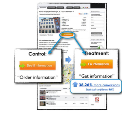
As an example, Aagaard points to a single word change on a CTA button that boosted conversions by 38 percent:
To compel a website visitor to act, the text in your CTA must:
Be clear. Your CTA must have an obvious thrust. The user wants — needs — to know what will happen if he or she clicks your CTA button. Your CTA must match what the user anticipates.
For example, if a visitor to your site is reading about a free e-book you’re offering, then the CTA should make it obvious that he or she will get the free e-book if they click on the button. If you are selling pineapples, the CTA needs to let users know that if they click through, they can buy your pineapples.
This is no time for surprises, secrets or subtlety.
Some CTA buttons, actually say “next” on them. This is just about worthless. You need to tell people what comes next, not push them toward some murky abyss where they’re about to convert with no clue about the “next” they’re getting themselves into.
Here’s an unsettling example of “Next”:
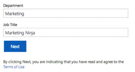
“Next” is not only uncompelling, but by clicking it, I’m submitting myself to some Terms of Use that I don’t have time to read. Pass.
This is much better — clear, compelling and reassuring:

Via ConversionXL
For absolute clarity, it’s hard to beat this babysitting service’s CTA:

Via ConversionXL
Whatever action it is meant to compel, your CTA text needs to say what you mean and mean what you say. Be clear and direct, and make sure the button performs as advertised.
In fact, ConversionXL says when they clicked the Seminole Sitters’ “Pay Now” button, they couldn’t actually pay. That CTA’s grade falls from an A to an F with one click of a mouse.
Use active verbs. Your CTA should be as strong and motion-oriented as possible. It’s a call to ACTION, after all.
The “Holt Handbook Sixth Edition” tells us that when a verb in a sentence is active, the subject of the sentence (the understood “you” in your CTA, i.e., the website visitor) acts or does something. When a verb is passive, its subject receives the action or is acted upon.
Use an action word: Order, Subscribe, Buy, Get, Learn, Discover … “Get” works pretty well, actually. Everyone likes to get something, and we all know what “get” means. It’s short, too.
Here’s a HubSpot CTA:

Communicate value. You’re asking users to act, so you need to make them understand that they’ll get something worthwhile in return. Obviously, this is true if the action is to hand over some money. But any action online is an investment of time and effort, so the ROI must be apparent.
Ask yourself: “What’s in it for the customer? Why should they click here?” Answer those questions in your CTA.
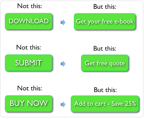
Unbounce’s Aagaard uses these three contrasting examples to depict adding value to a CTA:
[blockquote]The words “download,” “submit,” and “buy now” have zero value for the user. Instead, the user needs to know, I’m getting a book, getting a quote, or saving 25 percent. That’s value. And that’s what’s going to help them convert.[/blockquote]
Remember your value proposition. Remember also that your CTA text doesn’t all have to be a part of the “buy” button. A restatement of your value proposition can explain how the user benefits by clicking the button.
Neil Patel’s “Complete Guide to Understanding Consumer Psychology” explains how a list of benefits on ContentVerve’s CTA helped boost their conversion rates by 83 percent:
[blockquote]One of Aagaard’s website goals is to build his list of newsletter subscribers. He ran a test with two different “sign-up” form variations. The first was a simple “sign-up” call to action. The second articulated the benefits of signing up for ContentVerve’s email list.[/blockquote]
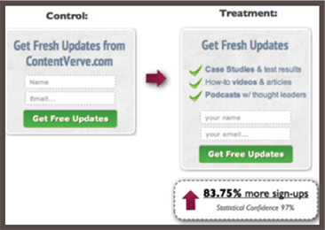
Here we have three benefits of subscribing to a blog:

Provide assurance. Building trust is a big part of ecommerce and conversions. Trust signals are important in landing pages and in CTAs.
You can instill trust with only a few words. A conventional subscribe button adds a layer of trust simply by telling users that they can “unsubscribe at any time,” for example.
This button tells users that they don’t have to use their credit card, another trust signal:

The button for buying Vimeo’s pro subscription assures users that it’s inexpensive, that their questions are probably answered and that under certain conditions (which they explain elsewhere), they can get a refund.

Conclusion
All of your website’s power comes to a fine point in the CTA. The user’s action is what it’s all about. Once you understand the basics of what a CTA is, its function, goal and proper content and usage, then you can create CTAs that improve conversion.
A CTA that works consistently is a creation of art and beauty. Its effectiveness is up to your imagination and your skill.
Start creating CTAs, keep testing your CTAs and allow your conversions to rise.
Contributing authors are invited to create content for MarTech and are chosen for their expertise and contribution to the martech community. Our contributors work under the oversight of the editorial staff and contributions are checked for quality and relevance to our readers. MarTech is owned by Semrush. Contributor was not asked to make any direct or indirect mentions of Semrush. The opinions they express are their own.
Related stories
About the author