How To Leverage Wikipedia Data For Deeper Consumer Insights
Whenever we try to get a better understanding of online consumer behaviors, we tend to look to Google for answers — either via the Google Keyword Planner to understand the quantitative volume of searches (aka the consumer interest) or by looking at Google Trends to understand trending and seasonality. Anyone working in search knows the […]
Whenever we try to get a better understanding of online consumer behaviors, we tend to look to Google for answers — either via the Google Keyword Planner to understand the quantitative volume of searches (aka the consumer interest) or by looking at Google Trends to understand trending and seasonality.
Anyone working in search knows the downfalls of using these tools. Primarily, the data are aggregated by either week or month, removing any opportunity to explore daily or day part trends. The data are also heavily delayed — and, living in today’s adaptive real-time environment, we need the data as fast and as granular as possible.
The other issue with Google Keyword-centric data is the fact that Google is constantly changing the way it treats/aggregates keywords, and it has become slightly dangerous to rely on Google-specific metrics for planning or insights.
The other option available to marketers is panel-based data such as ComScore, Compete, Nielsen or SimilarWeb. Panel data is behavioral data based on a specific subset of the population, usually collected through plugins, toolbars or ISPs. And while panel data provides a nice insight into the overall relative landscape, I would not trust its numbers too much as they are easily confused by changes in technology. If you have ever worked with panel data, you all have seen the oddities. (Remember Alexa?)
So, where do I go if I want to understand behavior in actual real-world metrics, and as recent as yesterday or as granular as time of day? There is a rich and often overlooked source of data: WIKIPEDIA.

Yes, Wikipedia . . . And Here’s Why:
- Wikipedia ranks highly for almost all terms that matter
- It’s a trusted source of information on millions of topics
- Content intent is very clear on Wikipedia
- And finally, they give away their pageview data for free
We looked across approximately 1,000 one-to-two-phrase keywords and found that Wikipedia ranked on page 1 for 82% of them. And in those cases, it ranked on average in position #4. This type of visibility makes Wikipedia traffic a very clear indicator for the behavior of information-seeking users.
So, how do you get this magical data? Does it cost money? Do you need an API? Do you need to build a database stack? No — you just need a browser and lots of memory.
Wikimedia.org allows you to download the raw hourly logs of any Wikipedia page. For true historic insights, it allows you to get by-the-hour historic logs all the way back to December 2007. And just to be clear that you understand the power of this data, I mean:
Hourly page views for every Wikipedia page in any language on any platform since 2007.
Enough talking; in order for you to get your hands on this data, all you have to do is visit the following URL on Wikimedia: https://dumps.wikimedia.org/other/pagecounts-raw/
Wikimedia describes the source of the data as follows:
Each request of a page, whether for editing or reading, whether a “special page” such as a log of actions generated on the fly, or an article from Wikipedia or one of the other projects, reaches one of our squid caching hosts and the request is sent via udp to a filter which tosses requests from our internal hosts, as well as requests for wikis that aren’t among our general projects. This filter writes out the project name, the size of the page requested, and the title of the page requested.
What that really means is that they have a log system that writes each pageview to a log file.
Let’s say you download the file named “pagecounts-20140201–070000.” This file contains the data for all wiki traffic on Feb. 1st, 2014 from 06:00:00-07:00:00 AM. It is in a simple space-delimited format and has rows that look similar to the one below:
en Apple 11568 19783
That means that on Feb. 1, 2014, between 6 and 7 AM, 11,568 people looked at the English Apple page (which has a size of 19783 bytes).
(You can find more information about the data, methodology and process here.)
There are a couple of things to keep in mind when obtaining these files:
- Wikimedia.org is throttling you to a maximum of two simultaneous downloads; after you’ve exceeded that limit, you will get a 403 error for a few minutes.
- These data files are massive. Each hourly file is approximately 80MB compressed (minimum 11GB a day uncompressed).
- The raw downloads contain all languages and media types (mobile, media, books, etc.).
- Make sure the data you want exists before you start joining GBs of files. This tool lets you look at individual page stats.
Do you see where I am going with this? This type of detailed data allows you to create insightful and factual stories that will enable you and your brands to get a better understanding of your audience’s behavior based on their interaction with Wikipedia pages.
The Data At Work
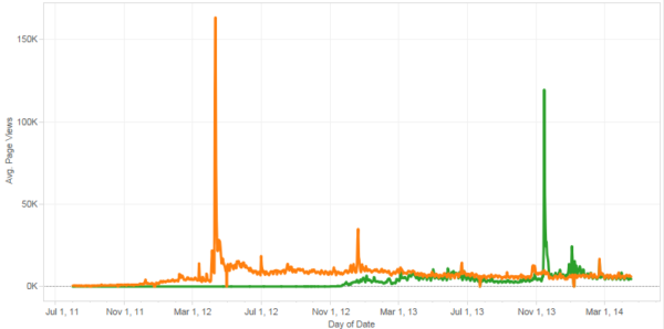
Let’s look at a real-world example of these data. Below you can see the pageviews to the Snapchat and Instagram Wikipedia pages. As you can see, it’s a fairly steady average across both of them, with the exception of some clearly unique and heightened activity on some days. The orange spike is the day the news of Instagram’s acquisition became public, and I am fairly sure you can also guess what the Snapchat spike is all about!

What is really interesting is that when you start analyzing the activity by day, you see an increase in Instagram’s Wikipedia pageviews right up to the acquisition. We can interpret from this spike that a large number of people knew that something was happening; I can easily see investors and stock market players leveraging an indicator like this as a directional indicator for investments. By monitoring companies in this way, you could use these data to inform investment decisions based on these signals.
Another great way to leverage this is to look at an average period (one without spikes) and examine the activity by day-of-week.

As you can see in the bar graph, the activity pattern of Hillary Clinton is very different from the one of Mel Gibson; Mel has a lot of activity on the weekends, while people seem to be more interested in Hillary during the week.
One thing to keep in mind is that there is a Wikipedia page for anything and everything. You can create trend patterns for a variety of topics; so to highlight this, I downloaded the log from an hour ago (which, at the time of this writing, would be April 30th at 8:00 p.m. Western European Time).
After removing some entries that had too few views, irrelevant admin pages, non-English content and anything that was not a page (media, books, etc.), I ended up with a grid that looks like this (28,512 active pages):
Obviously, there is too much data to visualize; therefore, I decided to limit the data and just show TV-show-related content (sized by Views, colored by byte size):
As you can see, this presents a very clear picture of the type of TV research currently being conducted. We also can see that pages with more content (byte size/color) are getting many more eyeballs than shallow, non-rich pages. These hourly insights become especially interesting when you are trying to evaluate second-screen behavior (browsing while watching TV).
These data hold so many more insights than I can describe in this article. Instead of showing you 20 more static graphs, I decided to upload an interactive dashboard with some sample data to Tableau Public, so you can play with it for yourself. The dashboard can be found here:
Or if technology permits, you can play with it right here:
With all the tools we have available to measure consumer intent and behavior online, Wikipedia holds the key to unlocking some terrific near-real-time, granular data around consumer interest. I hope that playing with the data and diving deeper into it has given you some ideas on how to leverage raw data like this to create better insights and actions for your brands.
Contributing authors are invited to create content for MarTech and are chosen for their expertise and contribution to the martech community. Our contributors work under the oversight of the editorial staff and contributions are checked for quality and relevance to our readers. MarTech is owned by Semrush. Contributor was not asked to make any direct or indirect mentions of Semrush. The opinions they express are their own.
Related stories
New on MarTech

