Instagram strips down its logo, apps because they weren’t simple enough already
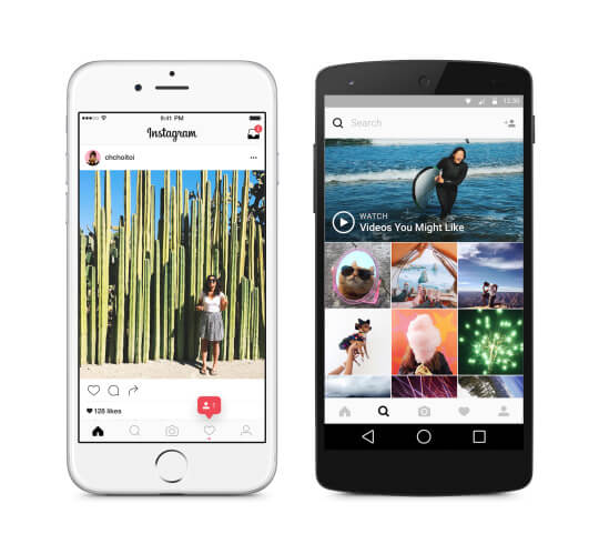
Instagram added color to its iconic logo to modernize it and stripped color from its mobile apps to make people's photos and videos the focus.
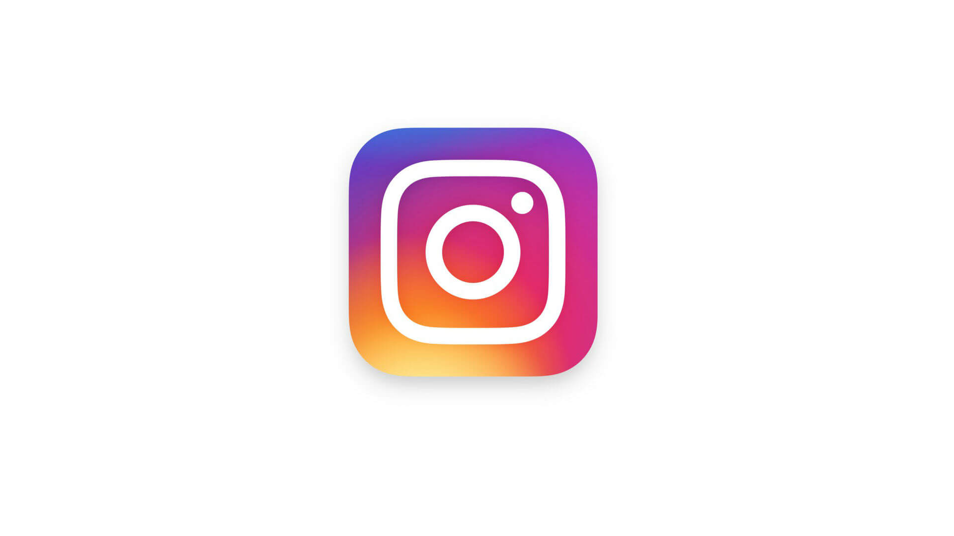
Instagram has redesigned its iconic logo. It’s a lot more colorful and pared-down. It also has redesigned its mobile apps. They’re a lot less colorful and pared-down.
Will this change whether you or 400 million other people continue to use Instagram? Probably not. Will this change how you use Instagram? Probably not.
The redesign doesn’t change anything about how Instagram’s apps actually work, just how they look. Instagram’s head of design, Ian Spalter, said in a Medium post about the redesign that the new look is supposed to make the photos and videos people check out on Instagram even more of the focus. Apparently, that content wasn’t “center stage” enough already.
Contributing authors are invited to create content for MarTech and are chosen for their expertise and contribution to the martech community. Our contributors work under the oversight of the editorial staff and contributions are checked for quality and relevance to our readers. MarTech is owned by Semrush. Contributor was not asked to make any direct or indirect mentions of Semrush. The opinions they express are their own.
Related stories
New on MarTech
About the author