Google Analytics Improves User Interface
Google Analytics announced yesterday a new set of improvements to the User Interface. According to the post: “The primary goal of this update is to bring more attention to the things that matter — your data, and how you analyze it. We improved legibility of score card and table data, and refined our color palette […]
Google Analytics announced yesterday a new set of improvements to the User Interface. According to the post:
“The primary goal of this update is to bring more attention to the things that matter — your data, and how you analyze it. We improved legibility of score card and table data, and refined our color palette to draw attention toward data instead of navigation elements.”
However, the official post does not provide a list of changes, which was significant. In a discussion on Google+, I collected changes people have seen in the interface, below is a summary of the most noteworthy changes:
New Icons
The thumbnails were upgraded on sidebar and now occupy a more prominent place. My only critique is that the icon with a $ sign was used in the Advertising tab, while I believe it should have been used in the Conversions tab. Freud could explain that! Below are the new thumbnails, both on the Standard Reporting, Custom Reporting, and Home.
Improved Graph Area
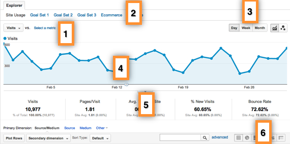
Below are a list of the improvements on the graph area, usually above the tables inside reports and overview tabs. See numbering on screenshot above:
- Increased visibility of “compare to metrics” option.
- Goals tab is more prominent and easy to use, this is a heavily used navigation option.
- The data grouping options (Day, Week, Month…) were brought outside the drop down, making it easier to use.
- Better looking graphs: the points got smaller and more linked to the lines. The graphs does not use Flash anymore, i.e. they can be seen also on iPads/iPhones.
- The strip with the totals are now below the graph, which is more intuitive.
- The types of data visualization above tables are much easier to use outside a drop down.
Functionality Changes
Ability to share advanced segments and dashboards: these changes are extremely important. They were possible in the past, but after Google Analytics v5 it was disabled. Now we have these possibilities again. Below is where to find them:
- Advanced Segments sharing can be found on the following path: click on Admin link on the top navigation => Assets => Advanced Segments => Share
- Dashboards can be found on the Home link (top navigation): to share a dashboard just click on “Share Dashboard” just below the top navigation.
Google Analytics Speed Updates
This announcement comes immediately after another release, from last week, where Google improved the speed of reports and added functionality to the tool. The changes are well documented in their official announcement post, but here are the main changes, for reference:
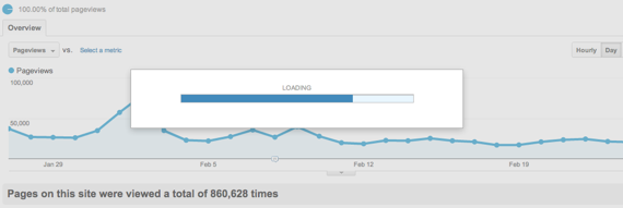
Visual indicator showing the progress of report loading

More transparent usage of sampling: this is an extremely important change, learn more on Google help center.
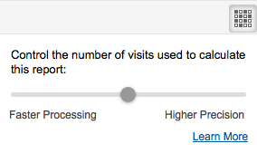
Report calculation control
Google Analytics UI Developments
In an interview with Lucas Pettinati, Google Analytics Lead UX Designer, he shared insights on how those type of UI changes are made on the tool. According to him:
“The past couple of years have been about adding features to Analytics to make it a very feature rich product; in doing that there were a few things we put of. The focus for the next several months will be on quality, how can we better leverage the information that we get from our users about what they really need to do their jobs and impacting the interface like that.”
Contributing authors are invited to create content for MarTech and are chosen for their expertise and contribution to the martech community. Our contributors work under the oversight of the editorial staff and contributions are checked for quality and relevance to our readers. MarTech is owned by Semrush. Contributor was not asked to make any direct or indirect mentions of Semrush. The opinions they express are their own.
Related stories
New on MarTech


