Conversion Optimization: Measuring Usability In The User Experience (UX) – Part 1
Here is the scenario: I am speaking at a conference about the 7 Facets of the User/Searcher Experience. Whenever I can, I try to provide case studies and usability test results to help illustrate each facet. Inevitably, there is somebody in the audience that stereotypes search engine optimization (SEO) professionals. What could an SEO possibly […]
Here is the scenario: I am speaking at a conference about the 7 Facets of the User/Searcher Experience. Whenever I can, I try to provide case studies and usability test results to help illustrate each facet.
Inevitably, there is somebody in the audience that stereotypes search engine optimization (SEO) professionals. What could an SEO possibly know about the user experience? From my perspective, usability is at the top of my UX list. Findability is intricately intertwined with usability. People can’t use what they can’t find.
Through field studies and multiple usability tests, I learned that some users refused or were unable to accomplish specific tasks on a smartphone. In general, these tasks had one of the following issues associated with them:
- Difficult And Time Consuming. In these cases, critical tasks were too difficult and time consuming to complete on a smartphone. Users always used their laptop/desktop computers to accomplish specific, complex tasks.
- Privacy And Trust. In these cases, users did not trust that private information was secure on a smartphone. In the medical industry, patient privacy is a top priority.
- Undecipherable Content. In these cases, specifications and drawings that users needed to view were undecipherable.
I actually observed users trying to complete complex tasks on their smartphones. I saw their frustration. I heard the cursing. The main roadblock was clear: the screen was too small.
Do you notice what I am focusing on in this scenario? I am focusing on task completion, because website usability isn’t about one’s personal opinion. Website usability is not about a “coolness” or “wow” factor. It’s not about forcing your personal beliefs or design preferences onto users. It’s about task completion.
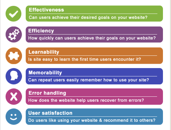
In my article, 4 Things Online Marketers Should Know About User Experience (UX), I showed the following elements of website usability:

Let’s go over each of these usability items.
Effectiveness = Task Completion
At the core of website usability is effectiveness: do specific users (i.e., users who fit a specific persona or profile) complete the task? For conversion optimization, it is a simple measurement. Either users complete the task or they don’t. We call this the completion rate.
If users abandon the task, what were the reasons for abandonment? Usability professionals also measure the accuracy and completeness of users’ completing their tasks. Not only do we identify roadblocks, we also identify where roadblocks occurred during the interface evaluation.
So for conversion optimization, we (1) identify roadblocks, and (2) determine the frequency of abandonment at various roadblocks.
In the scenario I mentioned previously, the main roadblock was very straightforward: the screen size was too small. 100% of users outright said the screen was too small, and some of them did not even attempt the task. They skipped it.
Efficiency = Quick-And-Easy
If a user does complete their desired task, how quickly and easily did they complete it? Usability professionals are looking at roadblocks encountered in this situation, too. Users might have completed the task, but the way they completed it was not very efficient.
Here is an example: we often observe users looking for a specific word or image on a page. SEOs call these keywords. Usability expert Jared Spool calls them trigger words.
If users are unable to locate desired content on a page, they might try alternative means to find that content. They might use a site search. They might go straight to a site map or a site index. They might go to a Customer Support or Help section. Or they quickly view navigation and click the category that seems to lead them to their desired content.
We have to be very careful not to impose our personal opinions onto users. For example, some users prefer to search. These users typically go straight to a site search instead of navigating the site.
Some usability professionals might view site search usage as a failure of navigation labels, when in reality, some users genuinely prefer to search. To them, searching is less time-consuming than browsing.
For conversion optimization, efficiency is tricky to measure. At the fundamental level, we measure:
- The number of steps it took for users to complete the task
- The total amount of time it takes for users to complete a task
- The number of elements on a website that discouraged or prevented users from reaching their goals
When examining the time it takes for users to complete a task, it’s important to break this time town into two distinct categories:
- Help Time: The amount of time users spend dealing with problems such as seeking help (FAQs, site map or site index, site search) or unproductively hunting through the website.
- Productive Time: The proportion of task time not spent in Help Time.
Does this sound like a lot of work? It is; but, I find that I am a better at my many jobs because of usability test results. I always learn something new with each usability study.
For Part 2, we will go over the next two components of website usability: learnability and memorability.
Contributing authors are invited to create content for MarTech and are chosen for their expertise and contribution to the martech community. Our contributors work under the oversight of the editorial staff and contributions are checked for quality and relevance to our readers. MarTech is owned by Semrush. Contributor was not asked to make any direct or indirect mentions of Semrush. The opinions they express are their own.
Related stories
New on MarTech