Analytics: A Beginner’s Guide To Data Visualization
Lately, I have been writing about taking a closer look at your marketing data, and my last piece discussed the design of meaningful dashboards for Google Webmaster tools. I received an overwhelming amount of emails, tweets, and comments asking me about the dashboard tools I used in it. Today, I’ve created a beginner’s guide to […]
Lately, I have been writing about taking a closer look at your marketing data, and my last piece discussed the design of meaningful dashboards for Google Webmaster tools.
I received an overwhelming amount of emails, tweets, and comments asking me about the dashboard tools I used in it. Today, I’ve created a beginner’s guide to data visualization to help you get started with your first dashboard.
The Benefits Of Data Visualization Tools
There are many data visualization tools (DVT) in the marketplace that can help you create interactive dashboards. Of course, each has its pros and cons, so be sure to explore some of them to see what works best for you. My personal preference is either Tibco’s Spotfire or Tableau.
Why would someone want to invest in a tool like Spotfire or Tableau? Can’t you use Excel to accomplish the same thing? From my perspective, DVTs provide a number of benefits.
First and foremost, the capacity of most DVTs far exceeds that of Excel, which maxes-out at 1,048,576 rows by 16,384 columns. However, some DVTs can handle as much data as you have the memory to support. For example, I have worked data in DVTs that exceeds 25 million rows.
DVTs also provide more data connectivity opportunities than Excel does. Some of these applications can connect natively to a data source, which can either be CSV/Excel exports, or direct connections to MYSQL, Google Analytics (GA), etc. This also facilitates scalability. By using a form of reference links instead of imports, you can easily hit a “refresh” button and the data is up to date. That means that once you have built your report, you will never have to create it again.
Besides scalability, DVTs also provide endless and instant flexibility. At their core, they are in-memory analytics tools. That means that they load the data into your computer’s memory and allow you to slice, dice, and analyze data in real time. They also tend to be “read-only,” which means that they don’t adjust your actual data. That encourages experimentation because you don’t have to worry about destroying your data.
DVTs also help you bring together your data from different channels so you can get a more complete picture. This is key because in order to drive results in the digital space, you can no longer look at practices in silos. The same goes for your data. You can’t really create a true story or strategy in the digital space without combining your channels into one place.
How To Create A Dashboard In Tableau
Now that you know why DVTs are worth it, let’s get started building your first dashboard. For this exercise, we will use Tableau. (Note: I am not trying to make this a Tableau guide — they have a ton of “getting started” videos on their site. Instead, my goal is help you think about building your own dashboards, and how you can use them.)
1. Get Tableau. Use this download link to obtain the free or trial version of the tool. Unfortunately, they only have a Windows version, so the Mac and xNIX users among us have to rely on a Virtual Machine for now (Parallels or VM Ware). I am using a VM on my Mac, and there really are no performance drawbacks I can see, as long as you allocate enough memory.
2. Connect Your Data. Once Tableau starts, you have the option to connect to a variety of data sources. In the interest of making this easy the first time around, I recommend starting out with Google Analytics data.
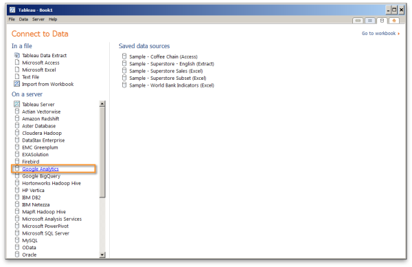
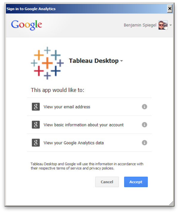
Tableau uses the OAuth method to connect with GA. Just click on the analytics link and login with your Google account info.

3. Extract The Data. Now you need to choose the dimensions and measures of the data you want to analyze. Dimensions are the category type data points such as landing page, source medium, etc. The measures are the number entries such as visits, bounces, etc. To see an overview and explanation of each, please refer to the Google Dimensions and Metrics Reference Guide.
Keep in mind that the more dimensions you add, the larger the data set will get. For example, adding a device type will give you one row of measures for each device. You can think of it this way: if your default data has 10,000 rows, and you add the hour dimension, you would have 10,000*24 (hours). So, if you add hours and mobile device type, you would have 10,000*24*~250 = 60,000,000. So, make sure you only pull the dimensions that actually matter. (I know it’s hard not to geek out sometimes.)
For the below exercise we are pulling:
- Dimensions: City, Country/Region, Date, Landing Page, Medium, Social Source, Source
- Measures: Bounces, Exits, Page Load Sample, Page Load Time, Page Views, Time on Page, Unique Page Views, Visits (There is a dropdown with some useful presets of Measures).
Now, select options similar to mine, and hit OK.

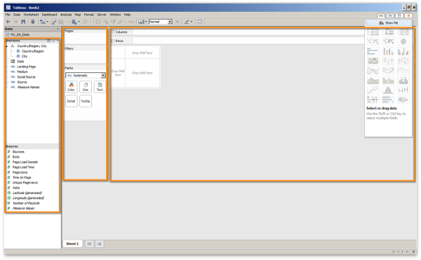
4. The Workspace. Now that we have loaded our data for this exercise, you should get familiar with the tool’s workspace. You’ll note that it is divided into three main sections: data, settings, and visualizations. In addition, you can see two sets of data on the left side of the screen — your dimensions are on the top, and your measures are on the bottom. Lastly, note the columns and rows sections near the top of the screen — they are a fundamental concept of Tableau.
5. Your First Data Visualization. For our first effort, let’s say we want to see what the traffic by medium looks like. To accomplish this, all you need to do is drag and drop icons from the dimensions and measures sections over to the columns and rows spots at the top. Specifically, drag the mediums icon to columns, and drag the visits icon to rows.
Now, how can we utilize this to take things to the next level? Let’s look at historic performance. To do so, drag the date icon into the end of the column line. This will show us the performance by medium by year.
But since we only pulled 2013 data, the result is kind of boring. However, if you switch the dropdown in the date menu to month (or day) instead of year, you’ll see that things get more interesting. You will have three line charts on the same axis comparing visits side by side.
But here is where the real power of DVTs comes into play. By simply dragging the medium from the columns area to the color area, you are instantly removing the columns for medium, combining it into one chart area, and then coloring by medium. This allows you to easily compare the data in a more visually interesting way.
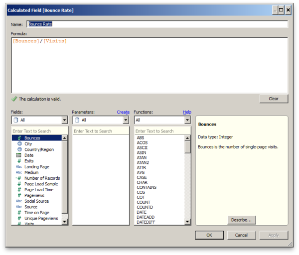
6. Enhancing Your Data. One of the differences between working in GA and working with raw data is that we still need to do some aggregation. For example, the raw data from GA includes the number of bounces and number of visits; however, it does not provide a bounce rate. Fortunately, that’s not a problem for Tableau. This tool has a very powerful “calculated field” functionality that can be leveraged for either measures or dimensions.
For instance, let’s say we want to calculate the bounce rate. Simply right-click in the measures area and select calculated fields. Then we would enter [Bounces]/[Visits].
The same approach can be used to do a variety of calculations. For instance, the code below could be used to distinguish weekend vs. weekday traffic:
if(DATEPart('weekday',[Date])=1) then 'Weekend' //Sunday

elseif(DATEPart('weekday',[Date])=2) then 'Weekday' //Monday

elseif(DATEPart('weekday',[Date])=3) then 'Weekday' //Tuesday

elseif(DATEPart('weekday',[Date])=4) then 'Weekday' //Wednesday

elseif(DATEPart('weekday',[Date])=5) then 'Weekday' //Thursday

elseif(DATEPart('weekday',[Date])=6) then 'Weekday' //Friday

elseif(DATEPart('weekday',[Date])=7) then 'Weekend' //Saturday

end
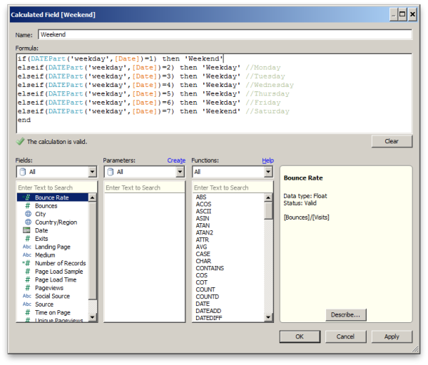
The above will give you a new dimension that allows you to separate your traffic by weekend and weekday. Overall, you can find some pretty interesting stories from similar behavioral segmentation. We have seen a lot of beauty brands show very distinctive behavior in terms of daytime parts.
Another great way to look at the data is to filter down to only social source traffic, and then look at site engagement (PPV or time on-site). This will show you when your social traffic is performing best and when you can get the most ROI out of your social activities.
7. Segmenting Your Data. DVTs are also very effective in data segmentation (which is a big passion of mine). So let’s look at our sample data. The website I am using in this sample has a blog section. Generally, user behavior on blog pages differs dramatically from that on general brand/product pages. (Blog visits via search are generally one page and extended time on-page.) Therefore, we really do not want to judge engagement as an average across all pages.
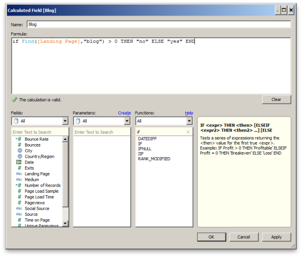
One way around this is to segment your data by landing page. In our sample site, my URLs are: http://www.brand.com/blog/topicXYZ. In order to separate the blog pages from the rest, I would insert another calculated field and add the following expression:
if Find([Landing Page],"/blog/") > 0 THEN "no" ELSE "yes" END
This expression would check if the landing page contains the string /blog/ and if it does, it adds the word “yes” into our newly calculated field (column). This will give me another dimension to segment my data against.
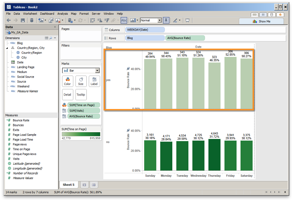
Now, we can look at the engagement by blog pages and non-blog pages, and even divide it by day of week. As you can see, the upper section (blog pages) has a much higher bounce rate than the non-blog pages. (It also seems that there was some special activity on Thursdays that affected the bounce rate).
The calculated field option is one of my favorite features in Tableau, as it allows you to dynamically extend and segment your data. We have done some amazing calculations with this functionality, and once you start playing around with the calculated field dialog, you will see the large variety of powerful functions available to you. We are using it from score calculations all the way to a form of tagging. The beauty here is that if you would refresh your data or even swap your data sources, all these fields will be recalculated.
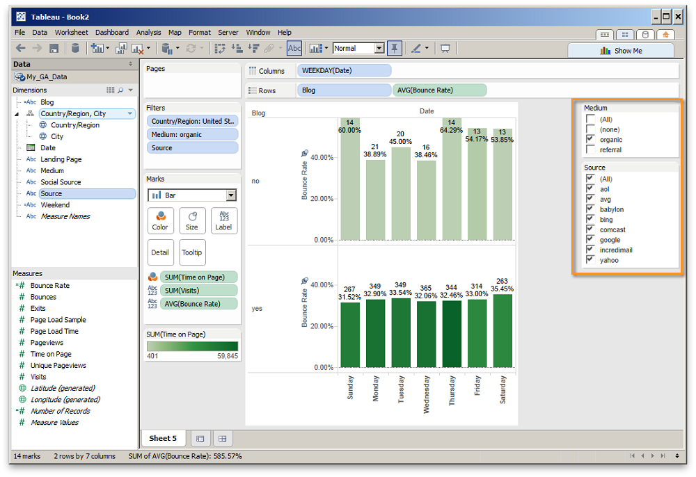
8. Filtering Options. One of the great “show room” qualities Tableau has is its ability to filter data in real time, and it provides two primary ways to make it happen. The first method is to simply drag and drop the element you want to filter onto the filter region, and then pick your option.
The other method (and the one I prefer) is the quick filter option. If you right-click on any element you want to filter and then click on “add to quick filter,” it will add the filters to the right hand column. In the example below, I used medium and source; now I can quickly filter to the items that are relevant to me.
This is a great functionality to have in a client demo or analysis session as you can quickly answer business questions like: “How does referral traffic differ from direct?” or “Can we compare pages per visit by medium or even city?”
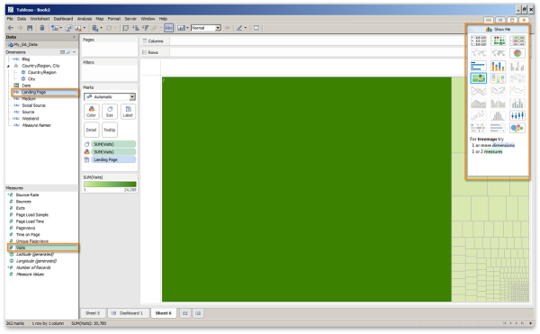
9. Quick Visual Options. In order to get started really quickly with your visualizations, Tableau has a feature called “Show me.” It is located in the top right of the screen, and it shows the different types of visuals Tableau offers. When you hover over the visuals, it will tell you what is required for each.
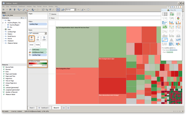
For instance, let’s select landing page and visits from the measure and dimensions area, and then select treemap for the visual type. Immediately, it shows you squares that represent individual landing pages, each one sized by the number of visits it has received.
In my example, the homepage “/” is very dominant and prevents us from digging into the details. To make things easier, let’s right-click on the homepage “/” and click exclude. By default, it is colored and sized by the amount of visits. This is great — but let’s start evaluating our data on multiple dimensions. Drop bounce rate on the color icon. (Note: I changed the color to a red/green gradient.) Now it shows us the top performing pages, sized by the volume, and color by the bounce rate.
This allows us to look at what is driving volume and what is driving engagement. Now, we can actually prioritize which pages we want to work on first.
Of course, in order to really evaluate this, you want to make sure you are filtering to the correct country your content is targeting, as well as a specific medium you are interested in evaluating. Again, it will get interesting if you now add conversion rate or another value KPI.
Next Steps
Hopefully, the above will get your mind thinking about how you can use dashboards and data visualization, and provide you with the “how-to” to get started.
What’s next? Take a dataset and try to reproduce your current reports. Once you have recreated them, you will be surprised by how fast you can deploy them. You can simply export them as PDFs, PPTs, or images.
But, as you move forward with your efforts and exploration, remember to be strategic as there are a million ways to visualize data. Because of that, it is easy to get lost! Before you dive into the data, sit down and try to figure out the story you are trying to tell and the questions you are trying to answer. Then tap into the power of data visualization. It should help you uncover some really interesting stories, and those findings should inform your strategies.
I usually leverage these tools to combine data from multiple channels. If you are interested in a follow-up article walking you through the steps of combining paid, organic and social data, please leave a comment or send me a tweet and I would be happy to provide a workbook and guide.
Contributing authors are invited to create content for MarTech and are chosen for their expertise and contribution to the martech community. Our contributors work under the oversight of the editorial staff and contributions are checked for quality and relevance to our readers. MarTech is owned by Semrush. Contributor was not asked to make any direct or indirect mentions of Semrush. The opinions they express are their own.
Related stories
