5 engaging visual content formats that aren’t infographics
Are you producing infographics on autopilot? Columnist Kerry Jones shares innovative content formats which may communicate your message more effectively.

There’s no telling how many times marketers have uttered the phrase, “Let’s turn this data into an infographic” since this visual format shot to popularity several years ago.
Infographics have become popular for good reason. When done well, they pack a powerful visual and informational punch. But sometimes infographics are a lazy way of visualizing data or telling a story. Different visualizations may work better than infographics for the story you’re trying to tell or the audience you’re trying to reach.
Here’s a look at five visual formats other than infographics to include in your content marketing toolbox.
Interactive content: Create a customized experience
Interactive content has become increasingly popular, in part because this format puts user experience first. Interactive features enable viewers to manipulate the content so it displays the information they want to see. By pulling the viewer in as a participant, rather than as a passive observer, this type of content is extremely engaging.
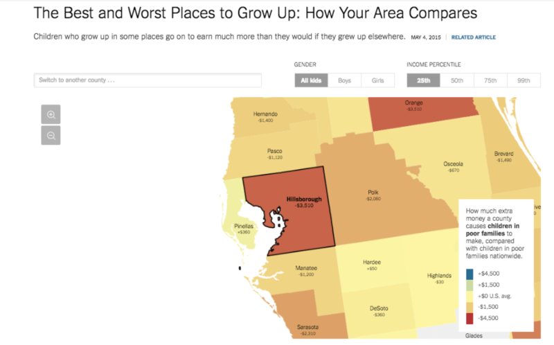
Example: Best and Worst Places to Grow Up

The New York Times’ Best and Worst Places to Grow Up illustrates how location is closely tied to opportunity when it comes to children in low-income families. The map offers a customized look at this issue. Viewers can select a county, gender and income percentile. The result? A stark look at income potential for children in poor families in a given area compared with national averages.
Because of the high “stickiness” factor, marketers will find interactive features effective for attracting awareness to a brand, but their usefulness also extends to prospects farther down the buyer’s journey.
Interactive calculators, checklists, flowcharts and quizzes are valuable tools for educating prospects. This type of interactive content should also help solve a pain point.
Example: Content marketing ROI calculator

Fractl created a content marketing ROI calculator to help answer a common challenge for marketers. Users can input known variables about a content campaign, such as traffic and social shares, and the calculator quantifies the combined value of those performance metrics.
Parallax scrolling: Tell an immersive story
At the moment, it’s trendy in website design, but parallax scrolling also lends itself to individual content pieces that benefit from a sense of movement.
This technique creates a three-dimensional effect, since the foreground and background of the page move at different speeds. It’s ideal for storytelling, since it keeps viewers engaged as they scroll down the page; when you’re immersed in this format, it’s tough to click away.
Example: Every Last Drop

As you scroll through Every Last Drop, you see a man going through his day and consuming water. This is a powerful way to illustrate how much water people use on a daily basis.
GIFs: Get to the point with simple animations
The internet may not agree on how to pronounce GIF, but we can all concur it’s a compelling visual format. GIFs aren’t just for laughs; they’re also great for creating simple animations that illustrate changes over time.
Example: Evolution of popular cars

Fractl used GIFs for a project with eBay Motors. We wanted to show how popular car models had changed over the years. We compressed 60 years of car design into GIF form, which effectively illustrated just how much car design has evolved.
Slide shows: Communicate a lot of information in bite-sized chunks
Slide shows are effective for reaching people who are less inclined to read a long-form article. This format is ideal for presenting in-depth information in small slices that keep the viewer from becoming overwhelmed. Slide shows are also good for how-to content; each slide can discuss the next step in a process.
SlideShare has become the leading platform for discovering and publishing slide shows; hosting your slide shows here helps your content gain visibility and makes them easy to embed, too.
Slide shows are also perfect for repurposing content. Take a white paper or lengthy blog post and turn it into easy-to-digest slides.
Example: 10 Explosive Growth Hacks
Rocketship turned a popular in-depth guide it had written on this topic into a slide show that has racked up nearly half a million views on SlideShare.
While the original guide was lacking visual appeal, the slideshow uses bright comic book-style designs to communicate the guide’s key points.
Node maps: Analyze trends and connections
Node maps, aka network visualizations, illustrate connections between groups in any type of structured network. Some common applications include plotting the relationships within social networks and between fictional characters (like this look at “Star Wars”).
Gephi is a fantastic tool for creating network visualizations such as the examples below.
Example: Mapping Shakespearean tragedies

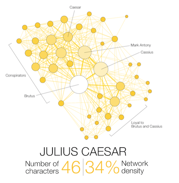
This project used node maps to analyze the structure of character relationships in 11 Shakespearean plays. The node maps reveal clusters of character groups at the center of the drama, as you can see in the Julius Caesar map below.
A 100-percent network density would mean every character is connected somehow, so this shows more than a third of the characters in Julius Caesar are connected.
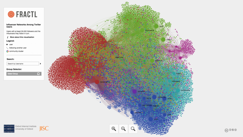
Example: Twitter influencer network

We used this interactive node map to examine connections between Twitter influencers (read more about this in my post on niche influencers).
Infographics are still a winning recipe for conveying a lot of information in a concise, visually pleasing package. But next time you lazily find yourself muttering “put it in an infographic,” consider if another type of visualization will serve your message and your audience better.
Contributing authors are invited to create content for MarTech and are chosen for their expertise and contribution to the martech community. Our contributors work under the oversight of the editorial staff and contributions are checked for quality and relevance to our readers. MarTech is owned by Semrush. Contributor was not asked to make any direct or indirect mentions of Semrush. The opinions they express are their own.
Related stories
New on MarTech