My, What A Big Profile Page & Cover Photo You Have, Google+
Like many today, Google+ offered to upgrade the cover photo of my Google+ profile page to the new larger size, up to 2120×1192. Wow, would that even fit on my screen? And would anything even show other than the picture? Let’s have some fun comparing profile pages at Google+, Facebook and Twitter. Oh Say What Can You See? […]
Spy on Any Website
Like many today, Google+ offered to upgrade the cover photo of my Google+ profile page to the new larger size, up to 2120×1192. Wow, would that even fit on my screen? And would anything even show other than the picture? Let’s have some fun comparing profile pages at Google+, Facebook and Twitter.
Oh Say What Can You See?
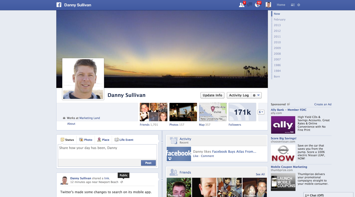
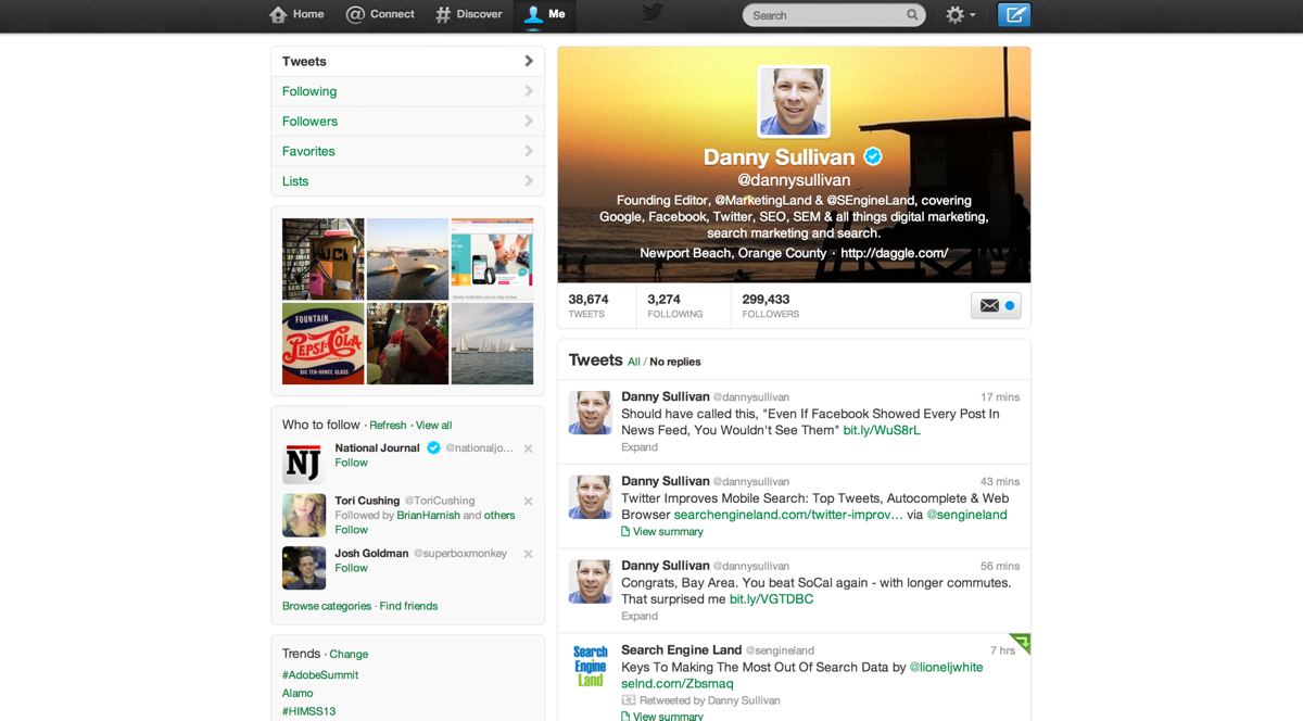
For this test, I loaded up all the pages on my MacBook Pro Retina running at the default display resolution of 1440×900. I normally run the screen at a higher resolution, 1680×1050, giving up a tiny bit of quality for more screen real estate. But I wanted to stick with what I thought was a reasonable and common screen resolution.
Here’s what I could see with Google, Facebook and Twitter, with my browser set to use up all the available space:
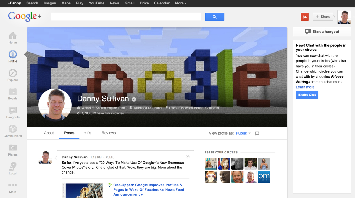
The first surprise is that Google’s cover photo doesn’t completely wipe everything out. How is it that a photo that’s 2120×1192 renders fully on a 1440×900 screen, with room left for other things? Google dynamically resizes the image.
If you have a monitor with a super-high resolution, like my external monitor does, you can see the image in its full 212×1192 glory. But the proportions remain the same. You’ll still see a tiny bit of the person’s first post, their circles (if they provide that) and navigational elements.
Profile Stacking Dolls
The second surprise was how little both Google and Facebook now show of someone’s actual activity. I’ll get back to that, but first, let’s play Russian stacking dolls:
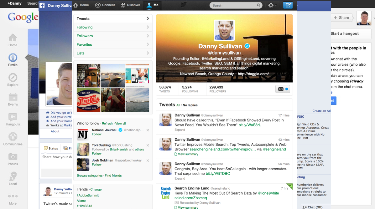
What I’ve done is put Facebook’s page over Google’s page, showing how it takes up less of the available space, then Twitter’s page on top of that. Of all of them, Twitter has the most compact display. Some may appreciate that, while others might feel Twitter is wasting opportunities for widescreen displays.
Recommended Articles
What Real Content Can You See?
Finally, what I call the content test. I wanted to get a sense of how much these profile pages inform you about a person, at a glance. What are they posting or sharing? Who do they follow? Here’s how it looks for Google, Facebook and Twitter:

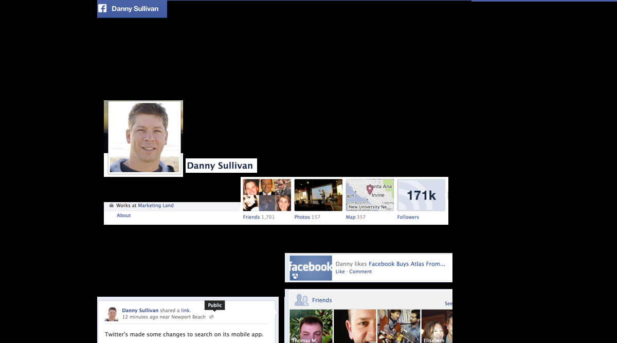

Personally, I like how Twitter does this. I learn a lot about people by what they share, and Twitter lets me see four tweets at once, along with six recent photos, a bio and some stats on followers.
Facebook and Google+ are about tied for me after that, and both a little disappointing. I can barely see the one update that Facebook shows; Google also shows one update, but with a bit more space. Followers are visible on Facebook; with Google, they get pushed off the page.
Of course, a cover photo can say a lot about a person — and can be used by marketers to communicate more about a company, if they want.
Contributing authors are invited to create content for MarTech and are chosen for their expertise and contribution to the martech community. Our contributors work under the oversight of the editorial staff and contributions are checked for quality and relevance to our readers. MarTech is owned by Semrush. Contributor was not asked to make any direct or indirect mentions of Semrush. The opinions they express are their own.
Danny Sullivan was a journalist and analyst who covered the digital and search marketing space from 1996 through 2017. He was also a cofounder of Third Door Media, which publishes Search Engine Land, MarTech, and produces the SMX: Search Marketing Expo and MarTech events. He retired from journalism and Third Door Media in June 2017. You can learn more about him on his personal site & blog He can also be found on Facebook and Twitter.
View Author ProfileAdd us as a preferred source on Google
Google's "preferred sources" feature allows users to customize their search results by selecting news outlets they want to see more often in the "Top Stories" section.
Add Martech NowRelated Articles

CMOs are spending more on digital media and acquisition as consumers grow more skeptical of AI-generated content and its value.
Read More
Vibe coding can replace SaaS tools fast, but risks in security, integration and maintenance can quickly outweigh the savings.
Read More
As AI reshapes martech, affiliate programs highlight where human expertise still drives performance and results.
Read MoreMarketing artificial intelligence (AI)
4 minutes readAdobe and Canva are rolling out AI tools that turn design into conversation, intensifying competition and reshaping how marketers create.
Read MoreRelated Articles
CMOs are spending more on digital media and acquisition as consumers grow more skeptical of AI-generated content and its value.
Read More
Vibe coding can replace SaaS tools fast, but risks in security, integration and maintenance can quickly outweigh the savings.
Read More
As AI reshapes martech, affiliate programs highlight where human expertise still drives performance and results.
Read MoreMarketing artificial intelligence (AI)
4 minutes readAdobe and Canva are rolling out AI tools that turn design into conversation, intensifying competition and reshaping how marketers create.
Read More