How To Make User-Friendly (And Search-Engine Friendly) Scannable Content
Back in 1997, I created my 5 Fundamental Rules of Web Design. These website design rules are very simple, but critical, for a positive user experience. My rules state that a website should be: Easy to read Easy to navigate Easy to find Consistent and clear in layout, design, and labeling Quick to download Some […]
Spy on Any Website

Back in 1997, I created my 5 Fundamental Rules of Web Design. These website design rules are very simple, but critical, for a positive user experience. My rules state that a website should be:
- Easy to read
- Easy to navigate
- Easy to find
- Consistent and clear in layout, design, and labeling
- Quick to download
Some of these guidelines seem so obvious. In fact, some people sincerely believe that they are stupid. “OF COURSE my website is easy to read!” some developers have exclaimed to me, rolling their eyes. “I can read it!”
The irony of being a usability professional is understanding that overlooking the obvious is something most users do. Designers, developers, content writers, and other web professionals are so heavily involved in their responsibilities on a website that they overlook obvious (and even essential) content guidelines.
Nevertheless, I keep returning to these 5 Fundamental Rules year after year. In fact, some of my rules (easy to read, quick to download) are actually ranking factors in search engines now.
Bing recently announced that content readability is a ranking factor for mobile websites, and I couldn’t agree more with this decision. I have conducted many usability tests on websites over the years, and I often hear test participants mumble about difficulties in reading websites, whether they are referring to content, navigation, or both.
Easy To Read. Easy To Scan.
Back in 1997, the Dr. Jakob Nielsen at Nielsen Norman Group wrote about How Users Read on the Web and provided some Writing Guidelines to Web Pages shortly thereafter. To summarize:
[blockquote]Web users generally prefer writing that is concise, easy to scan, and objective (rather than promotional) in style.[/blockquote]
Web users associate scannability with the amount of effort it will take to complete their tasks. In the article, “If It’s Hard to Read, It’s Hard to Do: Processing Fluency Affects Effort Prediction and Motivation” from the Association for Psychological Science:
[blockquote]People are more likely to engage in a given behavior the less effort it requires. As numerous studies have indicated, high perceived effort is a major impediment to behavior change….[/blockquote]
In my experience, even if a page ranks well in Web search engines, users will likely abandon your site immediately upon scanning it if: (a) they perceive that navigation is too difficult to use, and (b) content is too difficult to read. Therefore, for many reasons, I have always made scannability a priority when creating and publishing web content.
10 Ways To Make Content Easily Scanned
First and foremost, content should seem genuine and be genuine. I always tell copywriters to write the content first and worry about scannability after the main portion of Web content is written. As writers become more experienced, they can learn to incorporate scannability naturally into their writing formats. Never sacrifice scannability for genuine, sincere writing. Here are my 10 ways of making content easy to read and easy to scan.
Recommended Articles


1. Shorter, Concise Paragraphs
After I type the first draft of my web page’s content, I view it on a computer monitor so I can see where there are large blocks of black text. Then, I simply split the longer paragraphs into shorter ones. Often, I see if there is a sentence or idea in that paragraph that I want to emphasize, and then I put that single sentence into its own paragraph.
Instead of this:
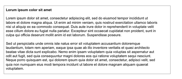
Figure 1a: Content with large blocks of black text can seem difficult to read.
Do this:
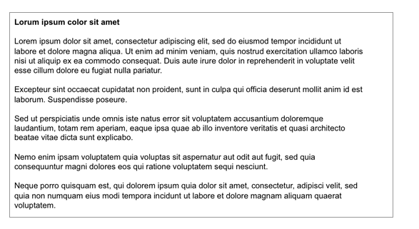
Figure 1b: Content can seem easier to read if you break it up into shorter, more concise paragraphs.
Quick Tip: At the top of the page and shortly after a subheading, I make sure I open the paragraph with my most important keywords and concepts. Many readers will skip over any additional ideas if they are not caught by the first few words in the paragraph.
2. Content-Embedded Text Links
Search engines and users treat content-embedded text links differently than global navigation links.
When search engines calculate a document’s unique content fingerprint, template items (such as global navigation links) are not included in that content fingerprint. Therefore, on almost every page on a site, I try to add some content-embedded text links to encourage users to click on them.
For example:

Figure 2: Simply adding a couple of relevant, embedded text links encourages site visitors to read more content.
Quick Tip: Don’t overdo this strategy! If content is short, you should have less links. If content is longer, then you can safely add relevant text links without making the page unscannable or unreadable.
3. Headings & Subheadings
If I know that page content is going to be longer than one computer monitor screen, I try to create headings and subheadings. If you look at the before-and-after images below, please note where your eyes go. Even without adding color or a different typeface to the subheadings, your eyes are naturally drawn to them.
Instead of this:
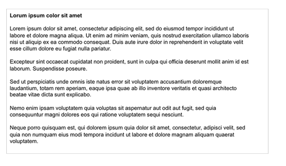
Figure 3a: This content might not seem interesting to readers because the only visual interest is the page’s primary heading and short paragraphs.
Do this:

Figure 3b: If you know your page content is going to require some scrolling, separating content into “chunks” or sections can make it easier to scan. Users will usually scan the text in the subheadings.
Quick Tip: Gray is not a color I recommend using for headings. Gray-colored text tends to recede, and headings should stand out on a page. Additionally, gray text is harder to read on mobile phones. For headings to stand out, make sure you have a high color contrast. A tool I like to use to check color contrast is the Color Contrast Checker at WebAIM.
4. Bulleted Or Numbered Lists
On long pages such as an FAQs (frequently asked questions) or Q&A (questions and answers) page, to keep scannable content above the fold, I like to put a bulleted or numbered list of clickable text links at the top of the page. That way, users don’t have to scroll to quickly scan the content that is available on the page.
Here’s an example:
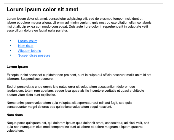
Figure 4: Long pages can easily be “chunked” with subheadings and on-page text links. Not only is this page format user friendly, it is also search-engine friendly.
Quick Tip: One way to add a scannable bulleted list to content is to find a sentence that contains multiple commas. You can probably rewrite and reformat the sentence as a bulleted list.
5. Pull-quotes & Blockquotes
One of the simplest ways to make scannable content is to create pull-quotes and blockquotes.
A blockquote element defines a section (within a document) that is quoted from another source. A pull-quote (or pull quote) is a brief, attention-catching quotation, typically in a distinctive format, taken from the main text of an article and used as page feature.
For search engine optimization (SEO) purposes, I often use these formats to encourage writers to emphasize keyword- or concept-focused content. Remember to format pull-quotes and blockquotes as text whenever possible.
Here are a couple of examples:
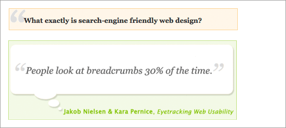
Figure 6: Pull-quotes and blockquotes provide some creative opportunities for design and conversion teams.
Quick Tip: Try to keep quotation text left aligned. The text will be easier to read and easier to scan. Also, don’t format this text in Javascript. You want search engines to pick up this text.
7. Graphic Images With Optional Captions & Headings
Graphic images on web pages should serve a purpose…more than purely an aesthetic reason. Does a graphic image make content easier to scan? Does the graphic image help with conversions, drawing users’ eyes to important content? Does the graphic image help provide a sense of place or information scent? Is the graphic image appropriate for the page and not a simple stock photo?
All of these are good reasons to use graphic images on web pages.
One option for graphic images is to include an image heading and caption, formatted in CSS (Cascading Style Sheet). Surrounding a graphic image with context helps both search engines and readers understand the image’s aboutness.
Quick Tip: Try to keep the image heading and caption text left aligned. The text will be easier to read and easier to scan.
7. Videos With Optional Captions & Headings
Like graphic images, videos on web pages should serve a purpose…more than purely an aesthetic reason or marketing hype. Do videos help establish credibility of your products and/or services? Do videos help users complete their desired tasks? Do videos help with user confidence?
I also like to surround videos with proper context – both a video heading and caption formatted in CSS – whenever possible.
8. Bold & Italics
A more subtle way of increasing content scannability is to use bold and/or italics within content. When used properly, this text format can draw users’ focus to a caption, heading, pull-quote, blockquote, or even a word or phrase within an article.
An annotated bulleted or numbered list can also receive extra attention by using bold text, as shown in the example below:
- Step 1: Do this and wait 30 seconds.
- Step 2: Do that immediately.
- Step 3: Wait another 30 seconds for something to happen.
- Step 4: Lather, rinse, and repeat as needed.
One place I like to use bold type is when I define a term within an article. I did it in this article with the definitions of blockquote and pull-quote. I use italic type sparingly because it can make text more difficult to read.
Please keep in mind that either of these can be easily overdone, especially if your content already contains headings and subheadings. In this instance, I highly recommend A/B and multivariate testing.
9. Numbers, Capitalization & Special Characters
Digits increase the scannability of web content, especially if users are looking for a fact. Simply placing a number (4) instead of the spelled out word (four) in content should increase fixations.
Characters such as a percentage sign (%), dollar or other currency sign ($) can also increase fixations. I will often use numbers and characters in page elements that I want users to pay attention to, such as a caption or a pull-quote.
Try this if you want to do a simple experiment. Which do you notice more, sixty-nine percent or 69%? Sixty-nine percent increase in sales or 69% INCREASE in sales?
Again, to be effective, do not overuse these items. Too much capitalization can have the opposite effect and can also appear as if you are shouting to your site visitors.
10. Annotations
This last item is often an overlooked way of providing information scent, aboutness, and keywords to content.
All too often, a link can be “sexy” without a keyword or keyword phrase. It can stand on its own (as long as it looks and is clickable). Since I have long understood that search engines value words in anchor text and next to anchor text, I often provide annotations on various areas of a page.
A headline can have a tagline, for example. Or if you have related articles you’d like people to read, you can simply put the annotation next to the text link, as shown in Figure 7 below:
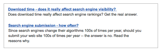
Figure 7: If you can’t get keywords in a link or a heading, an annotation can also provide a place to use important, related words as we see here in these Related Articles placed near the bottom of a page.
Test & Proofread Content
Of course, I am not recommending to implement all 10 of these items in a single web page.
If content is short (<400 words), then you might not need many scannable elements. A relevant graphic image and caption might be all a short blog post needs. However, if content is long (>800 words), then breaking it up with subheadings, bulleted lists, and some embedded text links can make content more readable and scannable. Before I publish, I view the content’s readability and scannability on multiple devices (desktop/laptop computer, tablet, phone) and in both orientations (horizontal andvertical).
And remember the words from poet John Lydgate and adapted by former U.S. President Abraham Lincoln:
[blockquote]You can please some of the people all of the time, you can please all of the people some of the time, but you can’t please all of the people all of the time.[/blockquote]
Do your best to make content easy to read from the user perspective and a search engine perspective. If you have any other scannability tips to offer, please put them in the comments below.
Contributing authors are invited to create content for MarTech and are chosen for their expertise and contribution to the martech community. Our contributors work under the oversight of the editorial staff and contributions are checked for quality and relevance to our readers. MarTech is owned by Semrush. Contributor was not asked to make any direct or indirect mentions of Semrush. The opinions they express are their own.
Shari Thurow is the Founder and SEO Director at Omni Marketing Interactive and the author of the books Search Engine Visibility and When Search Meets Web Usability. Shari currently serves on the Board of Directors of the Information Architecture Institute (IAI) and the ASLIB Journal of Information Management. She also served on the board of the User Experience Professionals Association (UXPA).
View Author ProfileAdd us as a preferred source on Google
Google's "preferred sources" feature allows users to customize their search results by selecting news outlets they want to see more often in the "Top Stories" section.
Add Martech NowRelated Articles
Validate AI-generated insights, establish governance, and prioritize real-world research where it delivers the greatest value.
Read More
Firsthand expertise, original research, and transparent thinking carry more weight than polished messaging. Here's why.
Read More
Marketing artificial intelligence (AI)
4 minutes readLearn how to balance AI chatbot efficiency with the high-touch needs of enterprise sales to engage VIP prospects without losing the human touch.
Read More
The strongest marketing messages address the frustrations and motivations customers rarely share directly. Here's how AI can help uncover them.
Read MoreRelated Articles
Validate AI-generated insights, establish governance, and prioritize real-world research where it delivers the greatest value.
Read More
Firsthand expertise, original research, and transparent thinking carry more weight than polished messaging. Here's why.
Read More
Marketing artificial intelligence (AI)
4 minutes readLearn how to balance AI chatbot efficiency with the high-touch needs of enterprise sales to engage VIP prospects without losing the human touch.
Read More
The strongest marketing messages address the frustrations and motivations customers rarely share directly. Here's how AI can help uncover them.
Read More