Conversion Optimization: Measuring Usability In The User Experience (UX) – Part 2
Many online marketers dismiss usability as a critical part of the user experience. A delightful experience requires effective and efficient goal attainment. A delightful experience also occurs on websites that are easy to use and easy to remember. As I’ve mentioned previously, usability should take into account the following 6 elements: Effectiveness: Can users achieve […]
Spy on Any Website
Many online marketers dismiss usability as a critical part of the user experience. A delightful experience requires effective and efficient goal attainment. A delightful experience also occurs on websites that are easy to use and easy to remember.
As I’ve mentioned previously, usability should take into account the following 6 elements:
- Effectiveness: Can users achieve their desired goals on your website?
- Efficiency: How quickly can users achieve their goals on your website?
- Learnability: Is the website easy to learn the first time users encounter it?
- Memorability: Can repeat visitors easily remember how to use your site?
- Error prevention/handling: How does the website help users recover from errors?
- User satisfaction: Do users like using your website and recommend it to others?
Last month, in Part 1, I discussed Effectiveness and Efficiency. In today’s column, I’ll tackle the next two elements: Learnability and Memorability.
Learnability = Easy To Learn
Learnability is a fundamental usability attribute since the first experience most people have with a website is learning how to use it. A website should be easy to learn so that visitors can rapidly begin to accomplish their goals.
Measuring learnability involves measuring the time to complete a set of tasks by novice users. Consistency, perceived click affordance and learnability are the most important factors affecting the usability of a website’s navigation system.
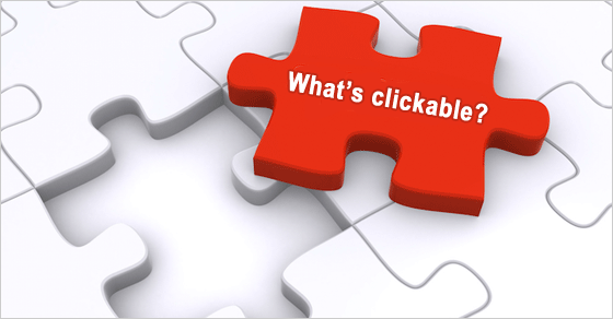
Perceived click affordance, or perceived clickability, is an essential attribute to test on websites and their prototypes.
On a website, it’s important for users to be able to discern between page elements that are and are not clickable.
Here are some general principles that I follow to establish perceived clickability:
- All clickable items on a web page should look clickable
- All unclickable items on a web page should not look clickable
- All clickable-looking items on a web page should be clickable and provide feedback
- Don’t put a link on a page that you do not intend for searchers/users to click
To determine perceived clickability, I use a click affordance test. It has two parts.
Perceived Click Affordance Test
- Begin the click affordance test by giving the test participants the paper prototype, graphic prototype, or screen shot of an actual web page. Ask users to circle everything on the page they believe is clickable. Chances are, users won’t circle every clickable element. They might circle some page elements that are not links. Some participants will circle big blocks of content; others will be very specific and will circle only one or two words.
- The second part of the test is the same as the first part of the test. I give test participants the same paper prototype, graphic prototype, or screen shot. However, instead of asking them to circle everything on the page that they believe is clickable, I ask them to circle everything on the page that is not clickable.
Based on the test results, I can report to the design/development team about items that need to be moved (to a place where users expect to see clickable elements), reformatted, and/ or redesigned.
 I am not saying that every link on a site should be blue and underlined. If link formatting, placement and color usage are consistent, many users can determine clickable and unclickable elements rather quickly.
Significant improvements in the user experience often require creative departures from standards and accepted practice(s). However, useful innovation in visual and interaction design should not burden the new user with a long and frustrating learning process. (Constantine and Lockwood, 2002)
Learnability is often a comparative usability study, comparing the learning curve of one interface with another.
According to usability pro Jeff Sauro in his book, A Practical Guide to Measuring Usability: Quantifying the Usability of Websites & Software:
“The most common way to measure learnability is to use time-on-task and to have users repeat tasks either during the same testing session or at some point in the future…. At a minimum you need to have users attempt tasks twice, but ideally, three to five times are better. Changing some minor details of the task… helps ensure users aren’t just mindlessly completing a task from memory.”
Graphing performance over time provides the learning curve. The steeper the learning curve, the harder it is for users to learn how to navigate the interface.
Does all of this learnability testing sound daunting? Don’t let it be. Click affordance tests are really easy to do.
Over time, the mental models of your users become clearer and clearer. Result? You continually make better websites.
Memorability = Easy To Remember
 We all want people to remember our website content. Many website owners want users to experience the WOW factor. In the user experience industry, memorability does not mean the WOW or coolness factor.
Memorability is a measure of how easily users remember how to use a website. For example, casual users should be able to return to your site and not have to re-learn how the site navigation system works.
Memorability is difficult to measure for two reasons:
- Casual users are not typically used as test participants in usability studies. Most website usability testing is done with participants who fit a specific persona or profile (i.e., the primary user). Casual users can be difficult to find.
- Memorability is also a comparative usability study. Some people do not have the time, patience or budget to do a longitudinal usability test.
For those reasons, I don’t recommend measuring this component of the user experience. But I still am on the lookout for some user behaviors and interface mistakes.
Inconsistency
Inconsistency in layout, design and labeling can decrease memorability.
When people click on a text link, they do expect some of the words in the text link to lead to a page containing the same (or very similar) words. If the labeling system confuses users, I make note of the confusing labels and why the labels confused users.
For the next iteration of the website, I then provide recommendations for an improved wording and placement of the site’s labeling system:
- Document labels
- Content labels
- Navigation labels
Minesweeping
Minesweeping is an action designed to identify where on a page links are located on a web page. Minesweeping involves the user rapidly moving the cursor or pointer over a web page, watching to see where the cursor or pointer changes to indicate the presence of a link (Koyani et al, 2004).
On a tablet or a smartphone, minesweeping involves the user rapidly moving his or her finger to determine what is clickable.
If users must minesweep to determine what is and is not clickable, it slows task completion. Minesweeping tells me that users have to re-learn the website’s navigation system. Therefore, minesweeping can be a strong indicator of poor memorability.
Contrary to popular opinion, users do not enjoy moving pointer around a site (‘minesweeping’) in hopes of finding something clickable (Nielsen and Loranger, 2006).
The exception? Children. To children, minesweeping is fun.
I understand that making a website learnable and memorable can take a long time in our “I want it yesterday” internet society. Nevertheless, measuring the user experience is an ongoing process. I want my client sites to be memorable for the right reasons.
Marketing Land readers, what have you learned about your site visitors based on some of your usability tests?
Sources For Further Investigation:
Constantine, L. L., & Lockwood, L. A. (2002). Instructive interaction: Making innovative interfaces self-teaching. User Experience, 1(3).
Kalbach, J. (2007). Designing Web Navigation. O’Reilly Media, Inc.
Koyani, S. J., Bailey, R. W., & Nall, J. R. (2004). Research-based Web Design & Usability Guidelines (p. 232). National Cancer Institute.
Nielsen, J., & Loranger, H. (2006). Prioritizing Web Usability. Pearson Education.
Sauro, J. (2010). A Practical Guide to Measuring Usability: Quantifying the Usability of Websites & Software. Measuring Usability LCC.
Thurow, S., & Musica, N. (2009). When Search Meets Web Usability. New Riders.
Contributing authors are invited to create content for MarTech and are chosen for their expertise and contribution to the martech community. Our contributors work under the oversight of the editorial staff and contributions are checked for quality and relevance to our readers. MarTech is owned by Semrush. Contributor was not asked to make any direct or indirect mentions of Semrush. The opinions they express are their own.
Shari Thurow is the Founder and SEO Director at Omni Marketing Interactive and the author of the books Search Engine Visibility and When Search Meets Web Usability. Shari currently serves on the Board of Directors of the Information Architecture Institute (IAI) and the ASLIB Journal of Information Management. She also served on the board of the User Experience Professionals Association (UXPA).
View Author ProfileAdd us as a preferred source on Google
Google's "preferred sources" feature allows users to customize their search results by selecting news outlets they want to see more often in the "Top Stories" section.
Add Martech NowRelated Articles

The strongest marketing messages address the frustrations and motivations customers rarely share directly. Here's how AI can help uncover them.
Read More
New research shows buyers are ready for AI-powered experiences, while many organizations still struggle to deliver them.
Read More
Behavioral signals, intent data, and AI can improve personalization, sales alignment, and pipeline performance across complex buying journeys.
Read More
Most marketing activity creates attention. The campaigns that earn trust and action are built on genuine customer understanding.
Read MoreRelated Articles
The strongest marketing messages address the frustrations and motivations customers rarely share directly. Here's how AI can help uncover them.
Read More
New research shows buyers are ready for AI-powered experiences, while many organizations still struggle to deliver them.
Read More
Behavioral signals, intent data, and AI can improve personalization, sales alignment, and pipeline performance across complex buying journeys.
Read More
Most marketing activity creates attention. The campaigns that earn trust and action are built on genuine customer understanding.
Read More