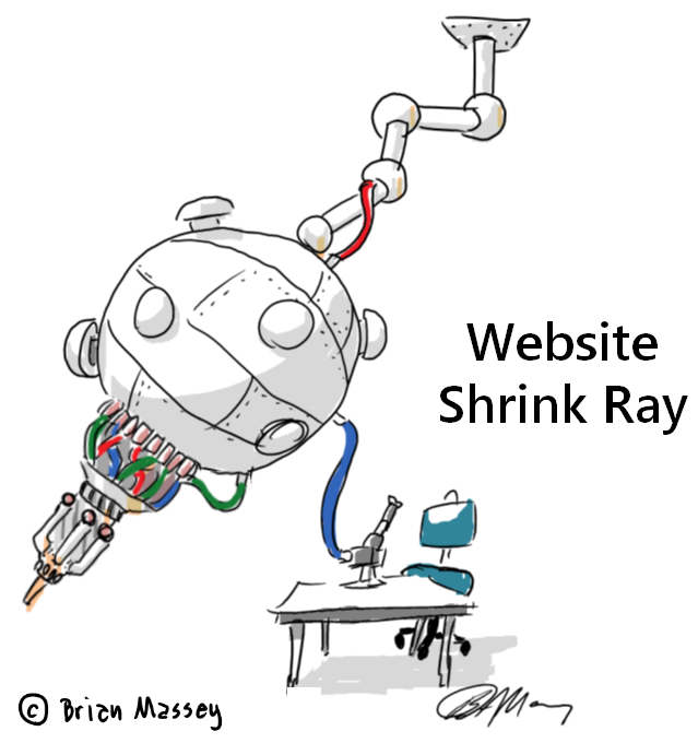
Is Google’s Mobilegeddon Scaring Website Owners Into Bad Design Decisions?
Columnist Brian Massey believes Google may be doing businesses a disservice by recommending a responsive Web design to improve the mobile experience.
Spy on Any Website

“We aren’t worrying about our mobile traffic right now.”
At my company Conversion Sciences, this is what we’ve heard from many — if not most — of our website optimization clients over the past three years. Businesses are just getting their heads around their big-screen websites. Mobile traffic is often small by comparison, and it converts terribly for my clients, often at half to one-third the conversion rate.
But the decision to ignore it may be short-sighted.
Mobile traffic is likely one of your fastest-growing segments. Have you done the calculations to see how quickly your mobile traffic is growing? In the example below, the red dotted line in the graph represents the percentage of mobile traffic visiting a site. Would you be surprised that 90 percent of its customers are over the age of 60?

Mobile sessions on this site grew from 12% to 24% of all traffic.
This website isn’t serving youngsters, and yet mobile traffic volume has tripled in one year, now making up a quarter of all visits. We aren’t surprised. We have more than one client that now has a higher conversion rate for mobile visitors than for desktop visitors.
Mobile is a force to be reckoned with, and apparently Google agrees. In April, Google bullied us all into paying attention to our mobile Web strategy with its “Mobilegeddon” algorithm change. This change will no doubt fuel one of the biggest website redesign trends the Web has seen.
Google’s Webmaster’s Mobile Guide recommends responsive Web design, or RWD.
[blockquote]One of the benefits of RWD is that you’ll only need to maintain one version of your site instead of two (i.e., you won’t need to maintain the desktop site at www.example.com and the mobile version at m.example.com)[/blockquote]
If businesses take Google’s threat and advice seriously, will we have a better worldwide Web? Our experience says, “No.”
We don’t do website design, so we don’t have a dog in the hunt for redesigns. Here’s why we think Google may be doing businesses a disservice with its Mobilegeddon recommendations.
Redesigns Are Dangerous
Those businesses that are moving to a responsive website in order to improve their mobile experience may be doing so at the expense of their big-screen desktop visitors. No matter how bad you think your current website might be, a redesign is as likely to reduce your conversion rate and revenue per visit as it is to improve it.
There are a number of examples of big-name redesign disasters including FinishLine.com and Marks & Spencer. So, if you’re redesigning a perfectly good desktop site in order to make your mobile site easier to maintain, you may be robbing Peter to pay Paul.
There are really only two good reasons to redesign.
- Your content management system or shopping cart isn’t letting you achieve your online goals.
- You are rebranding your company or products.
If your backend just won’t support a mobile site, then you should consider redesigning. Otherwise, you should consider developing a mobile site with mobile visitors in mind.
But is RWD really the way to go?
Responsive Designs Make Bad Decisions For You
Mobile visitors expect a mobile experience. Responsive sites provide a smaller version of a desktop experience.
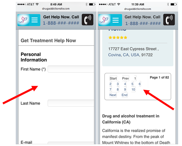
Here’s a form I was asked to fill out to simply register for a webinar.

It’s hard to fill out forms on most mobile devices. This one has sixteen fields.
It fits very nicely on my mobile screen. Thank you, responsive design! However, this whole experience should have changed with fewer fields, larger fields, and more multiple choice questions. Ironically, the title of this webinar was, “Advanced Conversion Strategies for Mobile Search.” I don’t know how it was. I didn’t register.
We call sites like this disresponsive, as in, “That site dissed me on mobile.”
Recommended Articles


Responsive Web Design Vs. Adaptive Mobile Sites
For those of you not familiar with the distinction between a responsive Web design and an adaptive mobile site, I’ll offer a brief explanation.
A responsive website grows and shrinks based primarily on the size of the browser window through which the site is being seen. The same content is being displayed on a 320×568 pixel iPhone 6 screen as is being presented to visitors coming on their 1,920×1,080 desktop monitor and everything in between. So, the template has to make a few decisions along the way in order to make this all work.
Can we get a mobile site by shrinking our desktop site?
This is accomplished by shrinking some elements, such as pictures and images. Selected elements found on the desktop can be hidden from small-screen visitors. Buttons may grow in size to make them easier to thumb.
An adaptive mobile site is built on a unique template different from the desktop site. These two sites may look similar and read from the same content databases, but an adaptive site has to be designed and managed separately. It doesn’t change with the big-screen desktop site.
[pullquote]The responsive design holds forth the illusion that a business is getting two sites for the price of one.[/pullquote]
The responsive design holds forth the illusion that a business is getting two sites for the price of one, but the responsive template often makes bad decisions. Such decisions cannot be anticipated, and many are introduced when new features are added to the site. Many of these bad decisions will cost you customers, leads and sales.
Broken Layouts
When choices are left to the whim of a template, things break. Tables, forms, buttons, and headlines are all potential breaking points. Some elements break on really small screens. Some break only on bigger screens. These breaks will reduce your conversions and revenue.
Here are two ways responsive designs can break a website.
The Unclosable Popover
Popovers have become a staple of blogs, online publications, and business sites. What will your responsive template do with the popovers you ad to your site? Often nothing.
When a popover appears on a small-screen device, care must be taken that the dialog box scales with the template. Otherwise, the (X) needed to close it falls outside of the screen. Popovers typically foil scrolling until they have been closed, or the visitor gives them what they want. There’s nothing to be done but leave.
The Never-Ending Map
Maps are particularly important to mobile users, because the word “mobile” translates into “lost” in at least three languages. The desktop experience primarily focuses on “what,” “how,” and “why.” Mobile visitors add the all important, “where” with a dash of “how fast can I…”
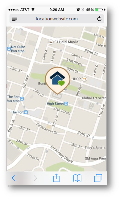
Swiping only moves the map.
If your responsive design handles the map on your site wrong, your mobile visitors can find themselves in the never-ending map. The map fills the small screen. Swiping up, down, left and right will move the map, but the visitor can no longer scroll the screen. This makes it impossible to do anything more than scroll and zoom around the city.
Third-Party Tools
As tool providers roll out new Web features, we can be sure that they will confuse our responsive design. The list is long and growing: exit-intent popovers, sticky trust seals, online chat, video spokespeople, popup surveys, and more. Any of these can create a smudge on the screen of your visitors’ mobile experience.

Is the Chat Now girl really the most important thing to emphasize?
In short, there really is no way to get two websites for the price of one. You will ultimately have to make customizations to your responsive mobile site just as if you were maintaining a separate “m-dot” site.
Responsive Design Is Slow
The mobile Web seems to be more susceptible to speed issues than the desktop is. This is a problem for responsive Web designers. People are more impatient, yet less willing to wait for your hidden images to load.
Last year, Internet Retailer published a study that was critical of responsive website design for ecommerce websites. With load times averaging 18.24 seconds, Internet Retailer and Keynote came to the conclusion that responsive design was costing e-retailers millions of dollars in lost revenue.
We have used our testing tools in two situations to turn a desktop page into a mobile-friendly page. We resized elements and adjusted the layout using JavaScript. In essence, we faked a responsive website. In both cases, the responsive mobile page performed more poorly than the desktop-formatted page on mobile visitors.
There is more going on here than layout issues. Could speed be the issue? We test our client’s mobile sites on 3G and 4G connections to find issues related to slow load times. You should, too.
Mobile Must Be Addressed
Mobile visitors expect a mobile experience — I said it again. While most mobile websites convert at a rate much lower than the desktop, it doesn’t have to be that way. With the right mobile experience, tailored to your mobile visitors, you can tap into this fast-growing segment of your traffic.
Google is recommending a responsive Web design as a solution to your mobile shortcomings. This may be better than no mobile site for some businesses, but evidence indicates that your mobile conversion rates will suffer with this approach.
Do the analysis of your mobile traffic, and see if you can’t make a case for an adaptive mobile site that is designed to give mobile visitors the mobile experience they want, not a pre-shrunk desktop experience.
Contributing authors are invited to create content for MarTech and are chosen for their expertise and contribution to the martech community. Our contributors work under the oversight of the editorial staff and contributions are checked for quality and relevance to our readers. MarTech is owned by Semrush. Contributor was not asked to make any direct or indirect mentions of Semrush. The opinions they express are their own.
Brian Massey is the Conversion Scientist at Conversion Sciences and author of Your Customer Creation Equation: Unexpected Website Forumulas of The Conversion Scientist. Conversion Sciences specializes in A/B Testing of websites. Follow Brian on Twitter @bmassey
View Author Profile
Add us as a preferred source on Google
Google's "preferred sources" feature allows users to customize their search results by selecting news outlets they want to see more often in the "Top Stories" section.
Add Martech NowRelated Articles
Validate AI-generated insights, establish governance, and prioritize real-world research where it delivers the greatest value.
Read More
Firsthand expertise, original research, and transparent thinking carry more weight than polished messaging. Here's why.
Read More
Marketing artificial intelligence (AI)
4 minutes readLearn how to balance AI chatbot efficiency with the high-touch needs of enterprise sales to engage VIP prospects without losing the human touch.
Read More
The strongest marketing messages address the frustrations and motivations customers rarely share directly. Here's how AI can help uncover them.
Read MoreRelated Articles
Validate AI-generated insights, establish governance, and prioritize real-world research where it delivers the greatest value.
Read More
Firsthand expertise, original research, and transparent thinking carry more weight than polished messaging. Here's why.
Read More
Marketing artificial intelligence (AI)
4 minutes readLearn how to balance AI chatbot efficiency with the high-touch needs of enterprise sales to engage VIP prospects without losing the human touch.
Read More
The strongest marketing messages address the frustrations and motivations customers rarely share directly. Here's how AI can help uncover them.
Read More