Comprehensive Guide To Creating Branded Templates In Excel
Wrapping up my series on dashboards, I want to address an issue I see in just about every spreadsheet I’ve seen in my career as a marketer: using Excel’s (hideous) default formatting for visualizations. You’ve seen them … the blue and red charts are particularly unforgivable. Worst of all, sticking with Excel’s default formatted table […]
Spy on Any Website
Wrapping up my series on dashboards, I want to address an issue I see in just about every spreadsheet I’ve seen in my career as a marketer: using Excel’s (hideous) default formatting for visualizations.
You’ve seen them … the blue and red charts are particularly unforgivable. Worst of all, sticking with Excel’s default formatted table and pivot table styles can also be discordant, especially if you are a brand with your own panoply of branded colors.
So, let’s see if we can remedy that with this post and make the digital world more beautiful.
Customizing Chart Formats
If you haven’t run across any of my charting resources, check out this video tutorial I produced and this post I wrote on Search Engine Land about making your charts sexier.
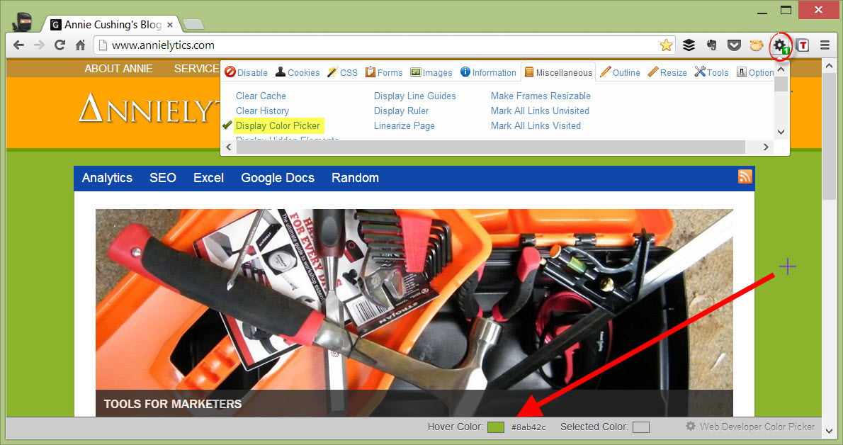
I highly encourage you to use your company’s branded colors in your charts (always). If you don’t know them, you can use the Eye Dropper extension in Google Chrome, or use the Color Picker under the Miscellaneous tab of the Web Developer Toolbar.
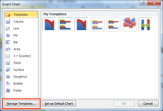
Once you create your branded charts, you should save them as templates. This will save the template in a folder on your hard drive. If you’re not in the practice of saving templates, this post/video I published on the Moz site will walk you through that process.
Customizing Formatted Tables
I’m a huge proponent of using formatted tables as the first line of defense in corralling data. But Microsoft doesn’t provide us with too many formatting options. However, it’s not terribly difficult at all to format them.
The Microsoft site offers this tutorial for PC users. It was written for 2007, but the steps still apply to current versions of Excel. I couldn’t find any tutorials on the Microsoft site that demonstrated how to apply custom styles for the 2011 Mac version (surprise, surprise), but the same principles apply that you’ll see in the tutorial for PC users.
Recommended Articles
Customizing Pivot Tables
Microsoft offers a number of ways to customize pivot tables. The Microsoft site points to a very useful post published by Rider University. But, the way I customize mine is with the pivot table selected: go to PivotTable Tools > Design tab > New PivotTable Style (Mac: Data > PivotTable > PivotTable Styles > New PivotTable Style), which will bring up the New PivotTable Quick Style dialog.
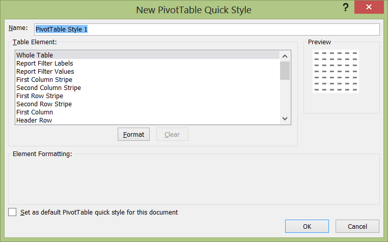
The options under Table Element are always the most intuitive, so what I do if something’s not clear is set the style to neon yellow fill and look to see what turned yellow. You just have to play around until you come up with a custom format you’re comfortable with.
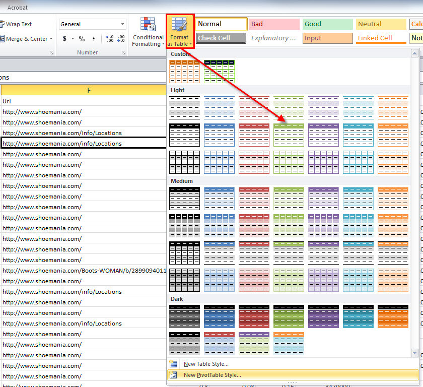
Applying Custom Styles
One of the absolute dumbest limitations I’ve seen in Excel is the inability to save custom tables and pivot tables to use in other workbooks. I mean, you can with charts. It’s pretty insane. But there is a hack to get around this that I learned from the Contextures blog. And I mean hack.
What I do to apply all of my custom formats from one workbook to the next is save all of my custom formats in a single spreadsheet. So I just have a formatted table and pivot table with minimal data in them to keep the file size small. I also included a formatted text box since I frequently use these in client workbooks.
And then, I right-click on the tab of the worksheet I want to copy, choose Move or Copy, select the Create a copy option (very important), and choose the workbook I want to copy the worksheet into.
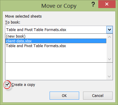
Once you pull it in to your workbook, you can delete the worksheet. Just bringing that formatted worksheet into a new workbook, even momentarily, is enough for Excel to access the styles, and they will be available to you when you go to format your table, pivot table, or text boxes.
Kind of ridiculous, but whatever works!
So, please stop using Excel’s nasty default formats, create your own, and present data that’s as pretty as it is actionable.
Contributing authors are invited to create content for MarTech and are chosen for their expertise and contribution to the martech community. Our contributors work under the oversight of the editorial staff and contributions are checked for quality and relevance to our readers. MarTech is owned by Semrush. Contributor was not asked to make any direct or indirect mentions of Semrush. The opinions they express are their own.
Annie Cushing is an SEO and analytics consultant. Her areas of expertise are analytics, technical SEO, and everything to do with data — collection, analysis, and beautification. She’s on a mission to rid the world of ugly data, one spreadsheet at a time. If you just can’t get enough data visualization tips, you can check out her blog, Annielytics.com.
View Author ProfileAdd us as a preferred source on Google
Google's "preferred sources" feature allows users to customize their search results by selecting news outlets they want to see more often in the "Top Stories" section.
Add Martech NowRelated Articles


The default martech sales motion asks you to tear out your stack and bet 18 months on a rebuild. Buyers increasingly prefer a different path.
Read More
Marketing artificial intelligence (AI)
6 minutes readA single afternoon of tool-calling can eat a $20 monthly subscription. The fix isn't using fewer tools, it's changing where your data lives.
Read More
As AI automates workflows, scoring, and orchestration, MOps shifts from system management to business impact.
Read MoreRelated Articles
The default martech sales motion asks you to tear out your stack and bet 18 months on a rebuild. Buyers increasingly prefer a different path.
Read More
Marketing artificial intelligence (AI)
6 minutes readA single afternoon of tool-calling can eat a $20 monthly subscription. The fix isn't using fewer tools, it's changing where your data lives.
Read More
As AI automates workflows, scoring, and orchestration, MOps shifts from system management to business impact.
Read More