Akamai: When creating responsive sites for mobile, consider dynamic image optimization
The content delivery network points out that marketers need to keep image performance in mind for mobile.

Responsive web design across several screens
Since the end of the last decade, responsive web design (RWD) has been a popular way for marketers to minimize the amount of website modification they have to do for multiple screens.
In responsive web design, a single website is automatically scaled for different screen sizes through proportion-based page grids. But mobile users are becoming pickier about mobile website performance, and this pickiness has been a driver of the increasing use of ad blockers.
Even though RWD images are resized for the screen, Akamai Technologies’ Senior Product Marketing Manager Anthony Larkin told me recently, it’s important that marketers keep in mind the need to optimize the images.
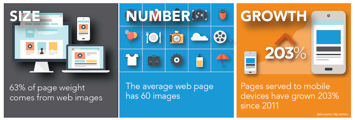
According to HTTP Archive’s research, an average of 63 percent of webpage weight is due to images. Larkin noted that some marketers deliver the same resized image to all users of RWD sites, whether they’re on mobile or desktop. Some others prepare small, medium and large images, with breakpoints for which images go to which screen sizes.
Graphic from Akamai
The latter strategy, of course, can involve a lot of extra effort. And, in either case, if the image is high-resolution, the performance could be limited by “over downloading,” where a given screen discards unneeded pixel resolution.
The “over downloading challenge is that you could be sending much less data to the mobile device, but you’re actually overtaxing the smaller devices [and the network],” Larkin said via email. “RWD [sites] are overweight by nature but you can optimize what gets loaded and being (sic) smart about how you load those sites by automatically adjusting quality size and adjust/resize images as needed.”
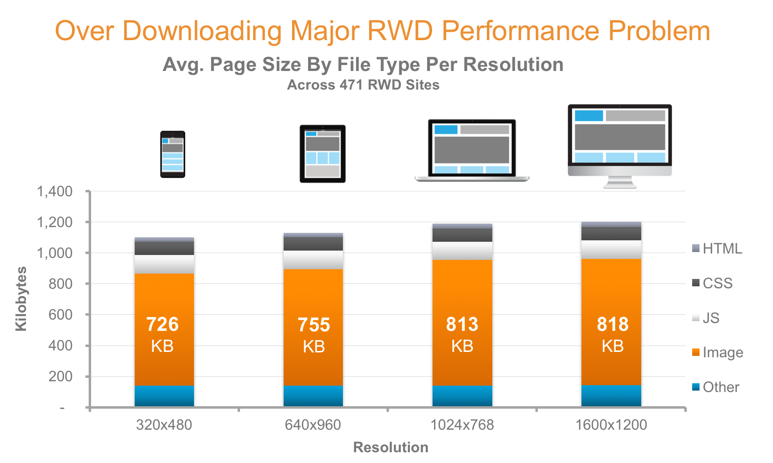
In this graphic from Akamai, for instance, the file sizes of downloaded, non-optimized images are approximately the same for the same page across different screen sizes/devices:
Graphic from Akamai
As image management provider Cloudinary noted in a blog post on the subject:
“The simple solution is to always deliver the image in the highest resolution and then simply scale the image down with CSS for lower resolution devices or smaller browser windows. However, high resolution images use more bytes and take more time to deliver, so this solution could needlessly waste bandwidth and loading time, increasing costs and harming users experience.
“To offset the problem, a more complex framework could be designed that can load different images for each responsive mode, but when considering the number of images needed and the time to create all the different resolutions and image dimensions, implementing this solution becomes complex and hard to maintain.”
Larkin’s recommendation: “Dynamically create and deliver images as needed” by employing one pristine image from which images are generated on the fly for the needed screen size.
He noted that this kind of cloud-based distributed service is available from such vendors as ImgIX and Cloudinary, as well as from his company.
Opinions expressed in this article are those of the guest author and not necessarily MarTech. Staff authors are listed here.
Related stories
About the author