Optimizing Organic Search For The Holidays With CTR Studies On Tableau
Columnist Benjamin Spiegel takes beginners step by step through identifying CTR outliers using Tableau.

It’s that magical time of the year again, when brands and online businesses are pushing to get the absolute most from their assets to capture the holiday volume.
One simple way you can do this, without developing new content, is by optimizing your existing assets. An approach that takes advantage of low-hanging search fruit is it to optimize your Meta Descriptions and titles to make sure that you are getting the most out of your organic listings.
The way you generally go about this is by looking at the click-through rate (CTR) for your keywords/pages and optimizing the ones that fall outside of the average. In order to do this, SEOs generally leverage one of the well-known CTR studies — like the ones done by Slingshot or Catalyst — and compare it against the brand’s CTRs.
However, I believe using someone else’s CTR study does not produce meaningful results. Over the years, I have touched over 100 brands and, based on my experience, I know that every category and industry generates a unique and distinct consumer behavior, and each theme and intent differs.
Therefore, I believe that if you are truly trying to understand the engagement rates of your consumers, you should build your own CTR Study based on your own data generated by your consumers. Today, I will follow up on my article on Data Visualization and provide a beginner’s guide to performing your own CTR study using Tableau.
Why Tableau Vs. Excel?
Aside from a variety of visualization and advanced analytics features, Tableau also allows you to link and merge external sources; update the data and your visualizations update automatically, so analysis can be done easily and at scale via swapping out a referenced file.
Besides, Tableau is so much more fun! You can get a free Tableau Public version (watch out, though, as any data you upload or visualizations you make will be publicly available with this version). You can also check out Tableau Desktop, as well as the company’s other products, with free trials — the Professional version is $1999 per user and the Personal version is $999 per user.
Step 1: Getting To The Data
The best way to create a detailed and meaningful CTR study is to use the data coming from Google Webmaster Tools. To obtain it you need to have a verified Google Webmaster Tools account.
Once you’re logged in and your account is activated, click on the left side of the window and choose Search Traffic -> Search Queries (fig. 1.1) or click on Search Queries from your dashboard (fig. 1.2).
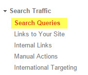
Fig 1.1

Fig 1.2
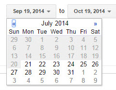
Step 2: Refining The Data
Once you are on the Search Query screen you want to make sure you pick the maximum available date range of 90 days.
By using the maximum available range you are making sure that you are using a large enough sample to even out irregularities like weekends, holidays or odd changes in paid search campaigns that may have affected the norm.
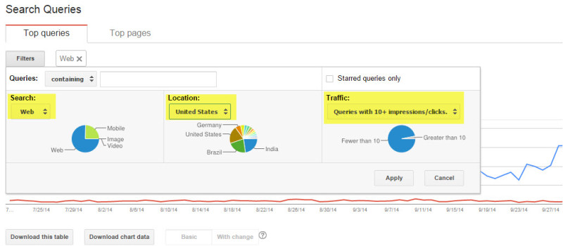
Another important step to refine the data is to limit the set to only contain web data (no images, videos or mobile) and to remove anything that is below 10 impressions (because it will skew the data).
Also, please make sure you limit the data to the country you operate in, to avoid skewing the data any further. I often do two exports, one with Web data and one with mobile data, which allows me to better filter and define my results.
Step 3: Saving The Data
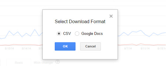
The last step before moving into Tableau is to save the data onto your computer.
I recommend using the CSV export option for this exercise, but if you would like to start keeping historical records, a quick click on Google Docs as an option will make that easier. Choose “Download This Table.”
Step 4: Import Into Tableau
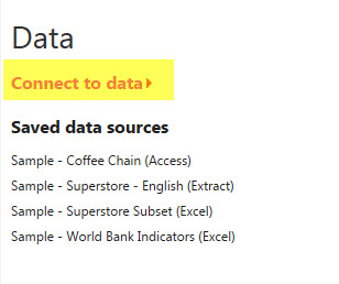
Once you have launched the application, choose Data – > Connect to data on the left-hand side.
On the next screen, simply choose In a File -> Text File. Since Webmaster Tools exports as CSV, you need to select the text option as opposed to Excel.

Once you load the file, you are presented with a preview of the Data. All you have to do here is to make sure that you are using the right data types for each column (# vs. string) and then proceed with “Go to Worksheet.”

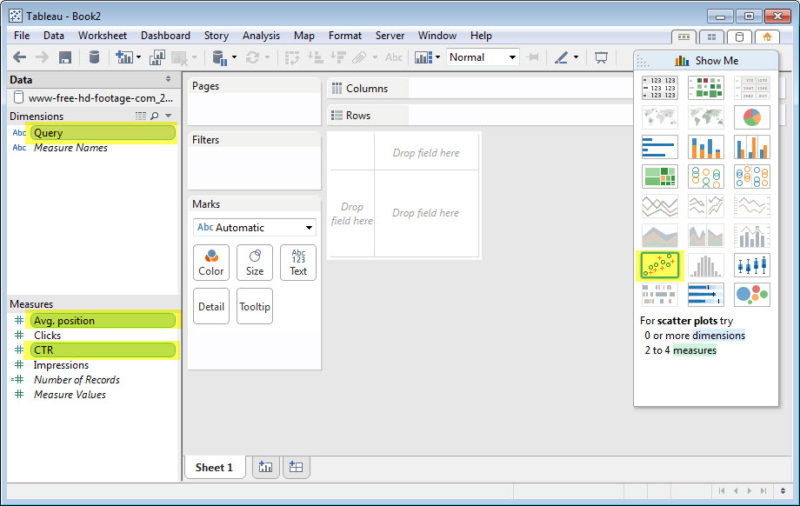
This will present you with an empty workspace. On the left-hand side, you will find two sections: Dimensions and Measures (metrics), very simple and straightforward.
Next, highlight (Ctrl + Click in Windows and Command + Click on a Mac) Query, Avg. Position and CTR. Once you have them highlighted, click on the scatter plot option on the right-hand side under “Show Me.” You’re almost there.
Step 5: Preparing The Worksheet
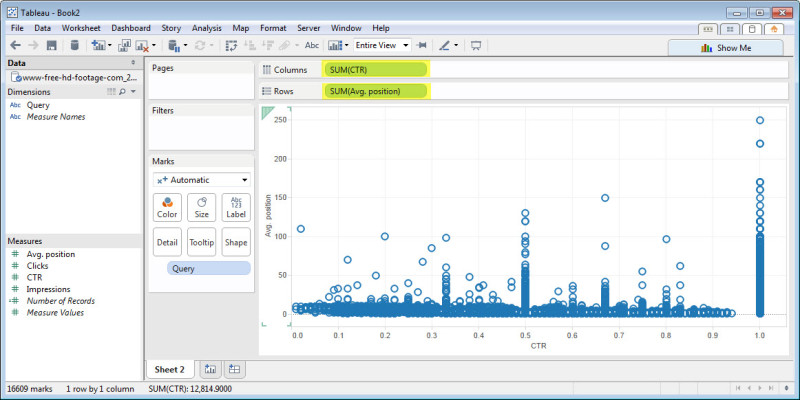
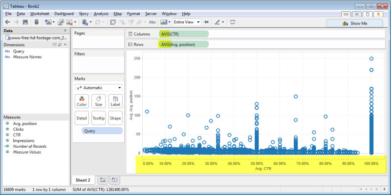
You have now created a scatter plot that is charting the CTR along the X axis and the average position along the Y axis. It’s time for a little bit of housekeeping at this point.
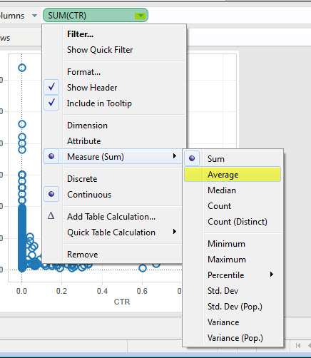
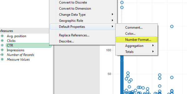
First, click on the little triangle next to the SUM(CTR) and change it to AVG(CTR) by choosing Measure -> Average (See image below). Do the same for Avg. Position. This will ensure that if we add multiple files, we will use the average and not the sum.
I also recommend you go into the left-hand Measures column, right click on CTR and choose -> Default Property -> Number Format -> Percentage. This will format the CTR as a percentage rather than a sub-zero number.
Now, it should look something like this. You want to make sure that the X axis has the percentage format on it and the Row and Column sections read AVG(CTR) and AVG(Avg. Position). Just a few more steps, I promise.
Step 6: Making It Flexible
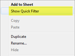
In order to make sure your report is flexible and can be applied to a variety of data sets, I recommend adding some Quick Filters to it.
The way you do that is by right clicking in Measures on the value you want (in our case it is Avg. Position) and select Show Quick Filter. (On a Mac, you click on the small triangle to the right of the Measure.)
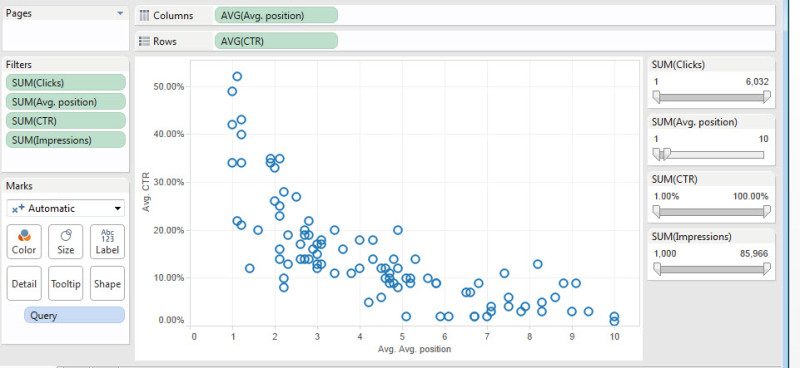
Repeat this step for each of the metrics (excluding Number of Records and Measure Values). Now your right-hand side should look just like mine below.

You can use these sliders to limit the data in real time. I recommend you have at least 500-1000 impressions (depending on your traffic volume) and that you limit your data to the first top 10 rankings.
In order to stick with the traditional format for CTR Studies (Avg. Position on the X Axis and CTR on the Y Axis), I would also click the swap icon —![]() ; this will swap the axes and provide a more traditional view of the CTRs by position. If you followed along correctly, it should look like the view below:
; this will swap the axes and provide a more traditional view of the CTRs by position. If you followed along correctly, it should look like the view below:
We now have a nice plot showing us all our query positions and their respective CTRs. Immediately, we can spot some outliers, but to make things easier, let’s add a trend line by right clicking on the canvas (CTRL + Click on a Mac), and choosing Trend Lines – > Show Trend Lines.
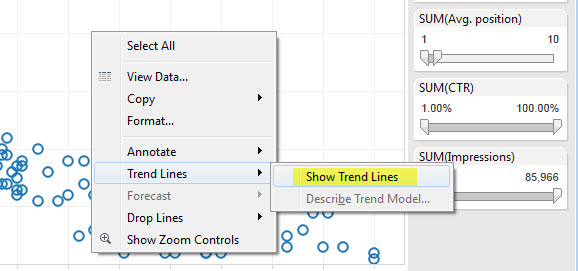
This will give you the default trend line model. I prefer exponential models; so in order to switch the model, I simply right click on the canvas and choose Trend Lines -> Edit Trend Lines. There is some fairly good information on trend line models on this Excel support page.

Also, whatever you choose, be sure you keep the “Allow a trend line per color” option active, as we will use it in our last and final step. If you have followed all the steps (and I did not mess up) your view should look like this:

Step 7: Enhancing The Data
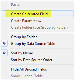
In the final step for this part of the series, I want to break out the terms by intent; to achieve this in a scalable way we must create a calculated field. Simply right click in your Dimensions area and choose -> Create Calculated Field. This will open up an editor you can use to create formulas.
Once you create your field (I named it “Category”), you can create some rules for the content. In my example below, I want to check if the query has either “coupon” or “free” in it.
If so, I will tag it that way; otherwise I just add “other.” This will add another column to my dataset; you can extend this column with much more complex rules. As an example, you could add additional tags like “branded” and so on.
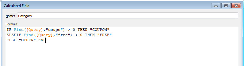
Here’s the code in a format that you can copy, paste and modify as needed:
ELSEIF Find ([Query],”free”) > 0 THEN “FREE”
ELSE “OTHER” END
Once you click Okay, that new field should show up in the Dimensions area on the top left. Now all you have to do is drag it onto the “color by icon” (highlighted in green below).
Doing so will segment the data by that column, and color the actual markers and the lines by that Column, in order to view the CTR by that category. This should result in the graph below—your completed masterpiece of a CTR analysis.

[CLICK TO ENLARGE]
I know this was a lot of information for a single article, and I hope you were able to follow along. My intention was to get you inspired to build you own CTR analysis based on your actual data, instead of relying on another brand’s consumer behaviors.
The next step now would be to investigate the areas highlighted in yellow, because those keywords are receiving a very low CTR when compared to my consumers and my category.
Are you ready to generate your own customized CTR study from your actual data? Have a question about any of the steps outlined here? Let me know in the comments or on Twitter.
Opinions expressed in this article are those of the guest author and not necessarily MarTech. Staff authors are listed here.
Related stories
About the author