Responsive Email: Avoid Defections By Improving Mobile Experiences
As many articles have noted, mobile email opens are on the rise; some predict that mobile opens will surpass desktop opens by the end of this year. The rise of the mobile market has been relatively quick, and not all marketers have grasped how this market affects them. One study reports 40% of consumers leave […]
As many articles have noted, mobile email opens are on the rise; some predict that mobile opens will surpass desktop opens by the end of this year.
The rise of the mobile market has been relatively quick, and not all marketers have grasped how this market affects them. One study reports 40% of consumers leave a brand following a poor mobile experience, with another 23% losing interest over time due to poor experience. Another study reports that 75% of smartphone owners claim they will delete their emails if they can’t read them on their phone. 
Given the increasing mobile interaction and customer responses to subpar mobile experiences, it makes sense to ensure that your audience is having a good experience that makes your messaging both attractive and accessible in all environments.
There are different approaches to make email for the mobile environment:
- Mobile Friendly Email: These sorts of emails are the same width as other emails, but have large headlines and call-to-actions that stay on the left, so that when viewed on mobile devices, the important take-aways are still easily absorbed on the side of the screen that is initially loaded.
- Mobile Optimized Email: These emails build on the same principles as mobile friendly emails by including creating clear, large headlines and call-to-action buttons. These tend to be smaller than emails designed for desktop. Desktop emails are usually 640px or wider, and mobile optimized end up between 480 and 560px. iOS will scale your message to fit the screen it’s displayed on, but Android doesn’t automatically scale content, and users will still have to scroll up, down, left and right to see the message.
- Responsive Email: Responsive email adjusts to fit the size of a user’s screen, with no action required on the part of the user. This means that your messages and images won’t be truncated or falling off the right half of the screen. Given that phone screens are small, people will still need to scroll, but you’ve put all the content on an up and down scroll, making it easier and more natural for people to take in, as opposed to having them pinch, zoom, and track left and right.
Responsive email really shines in the right environment, and brings a much smoother experience to your audience than the other options, if you can invest the appropriate time and effort. In general, responsive emails can take up to 1.5 times the initial effort to design. Once you have a good grid template set up in your design templates and coded in your HTML templates, the level of effort decreases.
Responsive emails should always be followed up with a good mobile experience. If your site isn’t optimized for mobile, it’s worth the time and effort investment to optimize that first, and then come back and update your email program to be mobile optimized.
If your site is mobile optimized but your emails aren’t, what are you waiting for!? Your emails are a great way to advertise the smooth mobile experience you put together for your customers, but having an email that’s hard to read and requires lots of zooming and tracking from side to side to get your message across is at odds with the message you’re really trying to send.
Responsive emails are usually designed at two sizes: one for desktop devices, and one for mobile devices. Given the variety of screen sizes across phones, it’s a good idea to create a fluid mobile design that allows your content to expand a bit on a screen that’s larger than an iPhone.
Once designs are completed, the email is written with advanced HTML & CSS that both Android and iOS native mail inboxes support; the most recent BlackBerry OS releases also allow for responsive email. It’s good to keep in mind that many third party apps don’t render responsive emails, although more are beginning adopting the technology.
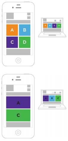
Responsive functionality makes use of a CSS feature called media queries. Media queries allow marketers to change their email layout by wrapping content (top), stacking content (bottom), or even hiding unnecessary content that may push the main message lower on the screen. Marketers can also scale content (both text and images) for better mobile viewing, adjust spacing around elements to ensure easier and more accurate clicking, and change text properties (font, size, color, weight) to make messages and call-to-action more obvious.
All of this adds up to making a better experience for people on mobile devices. It allows readers to reach the point of the message more quickly and easily. Right now is a great time to begin doing responsive emails — at current, it’s a pleasant surprise that brings about wonder when a reader discovers the differences between the desktop and the mobile email versions. Taking that step forward now and adopting this technology while it’s still not quite the norm will help your message stand out from the rest — in people’s minds and in their inboxes.
Opinions expressed in this article are those of the guest author and not necessarily MarTech. Staff authors are listed here.
Related stories
About the author