Twitter Media Galleries: Not User-Friendly & Not Brand-Friendly Anymore
In an era when brands are flocking to Pinterest because of the opportunity it provides for high-quality visual marketing, and Instagram is taking steps to be more attractive to its growing brand users, Twitter has made a curious decision that essentially takes away similar visual marketing opportunities on its platform. I’m talking about those media […]
 In an era when brands are flocking to Pinterest because of the opportunity it provides for high-quality visual marketing, and Instagram is taking steps to be more attractive to its growing brand users, Twitter has made a curious decision that essentially takes away similar visual marketing opportunities on its platform.
I’m talking about those media galleries that were in the news this week. They now show both photos and videos, but they’re a lot less useful than they were both for brands and regular Twitter users.
Here’s why: sometime in the last few months, Twitter removed the ability to see these galleries in their full, grid-view glory. Also gone is the “view all” link that led users into the gallery grid view.
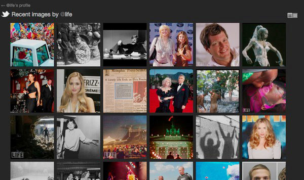
Here’s what I’m talking about using the LIFE magazine Twitter profile:

On the right is LIFE’s current Twitter profile, with the gallery widget showing six recent images but no link to the gallery.
On the left is LIFE’s Twitter profile shortly after galleries launched in August 2011. The arrow points to a “view all” link that took a user into a grid-view showing the whole gallery. This is what it looked like.
It’s a safe bet that the brands that actively share company photos and videos on Twitter (look at @AlaskaAir and @Starbucks for examples), would like their customers and followers to be able to see those full galleries.
The Gap’s Twitter profile is a great example of how this impacts brands negatively. On the profile page, The Gap has six high-quality product images; you can imagine that a lot of visitors would want to see more.
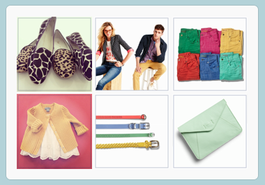
Users may want to see more, but they can’t … unless they’re willing to click through the images one at a time. It’s not user-friendly, and not nearly the great visual branding experience that The Gap can get from Pinterest, for example.
Not user-friendly and not brand-friendly.
I’m baffled by why Twitter made this change. The company declined to comment when we asked this week.
Opinions expressed in this article are those of the guest author and not necessarily MarTech. Staff authors are listed here.
Related stories
About the author