Show Me The Money! 6 Steps To Optimizing Your Payment Process
A smooth, seamless and convenient payment process is key to maximizing conversions.

You’ve worked hard to convince visitors to shop from you — and even harder to get them to the checkout page. So why on earth would you make it so painfully difficult for people to give you their money?
An astounding two-thirds of shopping carts are reportedly abandoned at the payment stage. Given the hoops many websites make their visitors jump through just to enter payment details, it’s no wonder. Few buyers would tolerate such friction at the point of purchase in a brick-and-mortar store. They’d just walk out.
Your payment stage is where visitors become buyers. Here are six steps to streamlining this critical last step in your conversion funnel.
1. Optimize For Clarity & Usability
Whether you employ a single page or a multi-step checkout process, online shoppers will eventually encounter your payment page. Nobody really likes parting with their money, so it makes a lot of sense to optimize the page design to improve the user experience.
Keep Your Payment Form Short, Simple And Clear. The first step in minimizing friction is to make it appear very fast and simple to enter payment details. Perception is critical. If your page layout looks confusing and your forms ask for too much information, you’ll discourage customers from going further.
Reduce clutter on your payment form by including only elements that are absolutely necessary for the transaction. Then, once you’ve visually convinced buyers that the payment step will be quick and painless, make it so.
Don’t require special formats for credit card numbers — if they want to enter their card number with hyphens (or without), let them. Your form should be very accepting of how users enter their data. Help shoppers by auto-populating information where possible (e.g., pre-filling the address field for visitors that are signed into their accounts, or automatically choosing the card type based on the customer’s credit card number).
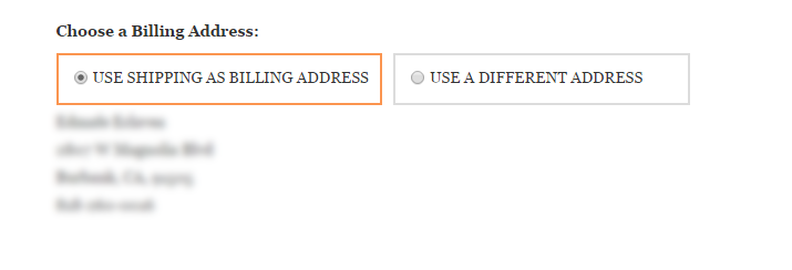
Cosmetics retailer Ulta.com allows users to automatically populate a billing address with the shopper’s shipping address.
Anticipate And Reduce Frustration From Errors. As an online shopper, I find it extremely annoying when a site wipes out the entire form after I inadvertently type in wrong information in one field. Clearing a form is the easiest way to turn off customers, especially when they’re inputting their credit card details. Luckily, you can easily solve this by submitting your form in AJAX, which allows you to preserve form information without storing sensitive financial data in your servers.
2. Address Security Concerns
Shoppers’ awareness of online shopping-related risks is naturally heightened at the payment stage, so go the extra mile in reassuring them.
Make sure your payment page looks consistent with your entire website and is professionally designed. The last thing you want is to trigger alarms in your shopper’s brain with a payment page that looks nothing like the website they just visited. Any visitor would also balk at giving personal and financial information to a poorly-designed form for fear of an insecure transaction.
Improve shoppers’ perception of security by displaying trust badges and encryption information prominently and in close proximity to sensitive form fields (where credit card information is required, for instance). A study conducted by Baymard Institute shows that the presence of security icons on certain parts of a checkout page served as visual reinforcements for shoppers, which tended to view these parts as more secure compared to the rest of the page.
Notice how prominent the Norton seal is on Home Depot’s payment page. Pre-checkout, the seal is tucked away in the footer, but it takes center stage once buyers enter the checkout process.
3. Offer Multiple Ways To Pay
Accepting a variety of payment methods on your site ensures that your visitors will have at least one viable option at checkout. In addition to major credit cards, consider expanding payment options to include PayPal, Google Wallet, Amazon Payments, Bill Me Later, or BitCoin.
Of course, your decision on which payment types to accept should be based upon your audience profile. For instance, BitCoin may not be used by a large percentage of your visitors, and if you know you get a lot of visitors using iOS devices, you might consider implementing Apple Pay.
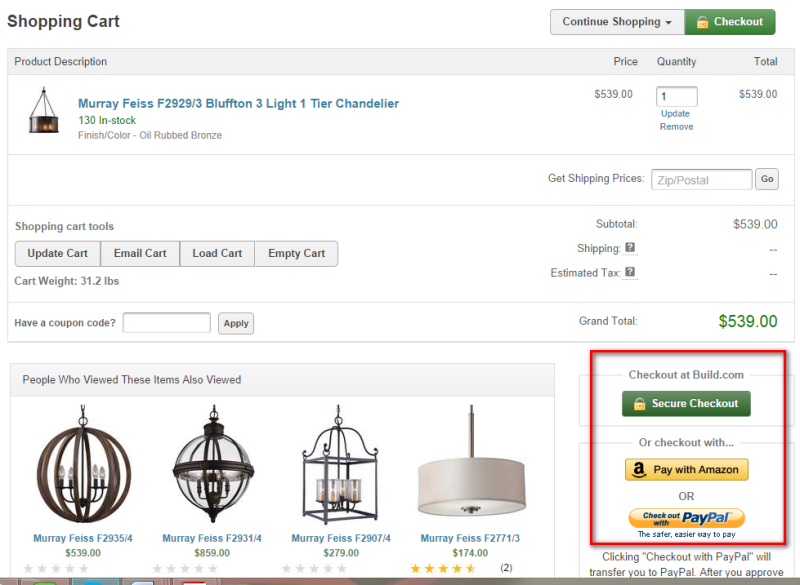
Build.com offers Amazon Payment and PayPal in addition to major credit cards. For buyers who are reluctant to enter payment information, having the option of using their existing payment accounts is reassuring.
There is a caveat, however. Increasing the number of payment methods can also increase the complexity of your payment page. Too many choices can hinder decision-making and lead to choice paralysis. So, before you rush into adding a bunch of payment methods to your page, plan your design carefully. Pay attention to steps you can take to nudge users into quickly choosing the most appropriate payment method for them. Then, minimize confusion by showing only the fields relevant to the shopper’s chosen payment method.
4. Fix Fat Finger Challenges
Payment pages are especially tricky on smaller screens. According to research done by SeeWhy, 99.5% of mobile users will bail out before buying. And a major cause of friction is any place where the user is required to enter information.
Here are some things you can do to improve the payment process for mobile buyers.
- Don’t require your customers to create an account to check out, but if you do remember customers’ account details (as is the case with Amazon), give them the option of logging in so they can access stored payment methods, shipping address and other account details.
- Minimize the customer’s effort by using technology to pre-fill information. For example, instead of asking for postal code as the last part of the address, put it before the city and state, and then pre-populate those fields based on the data entered for the postal code.
- Visually reinforce mobile shoppers’ sense of security with well-placed badges, icons and copy.
- Provide shoppers with several payment methods. According to SeeWhy’s Mobile Playbook 2014, mobile consumers are twice as likely to convert when given alternatives to entering credit card details.
- Show progress indicators to set customer’s expectation of how long the process will take, and to let them know where they are in the process.
- Error handling is an even bigger issue given how tedious it already is to enter information on small screens. Minimize frustration by having bigger text fields and buttons and clearly indicating which fields are causing errors.
5. Understand The Needs Of International Customers
If you sell to customers outside of your home country, you probably already know how challenging it can be to process international payments. Credit cards can be hard to authorize for international addresses. And even preferred payment methods will vary depending on the customer’s country.
According to eConsultancy’s “Internationalisation of Ecommerce Best Practice Guide,” Germans prefer to pay through ELV and debit card, while Scandinavians prefer to pay by cash on delivery. Not surprisingly, customers will also want to pay in their local market currency, so you will need to work with your payment service provider to make this possible.
Bonus Tip: If you currently don’t process international orders, say so upfront. Don’t wait until customers are deep into the checkout process before telling them that you don’t accept non-U.S. cards or don’t deliver to other countries.
6. Speed Up Payment Processing
Even after your customer has entered his or her payment details, your optimization job is not complete. Payment processing and authorization speed is just as crucial as getting the customer to fill out the payment form.
When customers finally click that “place order” button on your site, do they end up watching a spinning circle for 5, 10, even 15 seconds before being taken to the confirmation page? The longer the spinning circle goes on, the more anxious customers get.
A study from the Aberdeen Group reveals that a one-second delay in page load time decreases customer satisfaction by 16%. Imagine how much worse this is for people who have just given away their credit card information.
The time between clicking the “place order” button to the confirmation page should almost be instantaneous. Check how long it takes for your payment processor to authorize and confirm payments on different internet providers and devices, and address any performance issues you notice. If necessary, get a new payment processor.
Conclusion
Optimizing your payment process may be one of the least exciting projects you take on during this final pre-holiday push, but it can easily deliver the most impact. With all the effort that goes into offering the right products, optimizing conversion funnels, designing campaigns and driving targeted traffic, you owe it to your company, and your visitors, to make it as easy as possible for buyers to give you their money.
Opinions expressed in this article are those of the guest author and not necessarily MarTech. Staff authors are listed here.
Related stories
About the author