6 custom Google Analytics reports you should use for every CRO project
Are you getting the most out of Google Analytics for conversion rate optimization (CRO)? Columnist Jeremy Smith highlights six custom reports to improve how you analyze your metrics.
 Google Analytics (GA) is an indispensable tool for gathering data that will help you maximize your conversions.
As a bonus: It’s free.
GA offers excellent reports that provide an overview of key metrics for a particular period. But the out-of-the-box reports won’t always fit your needs. So, fortunately, GA also allows you to create your own reports.
Just click on “Customization” at the top of the home page screen, and you’ll be able to set up a report that shows you whichever metrics you want to see, all in one page.

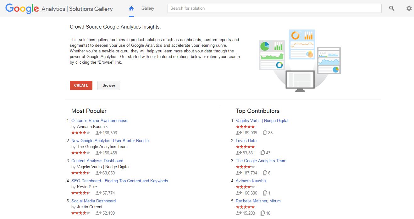
If you want to avoid the hassle of creating your own reports from scratch and instead leverage the work of some other great minds, you can head over to the Solutions Gallery and download any number of templates that might suit your purposes.
These things are powerful.
Within the Solutions Gallery, you can enjoy genius products from people like Avinash Kaushik, Justin Cutroni and members of the Google Analytics Team.
If you haven’t played around with the custom in-product solutions, it’s going to feel like Christmas morning.
The bottom line is that you will need some custom reports for a solid approach to conversion optimization. Here are six that I recommend:
1. Browser Report
Browsers matter. And there are a lot of them.
[blockquote]You think your developers did a good job making your site work with every browser? Don’t count on it.[/blockquote]
That’s the ominous warning delivered by ConversionXL’s Peep Laja.
The fact is, your site might look great on Chrome but not on Internet Explorer (Some people still use IE). As a result, some IE visitors might jump ship because of a user-hostile experience.
You probably won’t know that’s happening unless you look at a report that shows visitors who use a certain browser are bouncing much quicker than users of other browsers.
That’s why a browser-level report is so important.
Fortunately, you don’t have to set up that report yourself. You can import it directly into one of your existing GA properties.
Once you’ve imported the report, review it regularly for red flags. Your bounce rate should be roughly consistent for all browsers.
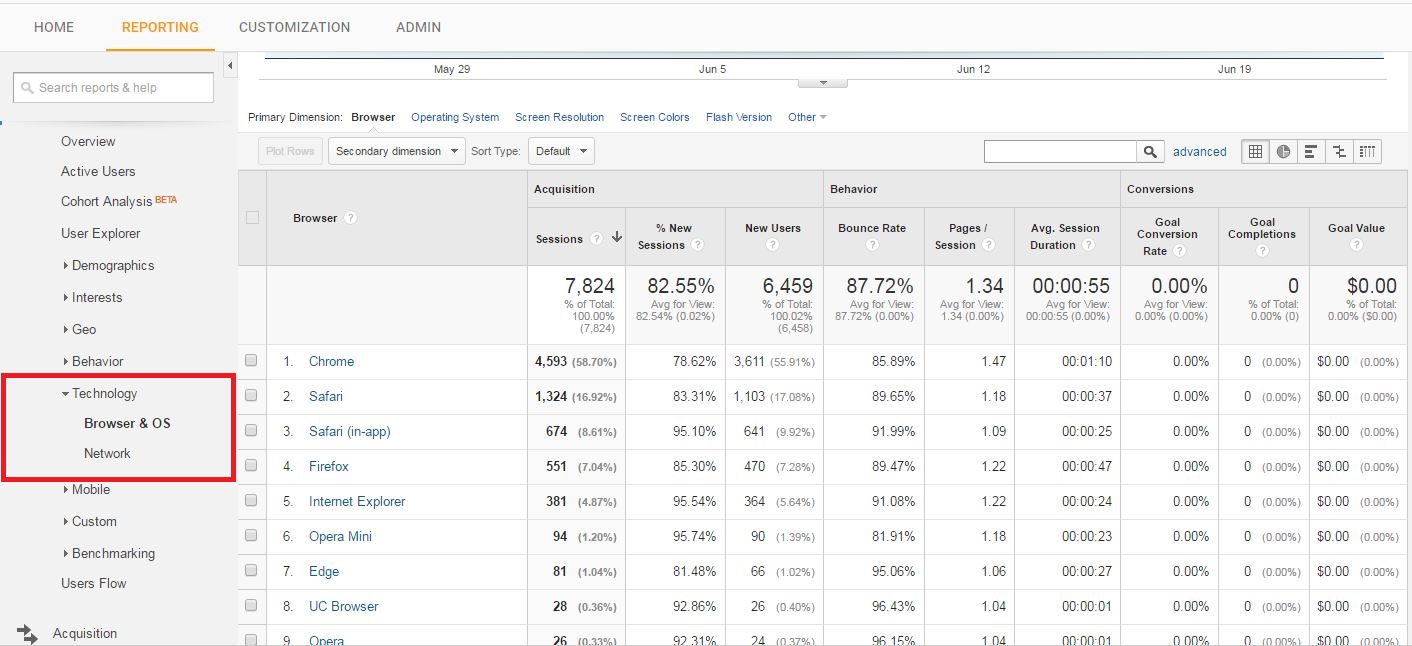
Also, if you’re running an ecommerce site, look for significant differences in unique purchase and revenue percentages. You might find that your CTA button is user-hostile on one of the browsers.

If you’re not running an ecommerce site, feel free to swap out the revenue metrics for goal-oriented conversion metrics. Just click the “Customize” button in the upper left-hand corner of the report to make the necessary changes.
2. Content Efficiency Analysis Report
With a name like “Content Efficiency Analysis Report,” it sounds like something produced by a government bureaucracy that’s designed to put you to sleep.
It’s anything but boring, though.
Basically, the report answers this question: What kind of content works best on my site? What do my visitors appreciate?
That’s invaluable information if you’re doing any content marketing. And you should be doing content marketing.
Also, the report was created by Avinash Kaushik, a man considered by many to be the master of Google Analytics.
When he creates a report, you use it.
The Content Efficiency Analysis Report tells you what you need to know to continue to produce content that’s engaging to your audience. It collects:
- page title
- entrances
- unique visitors
- bounces
- page views
- average time on page
- per visit goal value
- goal completions
Keep in mind, though, that you’ll have to set up goals if you want to see anything in those last two columns.
Use the report as your own localized version of BuzzSumo. Get a read on what’s popular, and then give the people what they want.
You can import the report into one of your GA properties by clicking here.
3. Mobile Performance Report
In this Information Age, mobile is everything.
If your site isn’t optimized for mobile traffic, you’re going to lose market share to competitors who have opted for a “mobile-first” strategy. That is, they design their sites for mobile users and then check to make sure the site also works well for desktop and laptop users.
Fortunately, there’s a custom Google Analytics report that will show you how well you’re faring with various mobile technologies. As with the previous report, it’s a creation of Avinash Kaushik.
The report gives you a breakdown of key metrics by mobile platform. Stats include the number of users, the number of sessions, the bounce rate, the average session duration and the goal conversion rate.
Use the report as you do the others. Look for glaring differences between platforms.
For example, if your goal conversion rate is significantly lower for one platform, then find out why. You probably have a user experience problem.
You can import the report by clicking here. It’s part of the “Occam’s Razor Awesomeness” suite of reports, which is one of the most popular custom report collections in the Solutions Gallery.
4. Site Diagnostics: Page Timing
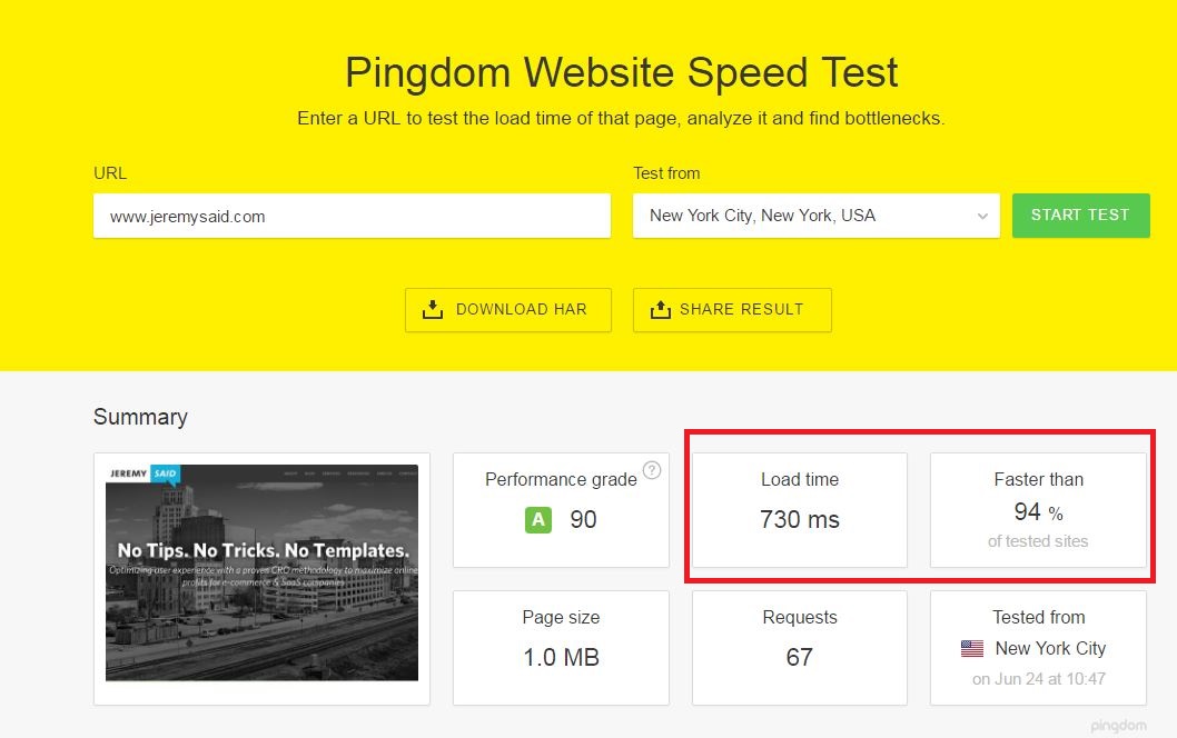
You’re going to lose visitors and customers if your site doesn’t respond quickly.
Not only that, but keep in mind that Google also uses page speed as a ranking factor. That means the pages on your site won’t rank well if they are sluggish.
You can run some quick tests on site speed, such as this one from Pingdom.
Better: You can run this custom report from Google Analytics Solutions Gallery:
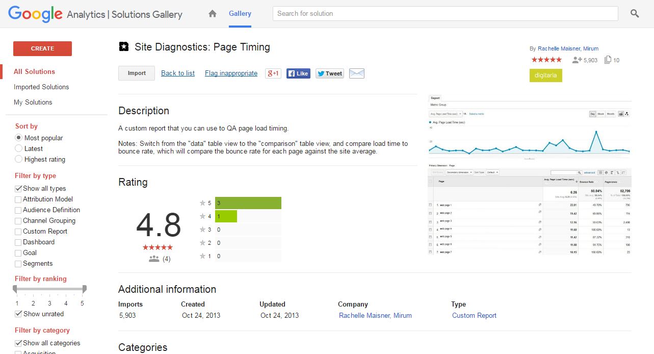
This report from Rachelle Maisner of the Mirum Agency is helpful because of the way that it analyzes and scores each page, while also allowing you to resort the data.
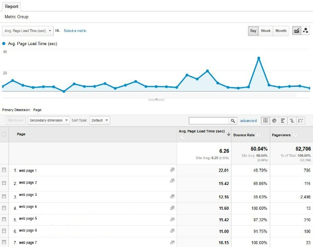
The report shows which of your pages are performing the worst in terms of speed. In other words, it ranks your pages in descending order of load time.
The load time is displayed in seconds. As a general rule of thumb, all your pages should load in less than two seconds. Anything more than that is simply unacceptable.
You can import the report by clicking here. Have a look at it and see whether there are any possibilities for performance improvement.
5. Hours and Days Report
A good content marketer doesn’t just know what type of content to promote, but also when to promote it. That’s what makes the Hours and Days report so valuable.
It’s a creation of Dan Barker that shows you which day of the week and what time your content performs best.
If you’ve spent any time browsing around cyberspace for information about digital marketing, you probably know that there are a lot people who have opinions about when you should post to social media.
Some will tell you to post late at night, when there’s less competition. Others will tell you to post during business hours, so people bored at work will find your awesome content.
The reality, though, is that there might not be a “one size fits all” solution to when you should promote your content.
That’s why it’s a great idea to review the Hours and Days report. You’ll be able to discern trends about when your audience is likely to visit your site.
Keep in mind that the report has four tabs:
- Hours of the Day: Shows you which hours in the day people have been visiting your site. The hour is expressed in military time.
- Day of the Week: Shows you which day of the week people have been visiting your site. The report expresses each day as a number, with 0 being Sunday and 6 being Saturday.
- Day of Week and Hour: Shows you not only the most popular day of the week for your site, but also the hour in the day.
- Linear Date and Hour: Shows you the actual date that your content performed well, along with the hour on that date. In other words, it doesn’t just show you the day of the week like the previous tab, but it shows the date expressed in YYYYMMDD format.
Click here to get the report.

Source: Dan Barker
6. Referring Sites Report
Ever wonder which sites are sending you the most traffic? GA provides rudimentary data, but there’s a custom report for that.
It’s a great way to determine which hand does the best job of feeding you. The report breaks down your incoming traffic from referring sites. It shows you how many visits you received and how well those referrals are contributing to your conversion goals.
If you’re doing any guest posting (and you should be, if you aren’t), you’re probably interested in seeing how much your guest posts are contributing to your conversions. The Referring Sites report is a great way to get that information.
In the report, you get a complete breakdown of every site that is sending you traffic, how many visits each one delivered, the number of goal completions from each channel and a channel-specific conversion rate.
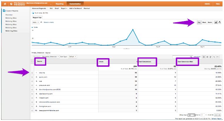
Also, consider adding the bounce rate metric to the report.
The report doesn’t show that metric by default, but it could be useful to see how many people visit your site from a referral and then leave right away.
One of the referrals might be giving people a false impression about what’s on your site.
You can import the report by clicking here.
Conclusion
Google Analytics is great, but it doesn’t give you everything you need right out of the box.
Be sure to create or import the custom reports that your optimization efforts require so that you can easily — and more closely — analyze your metrics and make informed decisions.
You can never have too much data. As long as you are correctly analyzing the data and strategically using them, you can benefit from having the information.
Opinions expressed in this article are those of the guest author and not necessarily MarTech. Staff authors are listed here.
Related stories
About the author