4 Steps To Justifying Mobile Usability & SEO In 2015
Contributor Bryson Meunier admits there are good reasons to not yet have a “mobile friendly” label in Google search results. But procrastination is not one of them.

Has the legendary “year of mobile” crept up on you?
Perhaps you’ve been hearing about the importance of mobile for years but haven’t found mobile SEO different enough, or just haven’t found a way to introduce the topic to an audience that will most likely be hostile, due to the fact that mobile SEO will almost certainly require additional budget.
There are good reasons to not yet have a “mobile friendly” label in Google search results. Procrastination is not one of them.
If you want to make your site mobile-friendly but need to justify the additional spend, here’s one easy way you can do that today.
1. Download Mobile Usability Errors In Google Webmaster Tools
On October 29, 2014, Google introduced the Mobile Usability Report within Webmaster Tools. This report allows webmasters to see specific pages on their site that mobile searchers may have trouble with, breaking it down by error type. If you’ve done nothing to make your site mobile friendly, every page Google has crawled should be in this report.
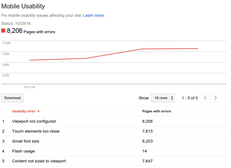
If, like many webmasters, you’ve made some content mobile-friendly but not all, the remaining pages will appear in this report. Either way, this report puts a specific number on the number of affected pages, which makes the project more manageable, and allows you to estimate cost of the project, and the return.
2. Categorize Errors By Page Type
If you have a blog where every page on the site has the same design, this doesn’t apply so much, but most sites have different page templates that will need to be redesigned in a way that is mobile friendly. Going through the errors and identifying different page types can help you understand which types of pages give mobile searchers the most headaches, and you can prioritize those pages for the redesign.

If you identify a specific page type with a specific layout, look for patterns in the page title or URL and use VLOOKUP or LOOKUP functions to associate the characteristic with the page type.
For example, Walmart’s product pages all seem to live at www.walmart.com/ip, while their category pages live at www.walmart.com/cp. Both templates have separate designs and would need to be redesigned separately for mobile visitors. The former resolves to mobile URLs currently, while the category pages are not mobile-friendly.
3. Use Analytics To Associate Important Business Metrics
How do we decide which sections of the site should be redesigned first? Generally, it’s the pages that are most important to the business.

For ecommerce sites, you’ll probably look most at revenue, but for publishers, it could be page views. Whatever metric you’re looking at, you want to make sure that you prioritize those pages that have the most potential for driving your business forward.
Once you’ve determined what that is, download a list of your landing pages in analytics, associate that with the page categories, and then use pivot tables to add up revenue (or pageviews, leads, etc.) for a given time that each page category generates. Ensure these page types are redesigned first.
4. Estimate Post-Redesign Lift & Project Cost
Conversion rate — the easiest thing to measure after a mobile redesign — can vary greatly based on the examples that you look at, as can the cost necessary for these types of projects.
It’s hard to find a case study of a responsive redesign out there where conversions haven’t improved by at least 10%.
And, making a site mobile friendly can vary greatly in terms of resources needed, but this tutorial puts a minimum at 5 hours for a basic site. The highest hourly rate on guru.com for freelance web designers is currently $150/hour, which would put the project cost at $750 at the high end for a basic responsive website.
Smartphone conversion rates on average are about 1.14%. If you had a site with that average conversion rate and an average order size of $100, along with 7 million monthly mobile visitors, your revenue is about $7.98MM/month. A simple 10% increase in conversion rate would mean $798,000 in revenue per month, or more than $9.5 million per year.

A site this big would no doubt cost more than $750 to make mobile friendly, but whatever it costs, the return is probably enormous.
By following steps two and three, you’ll be able to break it down even further, estimating conversions and ROI by page type and really understanding what a mobile-friendly redesign would do, not just for your users, but for your business.
Want to go even further? The model above assumes mobile users remains flat yea- over-year, but that’s not the case. According to StatCounter, mobile users increased by 16% last year. If you increase the visitors post redesign by whatever number your mobile traffic is growing, you’ll have a more accurate picture of what the true ROI will look like at the end of the project.
Hopefully, this little exercise will help all of you catch up to mobile users and make your content mobile-friendly sooner rather than later. Mobile users aren’t decreasing in number anytime soon.
Do you have an alternate method you use for forecasting revenue after a mobile redesign? Send it to me via Twitter or share it in the comments below.
Opinions expressed in this article are those of the guest author and not necessarily MarTech. Staff authors are listed here.
Related stories
About the author